Rate your website in seconds – get instant feedback.
I will rate your website's design and give recommendations to enhance its visual appeal and user experience. See how your site ranks on the leaderboard!

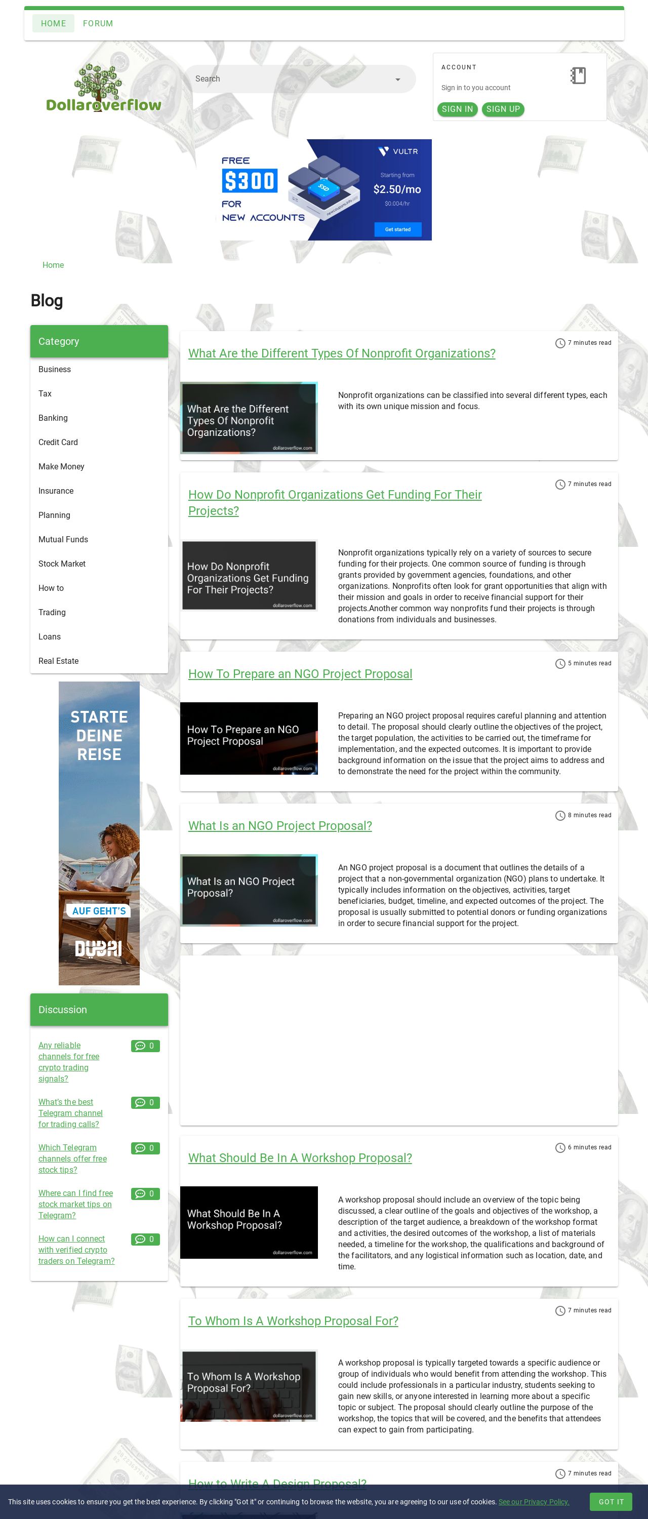
Dollar Overflow - Manage Your Money In A Better Way
Analyzed by AI for fun and insights - not to be taken too seriously!
Visual Design
The visual design of the Dollar Overflow website is a mixed bag. The color scheme is predominantly blue and green, which is clear and easy to read. However, the use of black text on a blue background in the footer is a bit difficult to read, and the font size is quite small. The website's logo is simple and easy to recognize, but it's not particularly eye-catching. The overall design is clean and uncluttered, but it lacks a bit of personality and flair. The use of images is limited to a few stock photos, which are not particularly inspiring. Overall, the visual design is functional but unremarkable.
Recommendation:
Consider adding more visual interest to the design, such as illustrations or graphics, and make sure the font size and color contrast are easy to read.
Layout and Clarity
The layout of the Dollar Overflow website is clear and easy to navigate, with a simple menu at the top and a prominent call-to-action ("Sign In" and "Sign Up") on the homepage. However, the layout is a bit too simple, with not enough visual interest or hierarchy to guide the user's eye. The use of white space is excessive, which can make the site feel a bit empty. The font size and line height are good, but the text could be formatted with more headings and subheadings to break up the content. Overall, the layout is functional but could be improved with a bit more attention to visual design principles.
Recommendation:
Consider adding more visual interest to the layout, such as images or graphics, and use headings and subheadings to break up the content.
Content
The content of the Dollar Overflow website is informative and well-organized, with clear headings and concise paragraphs. However, the content is a bit dry and lacks personality. The language is formal and technical, which may not be engaging for all users. The content could benefit from more examples, anecdotes, or personal stories to make it more relatable and interesting. Additionally, the content could be formatted with more bullet points, numbered lists, and other visual aids to make it easier to scan and understand. Overall, the content is solid but could be improved with a bit more creativity and flair.
Recommendation:
Consider adding more personality and creativity to the content, using examples, anecdotes, and visual aids to make it more engaging and accessible.
This website was last rated on Dec. 14, 2024, 3:40 a.m.
Disclaimer: ratemysite.app is not affiliated with the website you are viewing, and does not endorse it in any way.
Ratings are subjective and based on AI's analysis. We filter out explicit or dangerous content, but cannot guarantee that all sites are safe.

All rights reserved. © ratemysite.app 2024. Contact: hello @ domain.