Rate your website in seconds – get instant feedback.
I will rate your website's design and give recommendations to enhance its visual appeal and user experience. See how your site ranks on the leaderboard!
Example 1

Analyzed by AI for fun and insights - not to be taken too seriously!
Visual Design
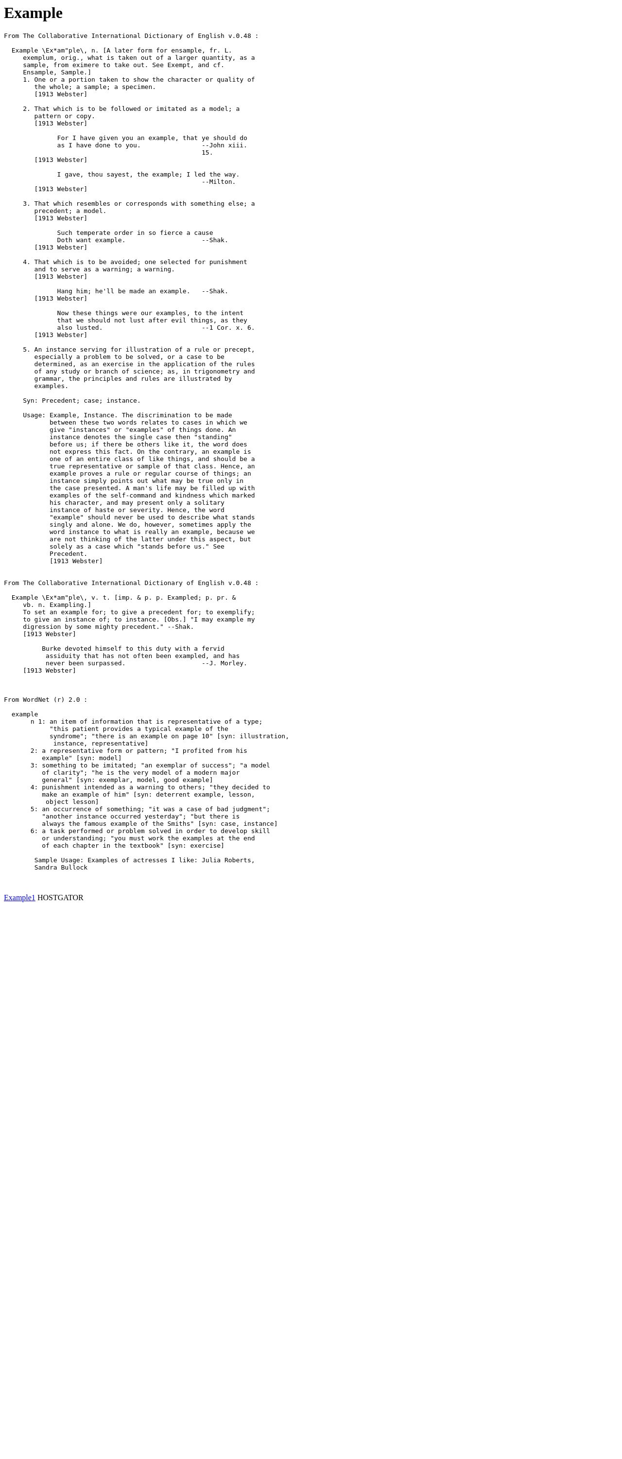
The visual design of the website is quite dense, with a lot of text and no real images or graphics. The font is small and difficult to read, especially on a desktop screen. The only visual element that stands out is the large block of text at the top, which is in a different font and color. The background of the website is a plain white, which doesn't add any visual interest. Overall, the website has a very text-heavy and plain design that could benefit from some visual elements to break up the text and make it more engaging. Additionally, the use of a serif font, such as the one used in the provided text, can be challenging to read, especially for those with vision impairments. It's recommended to consider using a sans-serif font, such as Arial or Helvetica, which are more legible and easier to read.
Recommendation:
Add some visual elements, such as images or graphics, to break up the text and make the website more engaging.
Layout and Clarity
The layout of the website is very cluttered, with a lot of text and no clear hierarchy or organization. The different sections of the text are not clearly defined, and it's difficult to distinguish between the different types of text. The use of multiple fonts and font sizes also adds to the clutter. The website could benefit from a more organized and structured layout, with clear headings and subheadings to help guide the user through the content. Additionally, the website could benefit from a more consistent use of white space, or negative space, to make the text more readable and the website more visually appealing. This would help to create a more balanced and harmonious design.
Recommendation:
Organize the layout of the website to create a clear hierarchy and structure.
Content
The content of the website is very dense and difficult to read, with long paragraphs of text that are not broken up by headings or subheadings. The text is also not well-formatted, with no clear use of bullet points or numbered lists. The website could benefit from a more concise and organized content strategy, with shorter paragraphs and clear headings to help guide the user through the content. Additionally, the website could benefit from a more consistent use of headings and subheadings, to create a clear hierarchy and structure for the content. This would help to make the website more readable and easier to navigate.
Recommendation:
Create a more concise and organized content strategy, with shorter paragraphs and clear headings.
This website was last rated on Oct. 23, 2024, 11:50 p.m.
Disclaimer: ratemysite.app is not affiliated with the website you are viewing, and does not endorse it in any way.
Ratings are subjective and based on AI's analysis. We filter out explicit or dangerous content, but cannot guarantee that all sites are safe.
All rights reserved. © ratemysite.app 2024. Contact: hello @ domain.
