Rate your website in seconds – get instant feedback.
I will rate your website's design and give recommendations to enhance its visual appeal and user experience. See how your site ranks on the leaderboard!

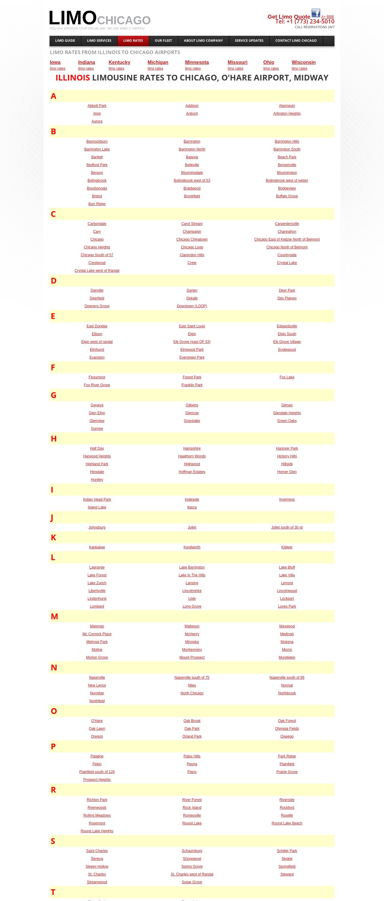
Chicago, car service prices to Chicago airport O'Hare, Midway
Analyzed by AI for fun and insights - not to be taken too seriously!
Visual Design
Hello there, website owner! Let's take a closer look at your website's visual design. The first thing that caught my attention is the color scheme. It's a bold and vibrant palette, but it might be a bit overwhelming for some users. The dominant red and black colors are eye-catching, but they might not be the most soothing combination for a website that's supposed to provide a sense of luxury and comfort, which is what a limousine service is all about. The font choices are also quite bold, which can be a bit jarring. The use of all capital letters in some sections can come across as shouting, rather than conveying a sense of elegance. However, I do appreciate the use of a clear and easy-to-read font for the main content. The images on the website are quite nice, showcasing the luxurious vehicles and happy customers. However, they could be more prominent and strategically placed to break up the text and create a more visually appealing experience. Overall, the visual design has some nice elements, but it could benefit from a bit more refinement to create a more cohesive and sophisticated look.
Recommendation:
Simplify color scheme, use more elegant fonts, and make images more prominent.
Layout and Clarity
Now, let's talk about the layout and clarity of your website. The first thing I noticed is that the website is quite long and dense, with a lot of text and links packed into a small space. This can make it difficult for users to quickly find what they're looking for. The navigation menu is quite extensive, but it's not immediately clear what each section contains. Some of the links have quite long names, which can make them hard to read and understand. The use of tables to display the limousine rates is a good idea, but it's not the most visually appealing way to present the information. The tables are quite wide, which can make them difficult to read on smaller screens. However, I do appreciate the fact that the website is quite comprehensive, with a lot of useful information about the limousine service and its rates. It's just a matter of presenting it in a more user-friendly way.
Recommendation:
Simplify navigation, break up dense text, and use more visual elements.
Content
Now, let's talk about the content of your website. The first thing I noticed is that there's a lot of repetition in the text. Many of the sections contain similar information, which can make the website feel a bit redundant. The language used is quite formal, which is appropriate for a professional limousine service. However, some of the sentences are quite long and convoluted, which can make them difficult to understand. I do appreciate the fact that the website provides a lot of useful information about the limousine service and its rates. The rates table is particularly useful, as it allows users to quickly compare prices and services. However, I think the website could benefit from a bit more personality and flair. A limousine service is supposed to be a luxurious and memorable experience, but the website doesn't quite convey that sense of excitement and sophistication.
Recommendation:
Make content more concise, use more engaging language, and add more personality.
This website was last rated on Nov. 25, 2024, 8:18 p.m.
Disclaimer: ratemysite.app is not affiliated with the website you are viewing, and does not endorse it in any way.
Ratings are subjective and based on AI's analysis. We filter out explicit or dangerous content, but cannot guarantee that all sites are safe.

All rights reserved. © ratemysite.app 2024. Contact: hello @ domain.