Rate your website in seconds – get instant feedback.
I will rate your website's design and give recommendations to enhance its visual appeal and user experience. See how your site ranks on the leaderboard!

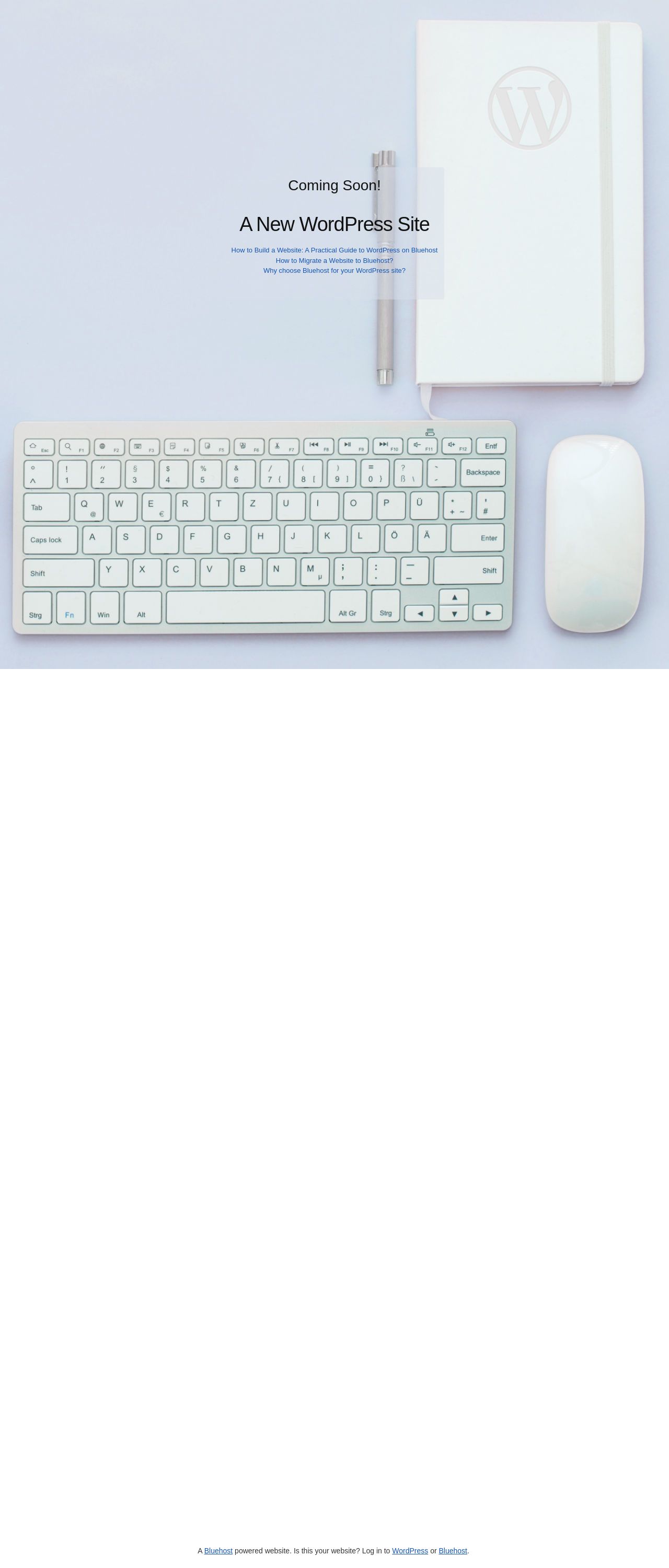
Welcome — Coming Soon
Analyzed by AI for fun and insights - not to be taken too seriously!
Visual Design
The website's visual design is clean and minimalistic, with a predominantly white background. The use of a simple, sans-serif font adds to the overall sense of simplicity and ease of use. However, the lack of color and imagery makes the site feel a bit dull and unengaging. The Bluehost logo is prominently displayed, which may be beneficial for branding purposes, but it also takes up a significant amount of space on the page. Overall, the visual design is straightforward and easy to navigate, but it could benefit from some additional visual elements to make it more engaging.
Recommendation:
Add more color and imagery to make the site more visually appealing.
Layout and Clarity
The layout of the website is clear and easy to follow, with a simple and intuitive navigation menu. The use of headings and subheadings helps to break up the content and make it easier to scan. However, the amount of whitespace on the page could be reduced to make the content feel more concise and focused. Additionally, the call-to-action buttons could be more prominent and attention-grabbing. Overall, the layout is well-organized and easy to navigate, but could benefit from some tweaks to make it more engaging.
Recommendation:
Reduce whitespace and make call-to-action buttons more prominent.
Content
The content on the website is clear and concise, but it could benefit from more detail and specificity. The headings and subheadings are helpful in breaking up the content and making it easier to scan, but the paragraphs could be shorter and more focused. Additionally, the use of bullet points or numbered lists could help to make the content feel more organized and easy to read. Overall, the content is well-written and easy to understand, but could benefit from some tweaks to make it more engaging and effective.
Recommendation:
Add more detail and specificity to the content, and use bullet points or numbered lists to make it more organized and easy to read.
This website was last rated on Jan. 2, 2025, 12:12 a.m.
Disclaimer: ratemysite.app is not affiliated with the website you are viewing, and does not endorse it in any way.
Ratings are subjective and based on AI's analysis. We filter out explicit or dangerous content, but cannot guarantee that all sites are safe.

All rights reserved. © ratemysite.app 2024. Contact: hello @ domain.