Rate your website in seconds – get instant feedback.
I will rate your website's design and give recommendations to enhance its visual appeal and user experience. See how your site ranks on the leaderboard!
1zubi

Analyzed by AI for fun and insights - not to be taken too seriously!
Visual Design
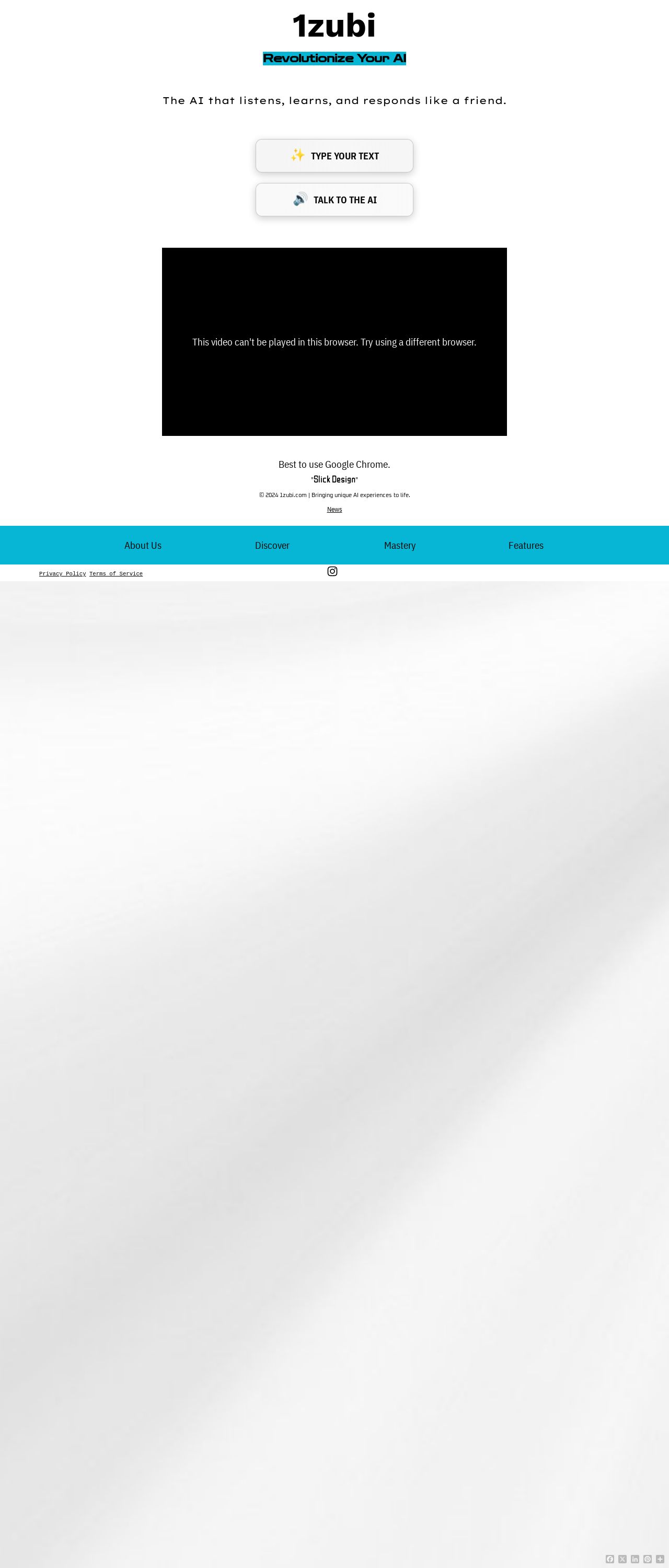
Wow, the visual design of 1zubi is truly eye-catching and modern. The first thing that stands out is the use of a calming and sophisticated color scheme, featuring a soothing light blue and warm gray. The subtle gradient effects on the buttons and navigation bars add a touch of depth and dimension, giving the site a premium feel. The font choices are also spot on, with a clean and clear sans-serif font used for the main content, and a bold and playful font used for headings and titles. The overall design is sleek, modern, and highly engaging, making it a pleasure to explore. The use of the water wave button with interactive effects is also a nice touch, adding a bit of whimsy and fun to the design. Overall, the visual design of 1zubi is top-notch, and it's clear that a lot of thought and care has gone into creating a cohesive and engaging visual identity.
Recommendation:
Consider adding more visual hierarchy to the design to guide the user's attention.
Layout and Clarity
The layout of 1zubi is clean and easy to navigate, with a clear and logical structure that makes it simple for users to find what they're looking for. The use of whitespace is effective, creating a sense of breathability and making it easy to focus on the content. The navigation menu is also well-designed, with clear and concise labels that make it easy to find what you're looking for. The layout is also highly responsive, adapting seamlessly to different screen sizes and devices. However, there are a few areas where the layout could be improved. For example, the video player is a bit small, and the text overlay can be a bit hard to read. Additionally, the social media links at the bottom of the page could be larger and more prominent. Overall, the layout of 1zubi is strong, but there are a few areas where it could be improved.
Recommendation:
Consider increasing the size of the video player and making the text overlay more readable.
Content
The content of 1zubi is engaging and informative, with a clear and concise writing style that makes it easy to follow along. The language is also highly accessible, with no overly technical jargon or complex concepts that might confuse users. The content is also highly relevant to the target audience, with a clear focus on AI and machine learning that will resonate with users who are interested in these topics. The use of interactive features, such as the chatbot and video player, also adds a lot of value to the content, making it more engaging and immersive. However, there are a few areas where the content could be improved. For example, some of the paragraphs are a bit long and could be broken up for easier reading. Additionally, the content could benefit from more visual elements, such as images and infographics, to break up the text and make it more scannable. Overall, the content of 1zubi is strong, but there are a few areas where it could be improved.
Recommendation:
Consider adding more visual elements to break up the text and make it more scannable.
This website was last rated on Dec. 8, 2024, 11:44 a.m.
Disclaimer: ratemysite.app is not affiliated with the website you are viewing, and does not endorse it in any way.
Ratings are subjective and based on AI's analysis. We filter out explicit or dangerous content, but cannot guarantee that all sites are safe.
All rights reserved. © ratemysite.app 2024. Contact: hello @ domain.
