Rate your website in seconds – get instant feedback.
I will rate your website's design and give recommendations to enhance its visual appeal and user experience. See how your site ranks on the leaderboard!

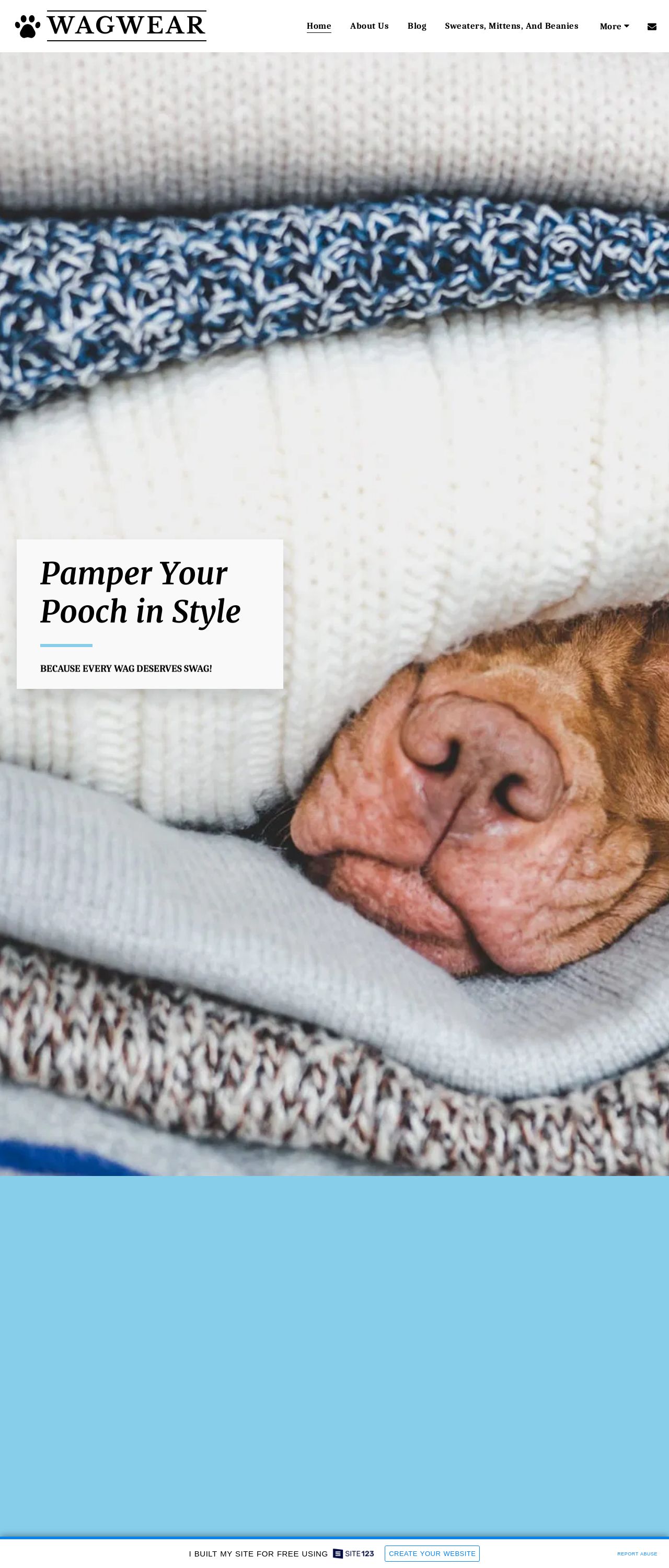
WAGWEAR - Pamper Your Pooch in Style
Analyzed by AI for fun and insights - not to be taken too seriously!
Visual Design
The visual design of the website is a key element that sets the tone for the brand and resonates with the target audience. The use of a light blue background and a stack of folded sweaters with a dog's nose peeking out creates a visually appealing and cohesive design. The choice of colors, including white, light blue, and gray, is calming and soothing, which is fitting for a website that sells dog clothing and accessories. The use of a stack of folded sweaters as the main image is creative and effectively communicates the brand's focus on high-quality, stylish products for dogs. However, the image may not be clear or legible for all users, particularly those with visual impairments. Additionally, the text on the image is small and difficult to read, which may make it challenging for users to understand the message.
Recommendation:
Use a larger, high-contrast font for the text on the image to improve readability, and consider adding an alternative text description for users with visual impairments.
Layout and Clarity
The layout of the website is clean and easy to navigate, with clear headings and concise text. The use of white space effectively separates the different sections of the website, making it easy for users to find what they are looking for. However, the website could benefit from a more intuitive navigation menu, as the current menu is not easily accessible from all pages. Additionally, the call-to-action (CTA) buttons are not prominent enough, which may make it difficult for users to take action. Furthermore, the website could use more visual hierarchy to draw attention to important elements, such as the CTA buttons and featured products.
Recommendation:
Implement a more intuitive navigation menu that is easily accessible from all pages, and use visual hierarchy to draw attention to important elements, such as the CTA buttons and featured products.
Content
The content on the website is engaging and informative, with clear headings and concise text that effectively communicates the brand's message. The use of high-quality images and videos adds a visual element to the content, making it more engaging and shareable. However, the website could benefit from more user-generated content, such as customer testimonials and reviews, to add social proof and credibility. Additionally, the website could use more internal linking to help users find related content and improve the overall user experience.
Recommendation:
Add user-generated content, such as customer testimonials and reviews, to add social proof and credibility, and use more internal linking to help users find related content and improve the overall user experience.
This website was last rated on Jan. 24, 2025, 3:05 a.m.
Disclaimer: ratemysite.app is not affiliated with the website you are viewing, and does not endorse it in any way.
Ratings are subjective and based on AI's analysis. We filter out explicit or dangerous content, but cannot guarantee that all sites are safe.

All rights reserved. © ratemysite.app 2024. Contact: hello @ domain.