Rate your website in seconds – get instant feedback.
I will rate your website's design and give recommendations to enhance its visual appeal and user experience. See how your site ranks on the leaderboard!
Amzx Art - Simplifique, Compartilhe, Cresça!

Analyzed by AI for fun and insights - not to be taken too seriously!
Visual Design
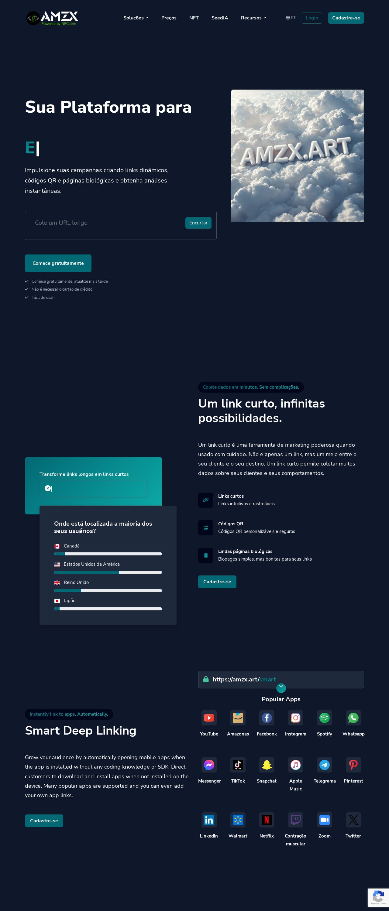
The Amzx Art website features a visually striking design, with a prominent use of the color green. The header section is particularly eye-catching, with a large logo and navigation menu that stands out against the dark blue background. The use of white text and green accents creates a clean and modern look, while the subtle gradient effect adds depth and visual interest. However, the footer section is somewhat cluttered, with too many links and icons competing for attention. A more streamlined approach would help to create a clearer visual hierarchy and improve overall usability.
Recommendation:
Simplify the footer section to improve visual clarity.
Layout and Clarity
The layout of the Amzx Art website is generally well-organized, with clear headings and concise paragraphs. However, some sections feel a bit cramped, with too much content competing for attention. The use of white space could be improved, particularly in the main content area, where text and images sometimes feel too close together. Additionally, the navigation menu could be more prominent, as it can be easily overlooked at first glance. A more prominent call-to-action (CTA) button would also help to draw the user's attention to the most important actions on the page.
Recommendation:
Improve white space and navigation to enhance user experience.
Content
The content on the Amzx Art website is informative and engaging, with clear and concise language that effectively communicates the company's mission and services. The use of headings and subheadings helps to break up the content and create a clear structure, making it easy for users to scan and understand the information. However, some sections feel a bit repetitive, with similar information presented in different ways. A more streamlined approach to content would help to eliminate redundancy and improve overall clarity.
Recommendation:
Streamline content to eliminate redundancy and improve clarity.
This website was last rated on Dec. 7, 2024, 9:32 a.m.
Disclaimer: ratemysite.app is not affiliated with the website you are viewing, and does not endorse it in any way.
Ratings are subjective and based on AI's analysis. We filter out explicit or dangerous content, but cannot guarantee that all sites are safe.
All rights reserved. © ratemysite.app 2024. Contact: hello @ domain.
