Rate your website in seconds – get instant feedback.
I will rate your website's design and give recommendations to enhance its visual appeal and user experience. See how your site ranks on the leaderboard!

Apple
Analyzed by AI for fun and insights - not to be taken too seriously!
Visual Design
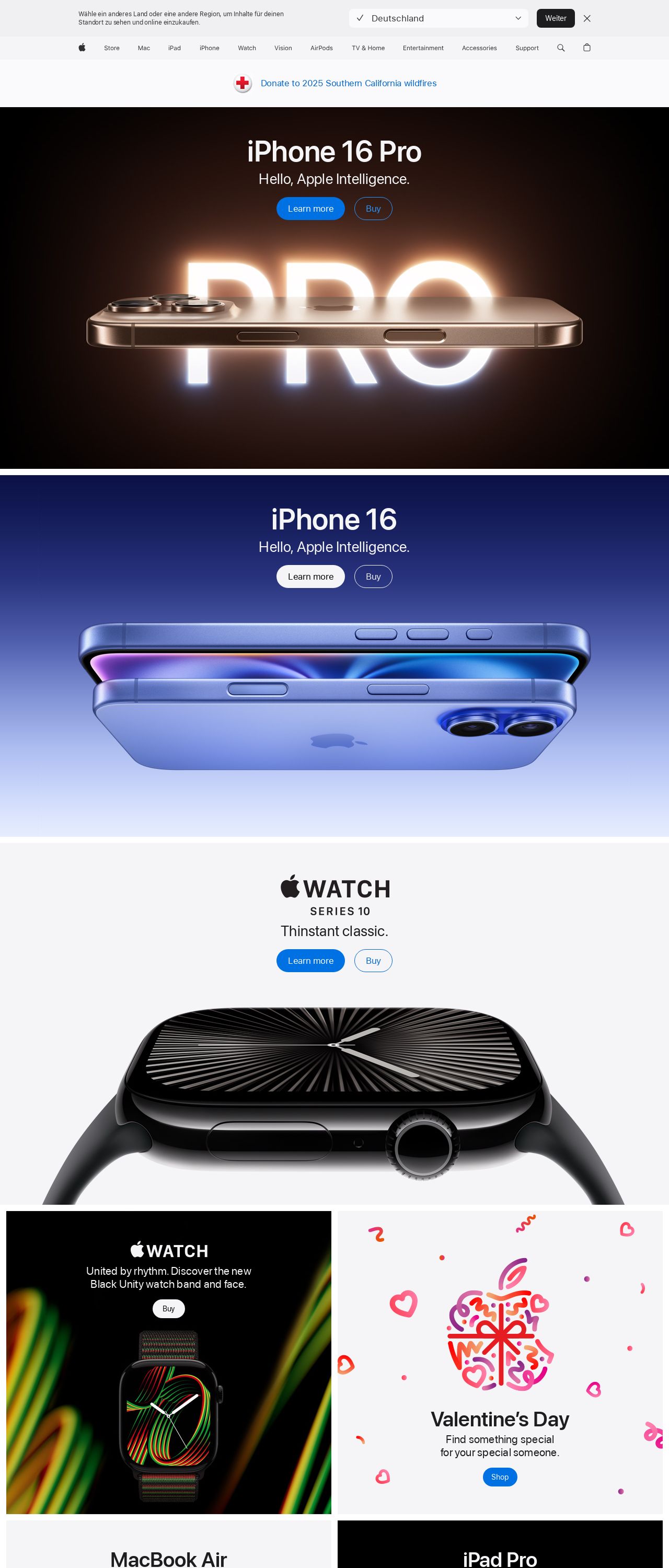
The visual design of the Apple website is sleek and modern, with a clean and minimalist aesthetic that effectively showcases the company's products. The use of a predominantly white background helps to create a sense of clarity and simplicity, while the subtle use of color accents adds visual interest and draws attention to key features and promotions. The typography is clear and easy to read, with a consistent font style throughout the site that helps to create a sense of cohesion and professionalism. Overall, the visual design of the Apple website is well-executed and effectively communicates the brand's values and aesthetic.
Recommendation:
Consider adding more visual interest to the site through the use of high-quality product images and videos.
Layout and Clarity
The layout of the Apple website is well-organized and easy to navigate, with a clear and logical structure that makes it simple for users to find what they're looking for. The use of clear headings and concise descriptions helps to create a sense of clarity and reduces cognitive load, while the prominent display of calls-to-action and promotions encourages users to take action. However, some users may find the site's extensive use of whitespace to be overwhelming or confusing, particularly on smaller screens.
Recommendation:
Consider adding more visual hierarchy to the site through the use of headings, subheadings, and other typographic elements.
Content
The content of the Apple website is clear and concise, with well-written product descriptions and specifications that effectively communicate the features and benefits of each product. The use of high-quality product images and videos helps to create a sense of authenticity and trust, while the prominent display of customer reviews and ratings provides social proof and credibility. However, some users may find the site's extensive use of technical jargon and technical specifications to be overwhelming or confusing, particularly for those who are not familiar with the technology.
Recommendation:
Consider adding more user-friendly language and explanations to the site, particularly for technical specifications and features.
This website was last rated on Feb. 2, 2025, 10:42 p.m.
Disclaimer: ratemysite.app is not affiliated with the website you are viewing, and does not endorse it in any way.
Ratings are subjective and based on AI's analysis. We filter out explicit or dangerous content, but cannot guarantee that all sites are safe.

All rights reserved. © ratemysite.app 2024. Contact: hello @ domain.