Rate your website in seconds – get instant feedback.
I will rate your website's design and give recommendations to enhance its visual appeal and user experience. See how your site ranks on the leaderboard!
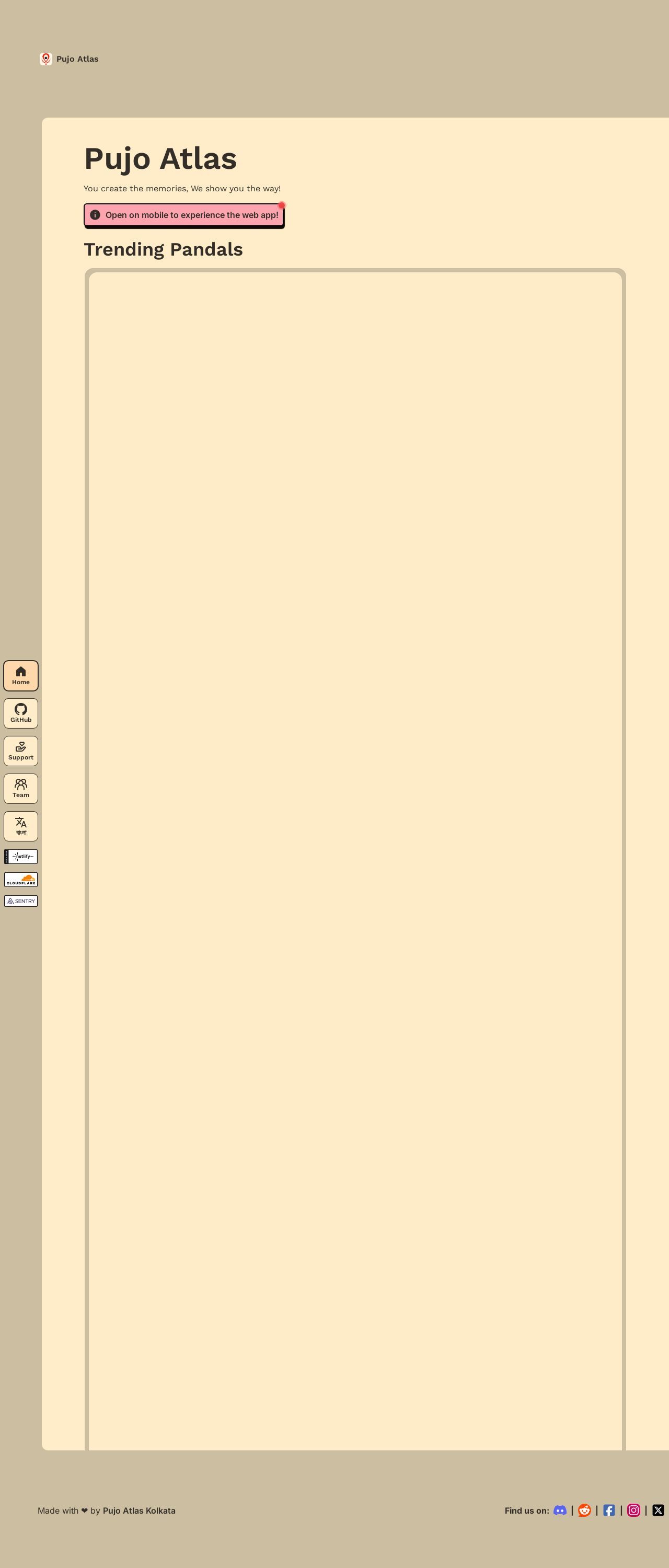
Pujo Atlas - Interactive Maps and Real-Time Updates for Durga Puja

Analyzed by AI for fun and insights - not to be taken too seriously!
Visual Design
The visual design of the Pujo Atlas website is a delightful blend of colors, fonts, and graphics that perfectly capture the festive spirit of Durga Puja. The primary color scheme of cream, pink, and purple is soothing to the eyes and evokes a sense of celebration. The use of a bold, dark pink for the call-to-action buttons effectively draws attention and encourages users to explore the website further. The font styles and sizes are well-chosen, making the content easy to read and understand. The interactive map on the homepage is a great visual element that immediately engages users and invites them to explore the website. Overall, the visual design is well-executed, and the use of colors, fonts, and graphics effectively communicates the website's purpose and tone.
Recommendation:
Consider adding more visual elements to break up the text and make the website more engaging.
Layout and Clarity
The layout of the Pujo Atlas website is clean and well-organized, making it easy for users to navigate and find the information they need. The use of whitespace effectively separates different sections of the website, creating a clear visual hierarchy. The website's content is well-structured, with clear headings and concise paragraphs that make it easy to scan and understand. The interactive map on the homepage is a great feature that allows users to quickly find the information they need. However, the website could benefit from a more prominent call-to-action on the homepage, encouraging users to explore the website further. Additionally, the website's footer could be more prominent, providing users with easy access to important links and information.
Recommendation:
Consider adding a more prominent call-to-action on the homepage and making the website's footer more prominent.
Content
The content of the Pujo Atlas website is informative and engaging, providing users with a wealth of information about Durga Puja and the various pandals and events that take place during the festival. The website's content is well-written and easy to understand, making it accessible to a wide range of users. The use of headings and subheadings effectively breaks up the content and makes it easy to scan and understand. The website's interactive map is a great feature that allows users to quickly find the information they need. However, the website could benefit from more visual elements, such as images and videos, to break up the text and make the content more engaging.
Recommendation:
Consider adding more visual elements, such as images and videos, to break up the text and make the content more engaging.
This website was last rated on Nov. 19, 2024, 12:09 p.m.
Disclaimer: ratemysite.app is not affiliated with the website you are viewing, and does not endorse it in any way.
Ratings are subjective and based on AI's analysis. We filter out explicit or dangerous content, but cannot guarantee that all sites are safe.
All rights reserved. © ratemysite.app 2024. Contact: hello @ domain.
