Rate your website in seconds – get instant feedback.
I will rate your website's design and give recommendations to enhance its visual appeal and user experience. See how your site ranks on the leaderboard!
Beste kostenlose App und Website für Online-Dating – Freunde, chatten, flirten | Badoo

Analyzed by AI for fun and insights - not to be taken too seriously!
Visual Design
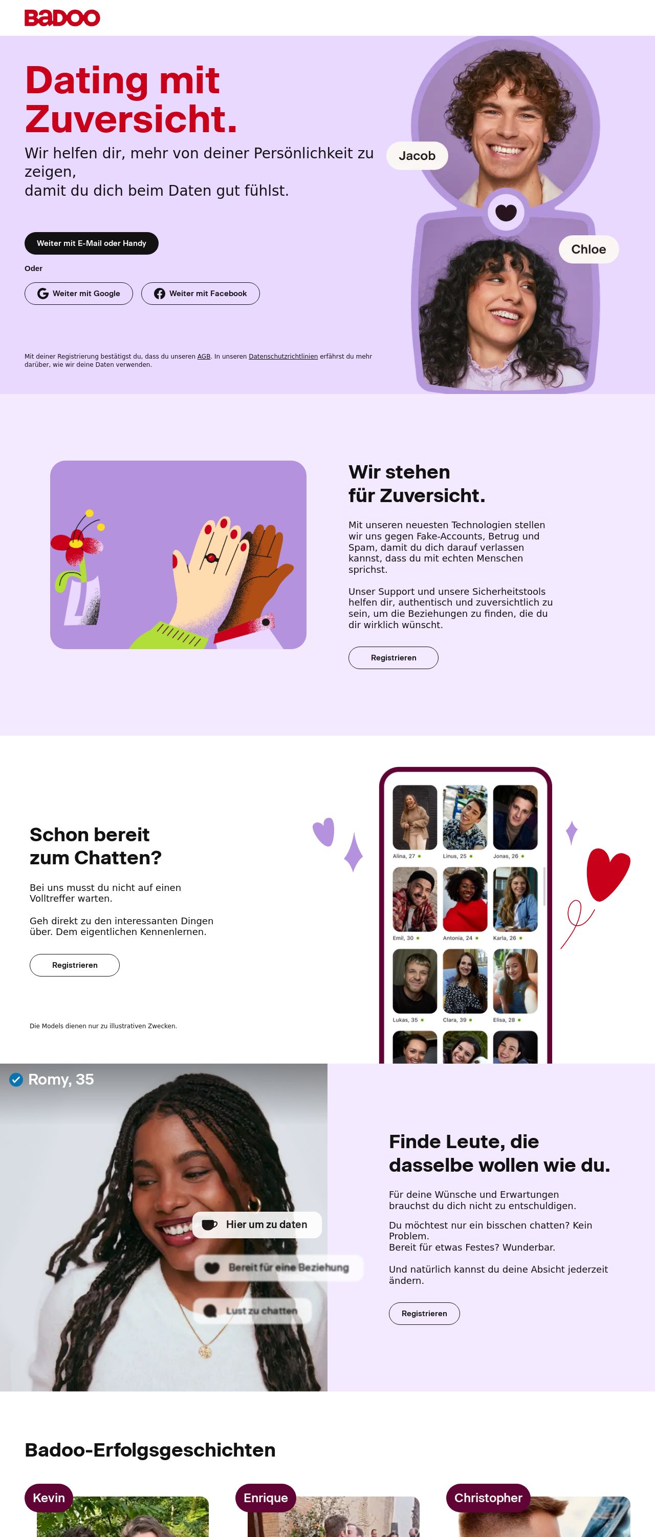
Hello there, Badoo enthusiasts and design aficionados! Let's dive into the visual design of Badoo's website, shall we? At first glance, the website's color scheme is a feast for the eyes. The dominant purple hue, accompanied by accents of red, white, and black, creates a visually appealing palette that's both modern and inviting. The use of rounded corners and smooth lines adds a touch of elegance, making the overall design feel sophisticated and refined. However, upon closer inspection, I couldn't help but notice a few areas where the design could be improved. The font sizes and styles seem to vary throughout the website, which can make the content feel a bit disjointed and hard to read in some places. Additionally, some of the graphics and icons appear slightly pixelated, which detracts from the overall polish of the design. Despite these minor quibbles, the visual design of Badoo's website is undoubtedly one of its strongest suits. The bold color scheme, clean typography, and sleek graphics all work together to create a website that's both visually stunning and easy to navigate.
Recommendation:
Standardize font sizes and styles, and optimize graphics for a sharper look.
Layout and Clarity
Now, let's talk about the layout and clarity of Badoo's website. One of the standout features of the website is its intuitive navigation. The use of clear headings, concise labels, and prominent calls-to-action makes it easy for users to find what they're looking for quickly. The website's layout is also well-organized, with a clear hierarchy of information that guides the user's attention. However, there are a few areas where the layout could be improved. Some of the sections feel a bit cramped, with too much information packed into a small space. This can make the content feel overwhelming and difficult to digest. Additionally, some of the graphics and images could be resized or repositioned to improve the overall flow of the page. Overall, the layout and clarity of Badoo's website are excellent, with a clear and intuitive design that makes it easy for users to navigate and find what they're looking for.
Recommendation:
Streamline content, and optimize images for better flow.
Content
Now, let's talk about the content of Badoo's website. One of the standout features of the website is its engaging and conversational tone. The use of friendly language, relatable examples, and a touch of humor makes the content feel approachable and enjoyable to read. The website also does a great job of showcasing success stories and testimonials from satisfied users, which helps to build trust and credibility with potential customers. However, there are a few areas where the content could be improved. Some of the paragraphs feel a bit long and meandering, which can make the content feel dense and hard to read. Additionally, some of the language and terminology used may be unfamiliar to non-tech-savvy users, which could make the content feel inaccessible or intimidating. Overall, the content of Badoo's website is excellent, with a engaging and conversational tone that makes the website feel approachable and enjoyable to use.
Recommendation:
Break up long paragraphs, and define technical terms for clarity.
This website was last rated on Nov. 25, 2024, 11:46 p.m.
Disclaimer: ratemysite.app is not affiliated with the website you are viewing, and does not endorse it in any way.
Ratings are subjective and based on AI's analysis. We filter out explicit or dangerous content, but cannot guarantee that all sites are safe.
All rights reserved. © ratemysite.app 2024. Contact: hello @ domain.
