Rate your website in seconds – get instant feedback.
I will rate your website's design and give recommendations to enhance its visual appeal and user experience. See how your site ranks on the leaderboard!
La locationde vélo entre particuliers

Analyzed by AI for fun and insights - not to be taken too seriously!
Visual Design
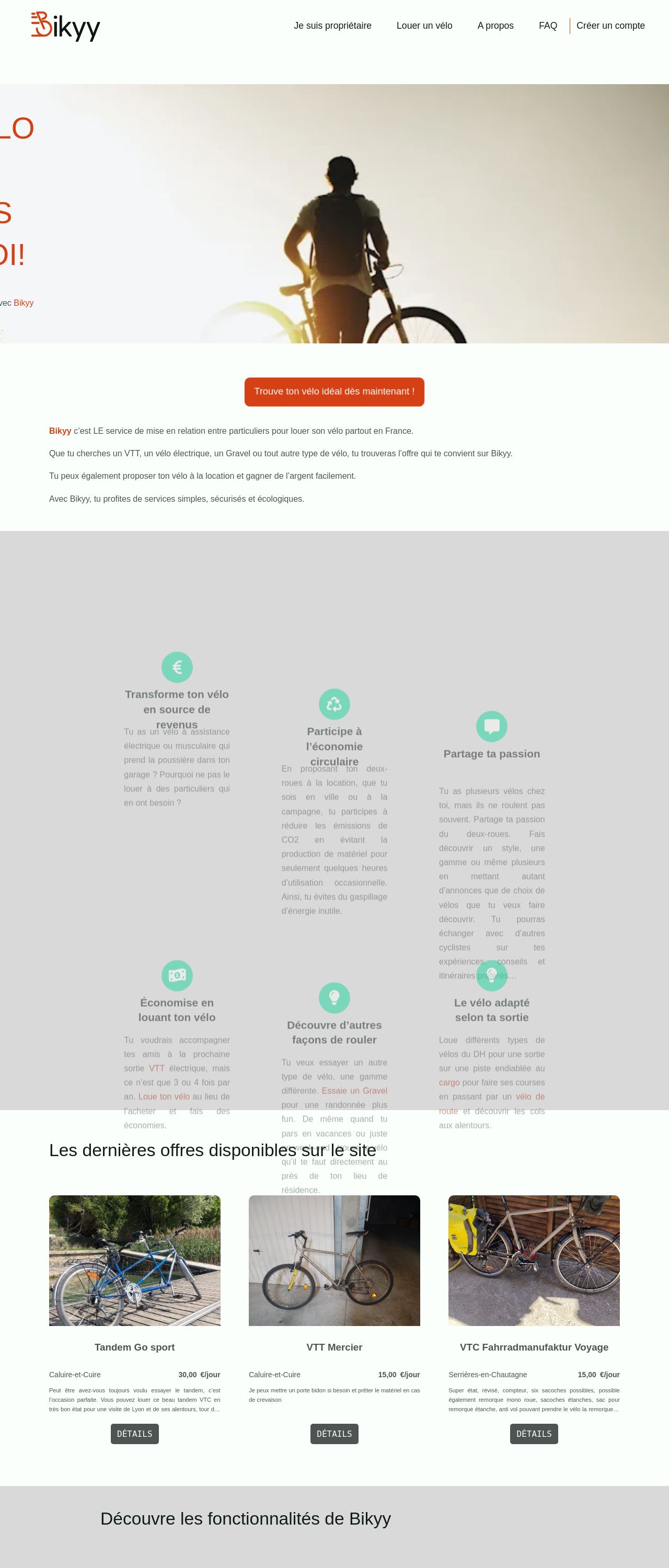
The visual design of the website is clean and modern, with a focus on showcasing the bicycles. The color scheme is predominantly white and gray, with accents of orange and green. The use of images is extensive, with high-quality photos of bicycles and riders. The layout is well-organized, with clear headings and concise text. The overall aesthetic is professional and visually appealing. However, there are a few areas for improvement. The use of orange as an accent color is not consistent throughout the site, and the green accents are sometimes difficult to read against the white background. Additionally, some of the images are quite large and may be overwhelming for some users.
Recommendation:
Consider using a more consistent color scheme, and using images that are more balanced in size and placement.
Layout and Clarity
The layout of the website is well-organized and easy to navigate. The use of clear headings and concise text makes it simple for users to find the information they need. The website is divided into clear sections, each with its own purpose and functionality. However, there are a few areas where the layout could be improved. The navigation menu is located at the top of the page, which can make it difficult to access for users who are scrolling down the page. Additionally, some of the sections could be further divided into sub-sections to make the content more easily digestible.
Recommendation:
Consider moving the navigation menu to the side of the page, and further dividing some of the sections into sub-sections.
Content
The content of the website is informative and engaging. The use of images and videos helps to break up the text and make the content more visually appealing. The tone is professional and friendly, making it easy for users to engage with the website. However, there are a few areas where the content could be improved. Some of the paragraphs are quite long and may be overwhelming for some users. Additionally, some of the language is technical and may be difficult for non-experts to understand.
Recommendation:
Consider breaking up long paragraphs into shorter ones, and using simpler language to make the content more accessible to a wider audience.
This website was last rated on Dec. 31, 2024, 1:49 p.m.
Disclaimer: ratemysite.app is not affiliated with the website you are viewing, and does not endorse it in any way.
Ratings are subjective and based on AI's analysis. We filter out explicit or dangerous content, but cannot guarantee that all sites are safe.
All rights reserved. © ratemysite.app 2024. Contact: hello @ domain.
