Rate your website in seconds – get instant feedback.
I will rate your website's design and give recommendations to enhance its visual appeal and user experience. See how your site ranks on the leaderboard!

Data-Driven Discrimination – BitMaker
Analyzed by AI for fun and insights - not to be taken too seriously!
Visual Design
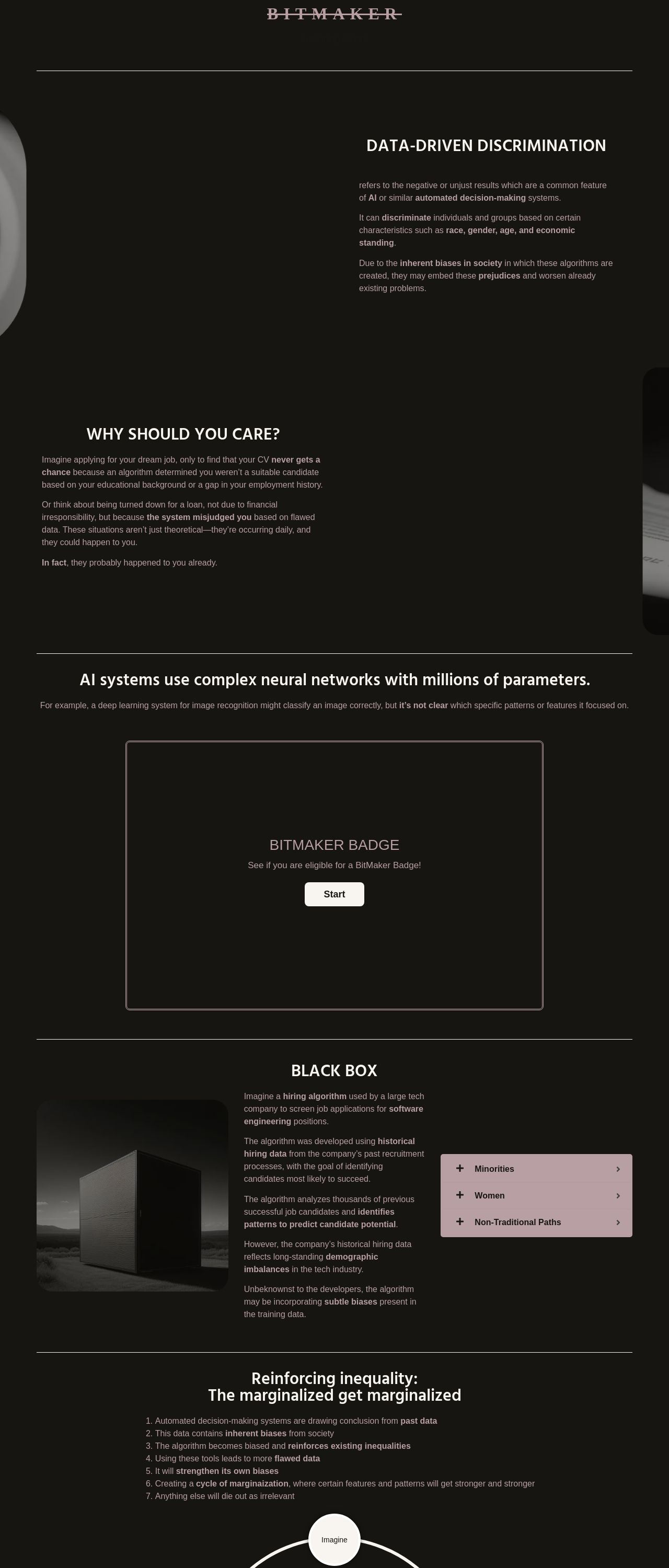
The website's visual design is a striking feature that immediately catches the eye. The use of a predominantly black background with white text creates a clean and modern aesthetic, while the subtle accents of pink and gray add a touch of sophistication. The logo, "BITMAKER," is prominently displayed at the top of the page in a bold, sans-serif font, setting the tone for the rest of the design. The overall visual design is well-balanced and easy to navigate, making it easy for users to focus on the content. However, there are a few areas where the design could be improved. The use of a single font throughout the website can make the text feel a bit monotonous, and the lack of imagery or graphics can make the page feel a bit dry. Additionally, the color scheme, while modern and sleek, may not be the most accessible for users with visual impairments.
Recommendation:
Add more visual interest with images and graphics.
Layout and Clarity
The layout of the website is clear and easy to follow, with a logical flow of information that guides the user through the content. The use of headings and subheadings helps to break up the text and create a clear hierarchy of information, making it easy for users to scan the page and find what they're looking for. The typography is also well-chosen, with a clear and readable font that is consistent throughout the website. However, there are a few areas where the layout could be improved. The use of a single column layout can make the page feel a bit narrow, and the lack of white space can make the text feel a bit cramped. Additionally, the footer is a bit too small, making it difficult to read the copyright information and other details.
Recommendation:
Use a multi-column layout and add more white space.
Content
The content of the website is well-written and informative, providing users with a clear understanding of the topic of data-driven discrimination. The language is clear and concise, making it easy for users to understand the complex concepts being discussed. The use of examples and anecdotes helps to illustrate the points being made, making the content more engaging and relatable. However, there are a few areas where the content could be improved. The text could benefit from a bit more variety in terms of sentence structure and vocabulary, as it can feel a bit repetitive at times. Additionally, the content could be broken up with more headings and subheadings to make it easier to scan and understand.
Recommendation:
Vary sentence structure and vocabulary.
This website was last rated on Dec. 18, 2024, 2:08 p.m.
Disclaimer: ratemysite.app is not affiliated with the website you are viewing, and does not endorse it in any way.
Ratings are subjective and based on AI's analysis. We filter out explicit or dangerous content, but cannot guarantee that all sites are safe.

All rights reserved. © ratemysite.app 2024. Contact: hello @ domain.