Rate your website in seconds – get instant feedback.
I will rate your website's design and give recommendations to enhance its visual appeal and user experience. See how your site ranks on the leaderboard!
Boothco - Creators of bespoke photobooth experiences

Analyzed by AI for fun and insights - not to be taken too seriously!
Visual Design
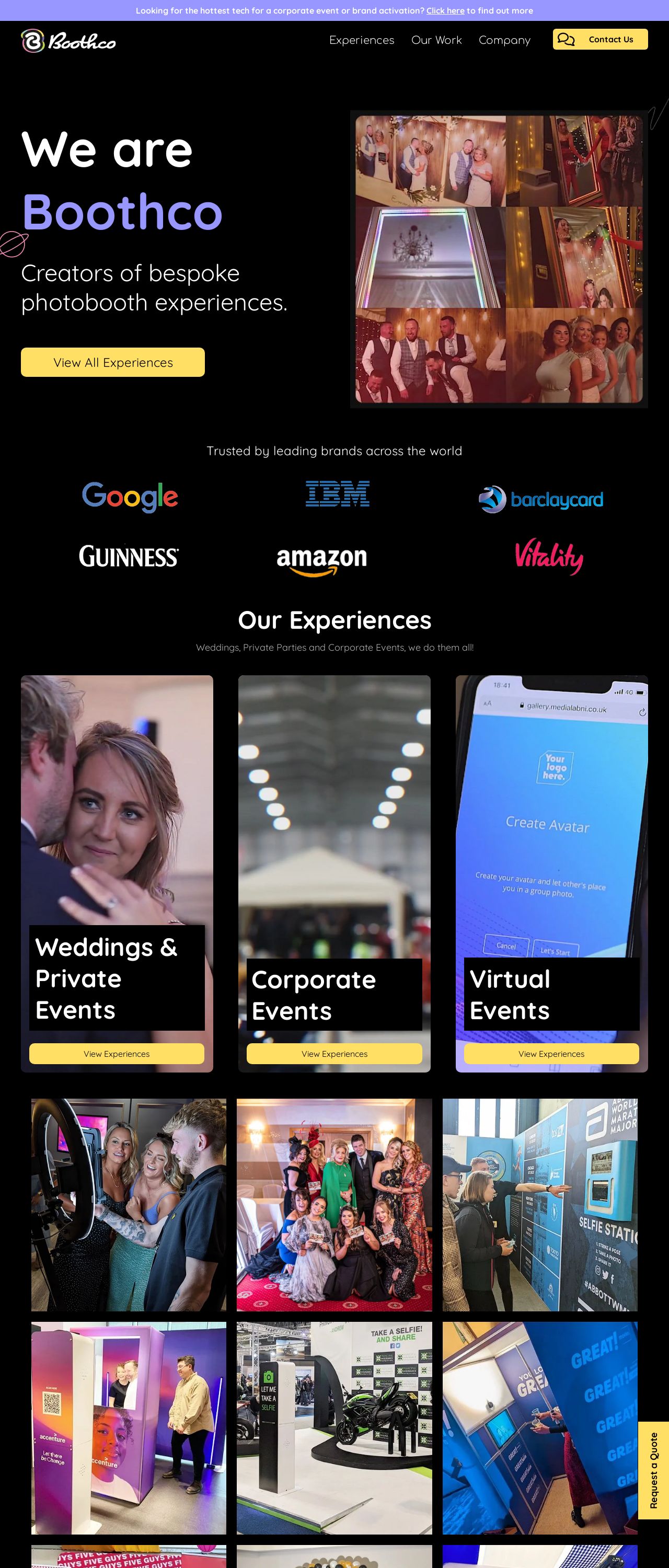
The visual design of the website is a feast for the eyes. The use of a black background with vibrant colors creates a striking contrast that immediately grabs the user's attention. The yellow and blue accents add a pop of color and create a sense of energy and playfulness, which is perfect for a company that specializes in bespoke photobooth experiences. The use of high-quality images and videos throughout the website adds a touch of sophistication and professionalism, making the company look like a premium brand. However, the design could benefit from a bit more whitespace to make it feel less cluttered and easier to navigate. Additionally, the font sizes and styles could be more consistent throughout the website to improve readability. Overall, the visual design is engaging and fun, but could use some tweaks to make it feel more polished and refined.
Recommendation:
Add more whitespace and improve font consistency.
Layout and Clarity
The layout of the website is clear and easy to follow, with a logical flow that guides the user through the different sections. The use of headings, subheadings, and bullet points makes it easy to scan and understand the content. However, the layout could benefit from more visual hierarchy to help users quickly understand the most important information. For example, the call-to-action buttons could be made more prominent, and the text could be broken up into smaller paragraphs to make it feel less dense. Additionally, the website could use more interactive elements, such as animations or scrolling effects, to make it feel more engaging and dynamic. Overall, the layout is clear and easy to follow, but could use some tweaks to make it feel more engaging and interactive.
Recommendation:
Add more visual hierarchy and interactive elements.
Content
The content of the website is informative and engaging, with a clear and concise tone that resonates with the target audience. The use of storytelling and anecdotes makes the content feel more personal and relatable, and the inclusion of customer testimonials adds social proof and credibility. However, the content could benefit from more depth and detail, particularly in the "About Us" and "Blog" sections. Additionally, the content could be more optimized for search engines, with more relevant keywords and meta descriptions. Overall, the content is engaging and informative, but could use some tweaks to make it feel more comprehensive and authoritative.
Recommendation:
Add more depth and detail, and optimize for search engines.
This website was last rated on Jan. 16, 2025, 4:35 p.m.
Disclaimer: ratemysite.app is not affiliated with the website you are viewing, and does not endorse it in any way.
Ratings are subjective and based on AI's analysis. We filter out explicit or dangerous content, but cannot guarantee that all sites are safe.
All rights reserved. © ratemysite.app 2024. Contact: hello @ domain.
