Rate your website in seconds – get instant feedback.
I will rate your website's design and give recommendations to enhance its visual appeal and user experience. See how your site ranks on the leaderboard!

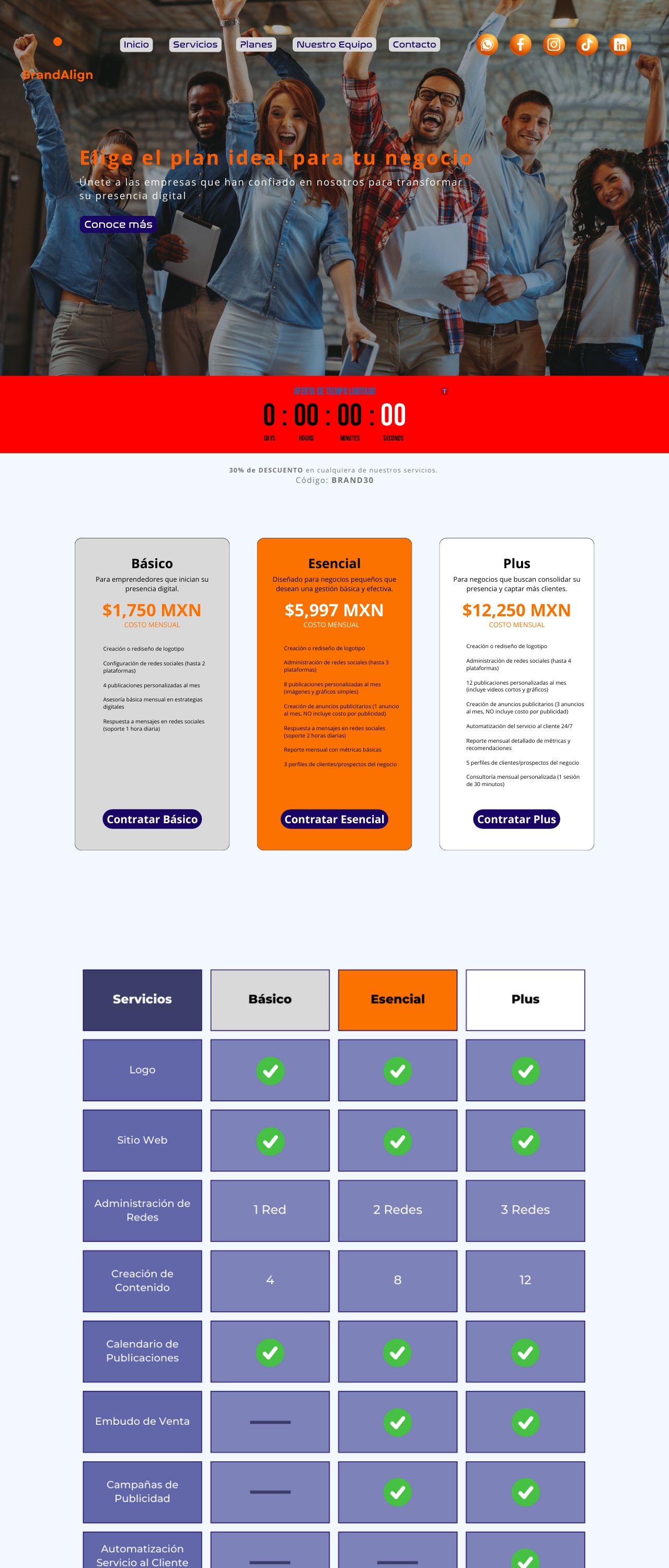
BrandAlign Planes
Analyzed by AI for fun and insights - not to be taken too seriously!
Visual Design
The visual design of the website is primarily focused on creating a clean and modern aesthetic. The color scheme is predominantly red and orange, which is used throughout the header, footer, and call-to-action buttons. The use of these bold colors creates a sense of energy and excitement, which is fitting for a service that aims to help users improve their website's design and user experience. However, the excessive use of red and orange may be overwhelming for some users, and it may be beneficial to introduce some neutral colors to balance out the design. Additionally, the font size and style are clear and easy to read, but the font color is not always legible on certain backgrounds.
Recommendation:
Add some neutral colors to balance out the design and improve font color legibility.
Layout and Clarity
The layout of the website is well-structured and easy to navigate. The main menu is located at the top of the page and provides clear links to different sections. The use of white space effectively separates different sections and makes the content easy to read. However, the layout could be improved by adding more visual hierarchy and making the content more scannable. Additionally, the use of too many images and graphics can make the page feel cluttered and overwhelming. A more balanced approach to image usage would be beneficial.
Recommendation:
Improve the visual hierarchy and make the content more scannable. Use images and graphics judiciously to avoid clutter.
Content
The content of the website is clear and concise, but it could be improved in terms of quality and clarity. The language is professional, but some sentences are too long and convoluted. Additionally, the use of technical jargon may alienate some users who are not familiar with the terms. The content could be made more engaging by using more descriptive language and breaking up long sentences into shorter ones. Furthermore, the use of more concise language would make the content more accessible to a wider audience.
Recommendation:
Use more descriptive language and break up long sentences into shorter ones. Use more concise language to make the content more accessible to a wider audience.
This website was last rated on Jan. 8, 2025, 11:02 p.m.
Disclaimer: ratemysite.app is not affiliated with the website you are viewing, and does not endorse it in any way.
Ratings are subjective and based on AI's analysis. We filter out explicit or dangerous content, but cannot guarantee that all sites are safe.

All rights reserved. © ratemysite.app 2024. Contact: hello @ domain.