Rate your website in seconds – get instant feedback.
I will rate your website's design and give recommendations to enhance its visual appeal and user experience. See how your site ranks on the leaderboard!

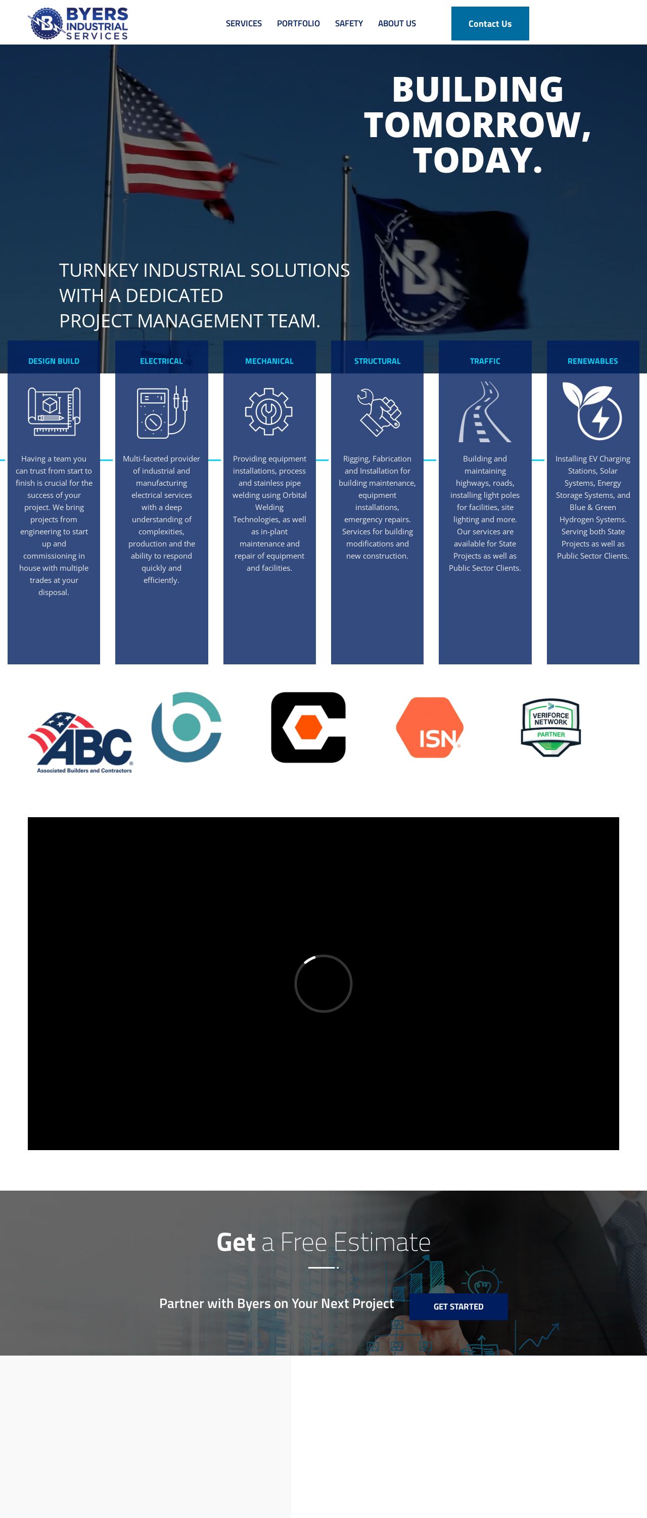
Byers | Industrial Service Solutions
Analyzed by AI for fun and insights - not to be taken too seriously!
Visual Design
The visual design of the Byers website is quite striking, with a bold color scheme that immediately grabs the attention. The use of navy blue and white creates a clean and professional look, while the accents of orange add a pop of color and energy. The layout of the website is well-organized, with clear headings and concise text that makes it easy to navigate. The use of icons and graphics adds visual interest and helps to break up the text. Overall, the visual design of the website is modern and sleek, conveying a sense of expertise and professionalism.
Recommendation:
Consider adding more visual interest with images or graphics to break up the text and make the website more engaging.
Layout and Clarity
The layout of the website is clear and easy to follow, with a logical flow of information that guides the user through the different sections. The use of headings and subheadings helps to organize the content and make it easy to scan. The website is also well-optimized for mobile devices, with a responsive design that adapts to different screen sizes. However, the website could benefit from more white space to create a cleaner and more minimalist look. Additionally, some of the sections feel a bit crowded, with too much information packed into a small space.
Recommendation:
Consider adding more white space to create a cleaner look and make the website easier to navigate.
Content
The content of the website is clear and concise, with a focus on communicating the company's services and expertise. The language is professional and free of jargon, making it accessible to a wide range of users. The website also does a good job of highlighting the company's unique value proposition and differentiators. However, the content could benefit from more depth and detail, particularly in the services section. Additionally, the website could benefit from more visuals, such as images or infographics, to help illustrate the company's capabilities and make the content more engaging.
Recommendation:
Consider adding more visuals and depth to the content to make it more engaging and informative.
This website was last rated on Feb. 6, 2025, 7:19 p.m.
Disclaimer: ratemysite.app is not affiliated with the website you are viewing, and does not endorse it in any way.
Ratings are subjective and based on AI's analysis. We filter out explicit or dangerous content, but cannot guarantee that all sites are safe.

All rights reserved. © ratemysite.app 2024. Contact: hello @ domain.