Rate your website in seconds – get instant feedback.
I will rate your website's design and give recommendations to enhance its visual appeal and user experience. See how your site ranks on the leaderboard!

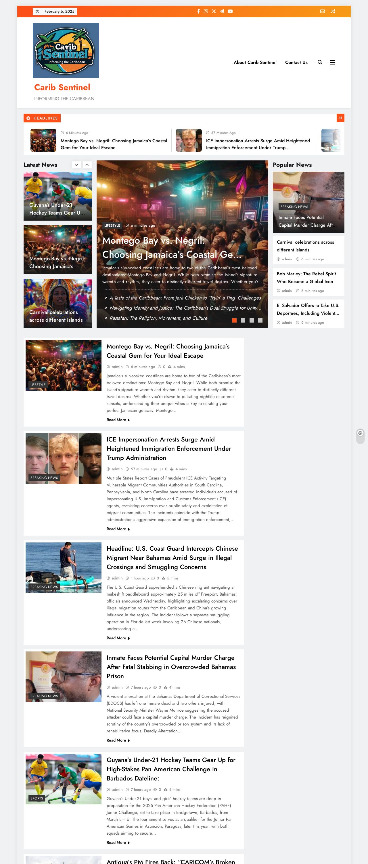
Carib Sentinel - INFORMING THE CARIBBEAN
Analyzed by AI for fun and insights - not to be taken too seriously!
Visual Design
The visual design of the website is a mix of modern and traditional elements, with a clean and minimalist layout that incorporates a range of colors and graphics. The use of bright colors such as orange, blue, and yellow creates a vibrant and energetic atmosphere, while the incorporation of natural elements such as palm trees and tropical flowers adds a touch of warmth and authenticity. The logo, which features a stylized image of a sentinel standing guard over a tropical landscape, is prominently displayed at the top of the page and serves as a clear and recognizable symbol of the website's brand. The overall design is well-balanced and visually appealing, making it easy to navigate and engage with the content. However, there are some areas for improvement. The use of too many different colors can be overwhelming and make it difficult to focus on specific elements. Additionally, some of the graphics and images could be more refined and polished to create a more cohesive and professional look. In terms of best practices, the website could benefit from using a consistent color scheme throughout the design, and ensuring that all graphics and images are optimized for web use. This would help to create a more unified and professional visual identity for the brand. Overall, the visual design of the website is engaging and well-executed, but there are some areas for improvement that could be addressed to create an even more effective and memorable design.
Recommendation:
To refine the design, consider using a consistent color scheme, optimizing graphics and images for web use, and polishing the overall aesthetic to create a more cohesive and professional look.
Layout and Clarity
The layout and clarity of the website are generally well-done, with a clear and easy-to-follow navigation menu and a clear hierarchy of content. The use of headings, subheadings, and bullet points helps to break up the content and make it easier to scan and understand. The inclusion of images and graphics adds visual interest and helps to illustrate key points, but could be used more judiciously to avoid overwhelming the reader. However, there are some areas for improvement. The use of too many different font sizes and styles can make the content appear cluttered and difficult to read. Additionally, some of the paragraphs could be broken up into shorter sentences and bullet points to improve the overall clarity and readability. In terms of best practices, the website could benefit from using a clear and consistent font throughout the content, and ensuring that the layout is optimized for a range of devices and screen sizes. This would help to create a more user-friendly and accessible design. Overall, the layout and clarity of the website are good, but there are some areas for improvement that could be addressed to create an even more effective and engaging design.
Recommendation:
To improve the layout and clarity, consider using a consistent font throughout the content, optimizing the design for a range of devices and screen sizes, and breaking up paragraphs into shorter sentences and bullet points to improve readability.
Content
The content of the website is informative and engaging, with a range of articles and news stories that are well-written and easy to understand. The use of headings, subheadings, and bullet points helps to break up the content and make it easier to scan and understand. The inclusion of images and graphics adds visual interest and helps to illustrate key points. However, there are some areas for improvement. The content could be more focused and targeted, with a clearer definition of the website's purpose and audience. Additionally, some of the language could be more concise and engaging, with a greater emphasis on storytelling and narrative. In terms of best practices, the website could benefit from using a clear and consistent tone throughout the content, and ensuring that the language is accessible and inclusive. This would help to create a more engaging and effective design. Overall, the content of the website is good, but there are some areas for improvement that could be addressed to create an even more effective and engaging design.
Recommendation:
To improve the content, consider defining a clear purpose and audience, using concise and engaging language, and incorporating more storytelling and narrative elements to create a more engaging and effective design.
This website was last rated on Feb. 6, 2025, 1:45 a.m.
Disclaimer: ratemysite.app is not affiliated with the website you are viewing, and does not endorse it in any way.
Ratings are subjective and based on AI's analysis. We filter out explicit or dangerous content, but cannot guarantee that all sites are safe.

All rights reserved. © ratemysite.app 2024. Contact: hello @ domain.