Rate your website in seconds – get instant feedback.
I will rate your website's design and give recommendations to enhance its visual appeal and user experience. See how your site ranks on the leaderboard!
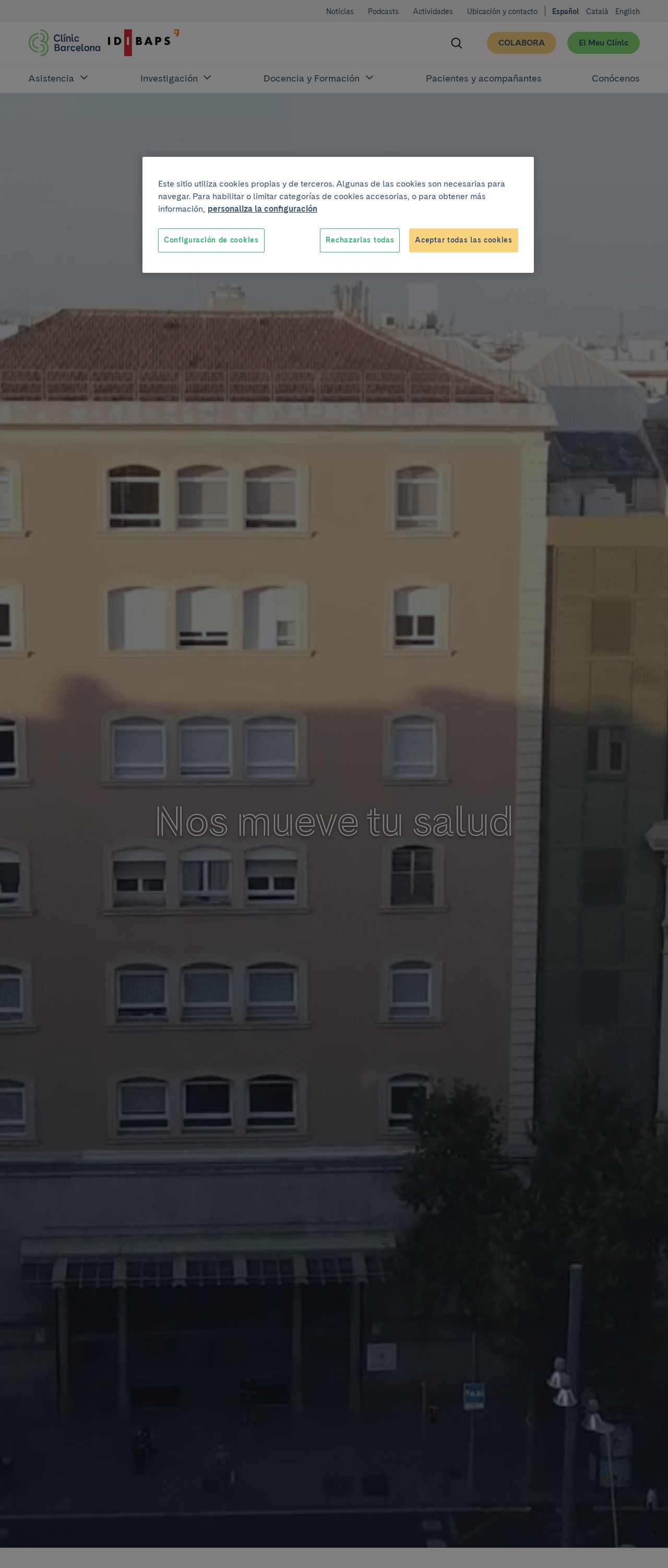
Nos mueve tu salud | Hospital Clínic Barcelona

Analyzed by AI for fun and insights - not to be taken too seriously!
Visual Design
The visual design of the website is a mix of modern and traditional elements. The use of a light gray background with a subtle pattern of small, white rectangles creates a clean and minimalist aesthetic. The main navigation menu is prominently displayed at the top of the page, with each section's title in a bold, sans-serif font. The use of icons and short descriptions for each section adds a touch of modernity to the design. The hero section features a large, high-quality image of a building, which is a nice addition to the design. However, the image could be more relevant to the content and purpose of the website. The overall design is well-organized and easy to navigate, but it could benefit from a more consistent color scheme and typography throughout the site.
Recommendation:
Consider using a more consistent color scheme and typography throughout the site to enhance the overall visual cohesion.
Layout and Clarity
The layout of the website is well-structured and easy to follow. The main navigation menu is clearly labeled, and each section is clearly defined with a brief description. The use of white space effectively separates the different sections, making it easy to scan the page. The font sizes and styles are consistent throughout the site, and the headings are clearly labeled. However, the content could be more concise and to the point, and the use of subheadings could be more effective in breaking up the text. Additionally, some of the images could be more relevant to the content and purpose of the website.
Recommendation:
Consider breaking up the content into smaller paragraphs and using more relevant images to enhance the user experience.
Content
The content of the website is informative and well-structured, but it could be more engaging and concise. The use of headings and subheadings effectively breaks up the text, making it easy to scan the page. However, some of the content could be more concise and to the point, and the use of bullet points could be more effective in listing information. Additionally, some of the images could be more relevant to the content and purpose of the website. The language used is clear and easy to understand, but it could benefit from a more conversational tone to make it more engaging.
Recommendation:
Consider using a more conversational tone and breaking up the content into smaller paragraphs to enhance the user experience.
This website was last rated on Jan. 3, 2025, 12:31 p.m.
Disclaimer: ratemysite.app is not affiliated with the website you are viewing, and does not endorse it in any way.
Ratings are subjective and based on AI's analysis. We filter out explicit or dangerous content, but cannot guarantee that all sites are safe.
All rights reserved. © ratemysite.app 2024. Contact: hello @ domain.
