Rate your website in seconds – get instant feedback.
I will rate your website's design and give recommendations to enhance its visual appeal and user experience. See how your site ranks on the leaderboard!
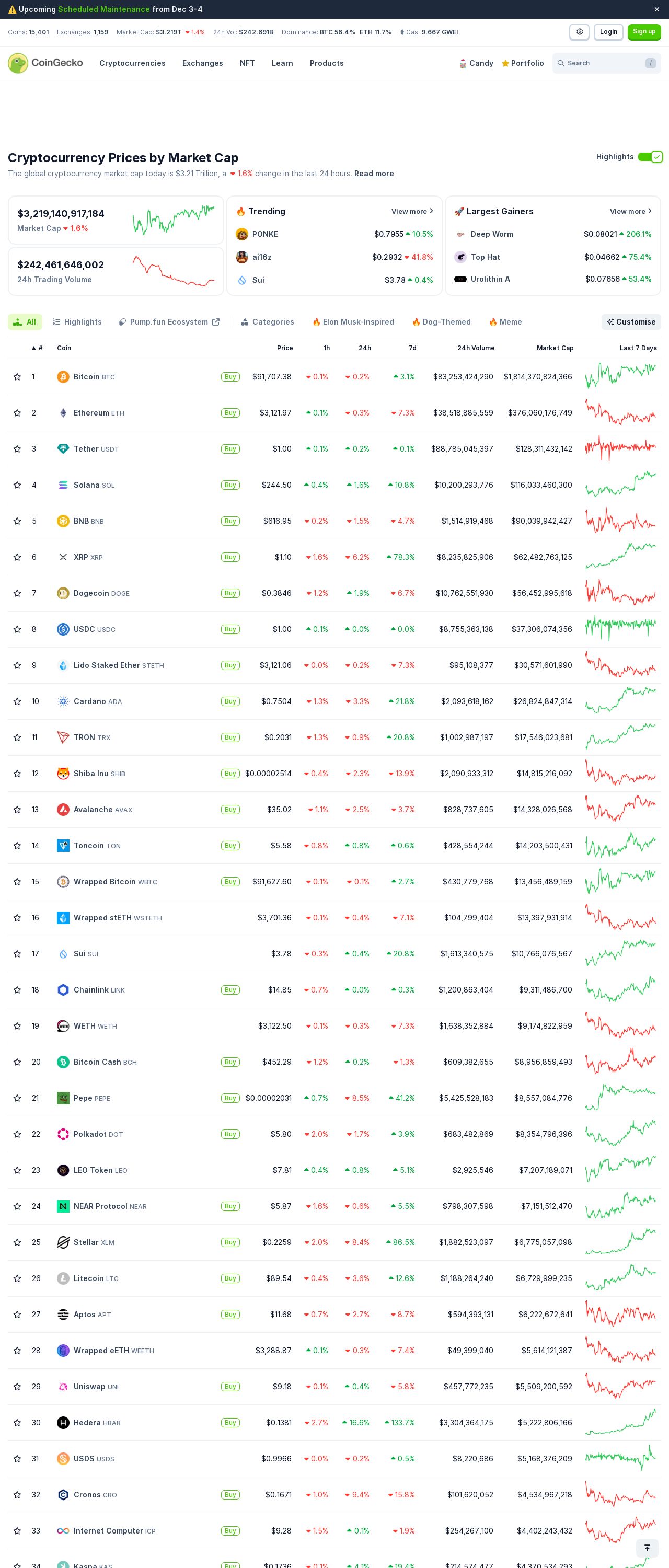
Cryptocurrency Prices, Charts, and Crypto Market Cap | CoinGecko

Analyzed by AI for fun and insights - not to be taken too seriously!
Visual Design
The visual design of the CoinGecko website is a mixed bag, with some elements working well together and others that could use some improvement. The color scheme is primarily a calming blue and green, which is easy on the eyes and suggests a sense of trust and reliability. However, the use of a lot of white space and simple graphics makes the site feel a bit bland and lacking in personality. The fonts used are clean and easy to read, but some of the text is small and could be enlarged for better accessibility. The overall layout is simple and straightforward, with clear headings and concise blocks of text. However, the lack of visual interest and the abundance of whitespace make the site feel a bit empty and unengaging. One area where the visual design could be improved is in the use of images and graphics. While there are some nice charts and graphs, they are not consistently used throughout the site, which can make it feel disjointed. Additionally, some of the icons and logos used are not high-quality and could be replaced with better-designed alternatives. Overall, the visual design of the CoinGecko website is functional and easy to navigate, but could benefit from some additional visual interest and personality.
Recommendation:
Consider adding more visual interest through the use of high-quality images and graphics, and experiment with different font sizes and styles to make the site feel more engaging.
Layout and Clarity
The layout and clarity of the CoinGecko website are good, but could be improved in some areas. The site is organized into clear sections, with easy-to-understand headings and concise blocks of text. The use of white space and simple graphics makes the site feel clean and easy to navigate. However, some of the text is small and could be enlarged for better accessibility, and the lack of visual interest in some areas can make the site feel a bit dull. One area where the layout could be improved is in the use of icons and graphics. While some of the icons are nice, they are not consistently used throughout the site, which can make it feel disjointed. Additionally, some of the graphics are not high-quality and could be replaced with better-designed alternatives. Overall, the layout of the CoinGecko website is functional and easy to navigate, but could benefit from some additional visual interest and consistency in the use of icons and graphics.
Recommendation:
Consider adding more visual interest through the use of high-quality images and graphics, and experiment with different font sizes and styles to make the site feel more engaging. Additionally, ensure that icons and graphics are consistently used throughout the site to maintain a cohesive look and feel.
Content
The content of the CoinGecko website is informative and easy to understand, but could be improved in some areas. The site provides a wealth of information on cryptocurrency prices, charts, and market cap, but some of the text is small and could be enlarged for better accessibility. The use of clear headings and concise blocks of text makes the site easy to navigate, but some of the language is technical and may be difficult for non-experts to understand. One area where the content could be improved is in the use of explanations and tutorials. While the site provides a lot of data, it does not always provide enough context or explanations to help users understand the information. Additionally, some of the language is overly technical and could be simplified for better accessibility. Overall, the content of the CoinGecko website is informative and useful, but could benefit from some additional explanations and tutorials to help users understand the information.
Recommendation:
Consider adding more explanations and tutorials to help users understand the information provided on the site. Additionally, consider simplifying some of the language to make it more accessible to non-experts.
This website was last rated on Nov. 19, 2024, 8:24 a.m.
Disclaimer: ratemysite.app is not affiliated with the website you are viewing, and does not endorse it in any way.
Ratings are subjective and based on AI's analysis. We filter out explicit or dangerous content, but cannot guarantee that all sites are safe.
All rights reserved. © ratemysite.app 2024. Contact: hello @ domain.
