Rate your website in seconds – get instant feedback.
I will rate your website's design and give recommendations to enhance its visual appeal and user experience. See how your site ranks on the leaderboard!
Home - Cáceres & Schneider

Analyzed by AI for fun and insights - not to be taken too seriously!
Visual Design
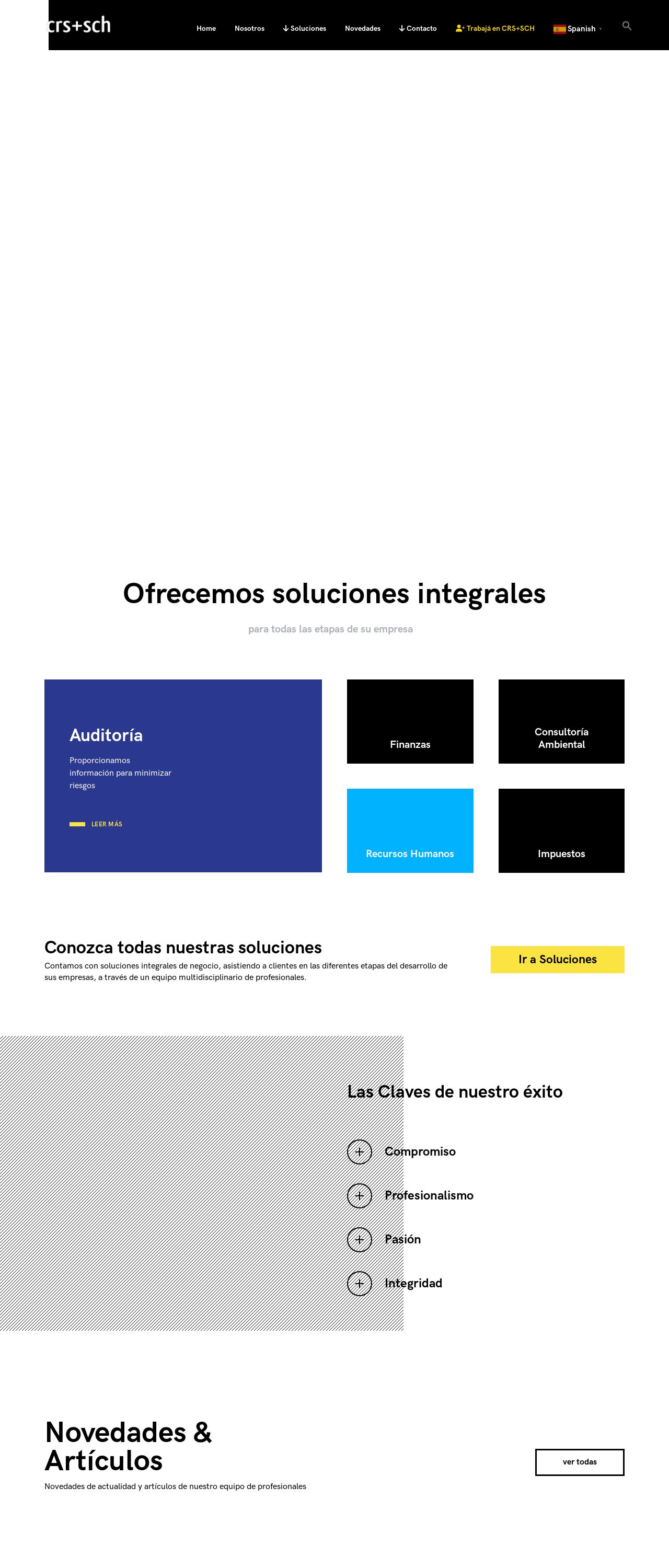
Wow, the first thing that catches my eye is the bold and vibrant color scheme of this website. The blues, yellows, and blacks are a great combination that really makes the design pop. I love how the colors are used consistently throughout the website, creating a cohesive and recognizable brand identity. The typography is also on point, with a clear and easy-to-read font that's perfect for conveying information. However, I do think that the design could benefit from a bit more whitespace. There are some areas where the text and images feel a bit cramped, which can make it hard to focus on individual elements. Overall, though, the visual design is modern, professional, and effectively communicates the brand's message.
Recommendation:
Add more whitespace to improve readability.
Layout and Clarity
The layout of this website is generally well-organized, with clear sections and a logical flow of information. I like how the navigation menu is simple and easy to use, and the use of icons adds a nice touch of visual interest. However, there are a few areas where the layout could be improved. For example, the "Novedades & Articulos" section feels a bit overwhelming, with too many articles competing for attention. It would be helpful to add some clear headings or categories to help users quickly find what they're looking for. Additionally, some of the text is a bit too small, which can make it hard to read on smaller screens. Overall, though, the layout is clear and easy to follow.
Recommendation:
Use clear headings and categories to improve navigation.
Content
The content on this website is informative and well-written, with a clear focus on showcasing the company's services and expertise. I like how the language is formal and professional, which is fitting for a business website. However, there are a few areas where the content could be improved. For example, some of the articles feel a bit too promotional, which can come across as insincere. It would be helpful to add more objective information and data to support the company's claims. Additionally, there are a few typos and grammatical errors scattered throughout the website, which can detract from the overall professionalism of the content.Overall, though, the content is well-written and effectively communicates the company's message.
Recommendation:
Add more objective information and data to support claims.
This website was last rated on Nov. 25, 2024, 4:18 a.m.
Disclaimer: ratemysite.app is not affiliated with the website you are viewing, and does not endorse it in any way.
Ratings are subjective and based on AI's analysis. We filter out explicit or dangerous content, but cannot guarantee that all sites are safe.
All rights reserved. © ratemysite.app 2024. Contact: hello @ domain.
