Rate your website in seconds – get instant feedback.
I will rate your website's design and give recommendations to enhance its visual appeal and user experience. See how your site ranks on the leaderboard!

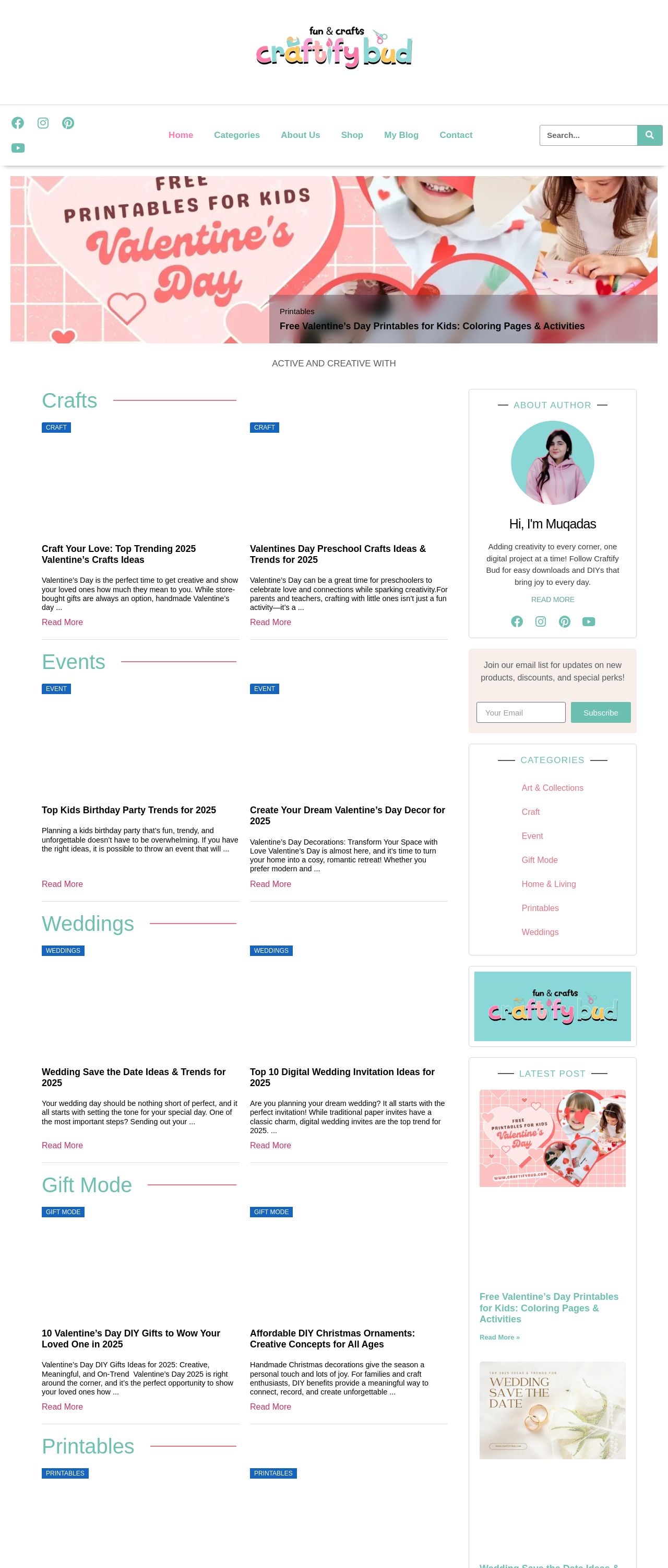
Home - Craftify Bud
Analyzed by AI for fun and insights - not to be taken too seriously!
Visual Design
The visual design of the website is a perfect blend of modern and playful elements. The use of pastel colors, such as pink and blue, creates a soft and inviting atmosphere, while the bold fonts and graphics add a touch of sophistication. The layout is clean and well-organized, making it easy to navigate through the different sections of the website. The use of high-quality images and illustrations adds a professional touch, while the subtle animations and transitions enhance the overall user experience. The design is well-balanced, with a good mix of text and images, making it easy to read and understand the content. Overall, the visual design is visually appealing, modern, and engaging.
Recommendation:
Continue to use a consistent color scheme and typography throughout the website.
Layout and Clarity
The layout of the website is clear and easy to follow, with a clear hierarchy of information. The use of headings, subheadings, and bullet points makes it easy to scan and understand the content. The navigation menu is simple and intuitive, making it easy to find what you're looking for. The use of white space is effective, making the content easy to read and understand. The website is also well-organized, with a clear structure and easy-to-use search function. Overall, the layout is well-designed, making it easy to navigate and find what you're looking for.
Recommendation:
Consider adding a breadcrumb trail to help users navigate through the website.
Content
The content of the website is engaging and informative, with a clear focus on providing valuable information to users. The text is well-written and easy to understand, with a good balance of short and long sentences. The use of headings and subheadings makes it easy to scan and understand the content. The images and illustrations are high-quality and relevant to the content, adding visual interest and breaking up the text. Overall, the content is well-written, informative, and engaging.
Recommendation:
Consider adding more interactive elements, such as quizzes or games, to enhance user engagement.
This website was last rated on Feb. 10, 2025, 2:40 p.m.
Disclaimer: ratemysite.app is not affiliated with the website you are viewing, and does not endorse it in any way.
Ratings are subjective and based on AI's analysis. We filter out explicit or dangerous content, but cannot guarantee that all sites are safe.

All rights reserved. © ratemysite.app 2024. Contact: hello @ domain.