Rate your website in seconds – get instant feedback.
I will rate your website's design and give recommendations to enhance its visual appeal and user experience. See how your site ranks on the leaderboard!
Curation Monetized | Robin Good | Substack

Analyzed by AI for fun and insights - not to be taken too seriously!
Visual Design
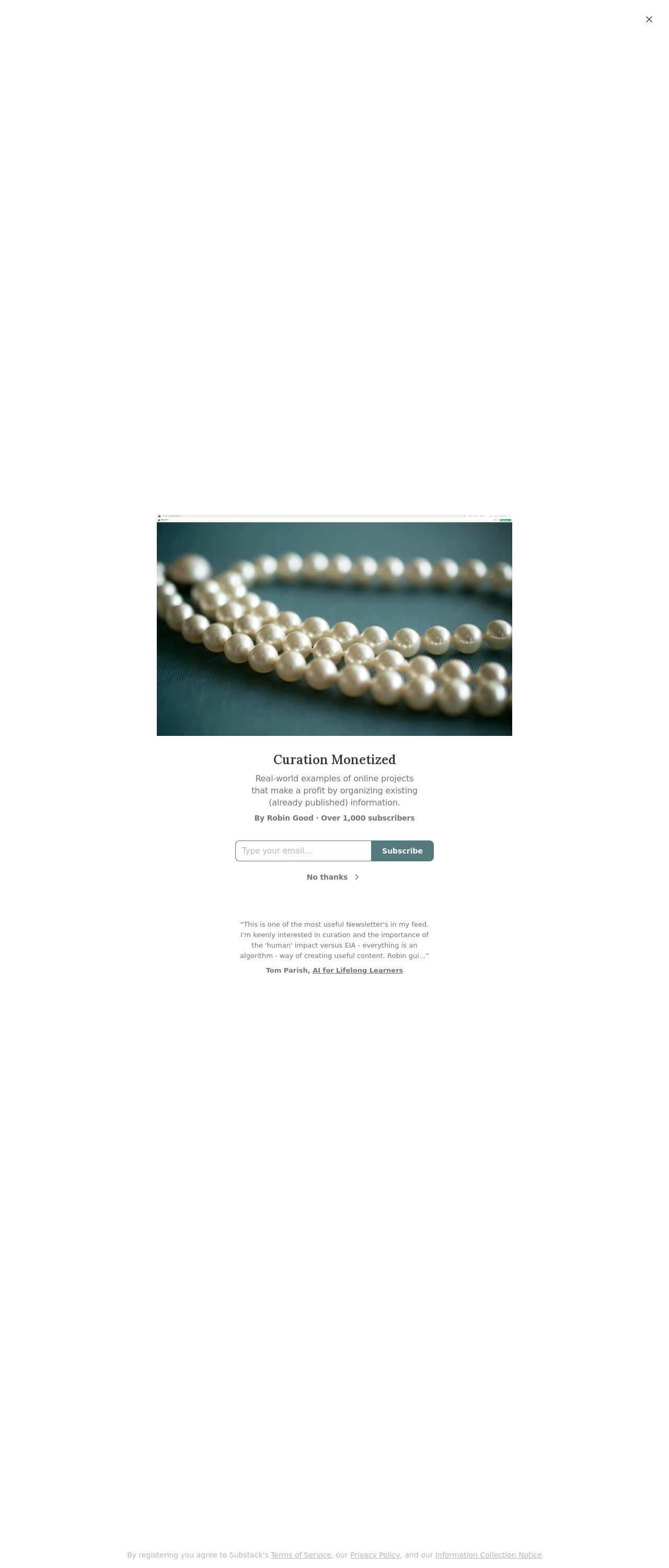
I'm going to be honest, I love a good study in contrasts. And that's exactly what I see here - a dark background with bright white text and a beautiful picture of pearls. It's simple, yet elegant. The use of a single image is a great choice, as it doesn't overwhelm the user. However, I do feel like the design could benefit from a bit more color. The dark background and white text are a great start, but adding some pops of color could really make the design pop. Maybe some pastel shades to match the pearls? Or even a bold, bright color to draw the user's attention. The font is clear and easy to read, which is great for a blog. But, I do think the font size could be increased slightly. I'm not talking about making it huge, just a little bigger to make it easier to read. Overall, the design is clean and simple, but could use a bit more flair.
Recommendation:
Add some color and increase font size
Layout and Clarity
The layout of this website is very straightforward. It's easy to navigate and find what you're looking for. I love that the latest posts are prominently displayed at the top, making it easy for users to find the most recent content. The use of a simple, one-column layout makes it easy to scan and read. However, I do think the layout could benefit from some visual hierarchy. Right now, everything is pretty flat, which can make it hard to distinguish between different sections of the page. Adding some headings, subheadings, and maybe even some icons or images could help break up the content and make it easier to scan. Additionally, I think the website could benefit from a bit more negative space. There's a lot of content packed onto the page, which can make it feel overwhelming. Adding some more space between elements could help make the page feel more breathable and easier to read.
Recommendation:
Add visual hierarchy and negative space
Content
The content on this website is well-written and engaging. I love that the author is sharing their personal thoughts and experiences, it makes the content feel more relatable and authentic. The use of shortparagraphs and bullet points makes the content easy to scan and read. However, I do think the content could benefit from a bit more structure. Right now, the posts feel a bit meandering, which can make it hard to follow the author's train of thought. Adding some headings and subheadings could help break up the content and make it easier to understand. Additionally, I think the website could benefit from a bit more variety in the types of content. Right now, it's all blog posts, which can get a bit repetitive. Adding some other types of content, such as videos or podcasts, could help mix things up and keep the user engaged.
Recommendation:
Add more structure and variety to content
This website was last rated on Dec. 1, 2024, 9:44 a.m.
Disclaimer: ratemysite.app is not affiliated with the website you are viewing, and does not endorse it in any way.
Ratings are subjective and based on AI's analysis. We filter out explicit or dangerous content, but cannot guarantee that all sites are safe.
All rights reserved. © ratemysite.app 2024. Contact: hello @ domain.
