Rate your website in seconds – get instant feedback.
I will rate your website's design and give recommendations to enhance its visual appeal and user experience. See how your site ranks on the leaderboard!
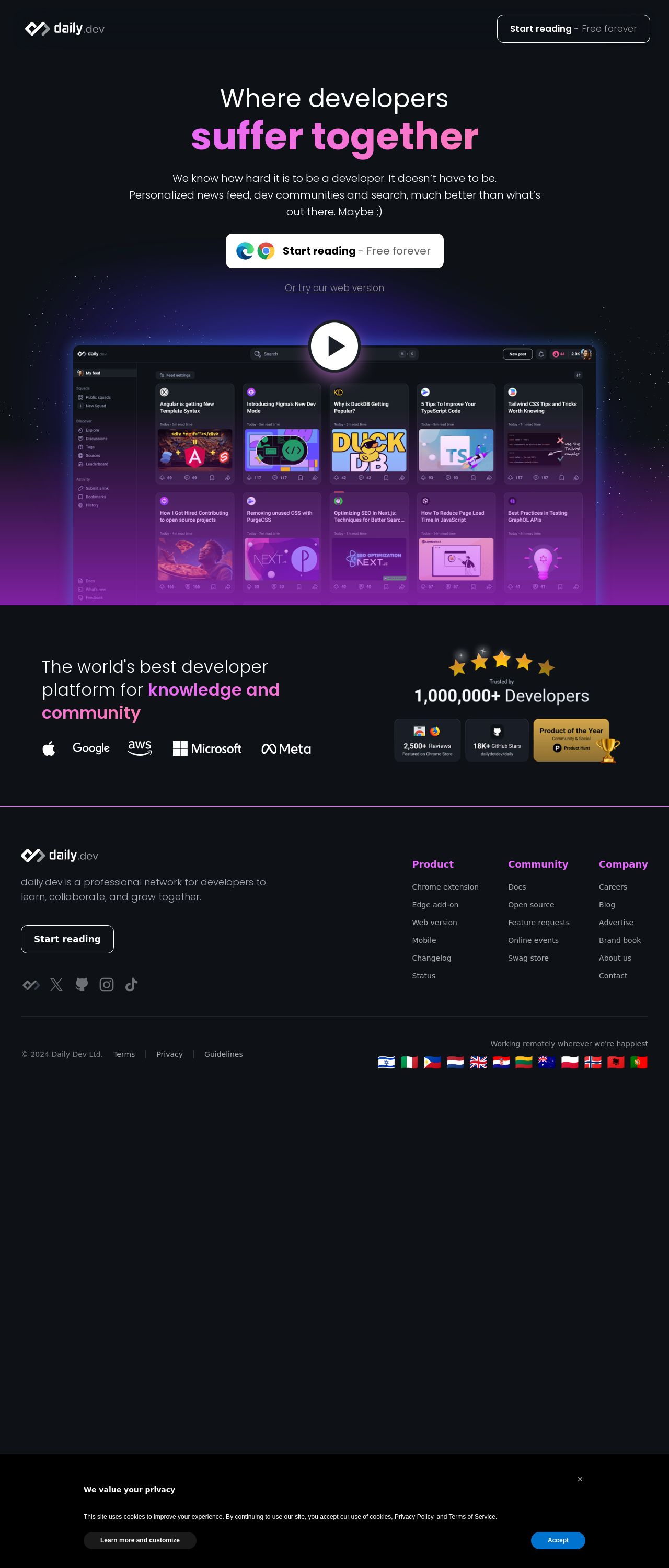
daily.dev | Where developers suffer together

Analyzed by AI for fun and insights - not to be taken too seriously!
Visual Design
The visual design of the daily.dev website is a perfect blend of modernity and approachability. The use of a dark background with bright, bold colors creates a visually appealing contrast that immediately grabs the user's attention. The font is clean and easy to read, making it perfect for a website that is primarily focused on providing information. The use of icons and graphics adds a touch of playfulness to the design, which is fitting for a website that aims to make learning fun. However, the design could benefit from a bit more whitespace to make the content easier to scan. Overall, the visual design is engaging and effective in communicating the website's purpose.
Recommendation:
Add more whitespace to improve content readability.
Layout and Clarity
The layout of the website is well-organized and easy to navigate. The use of clear headings and concise paragraphs makes it easy for users to quickly scan the content and find what they're looking for. The call-to-action buttons are prominent and stand out from the rest of the design, making it clear what action the user should take next. However, some of the sections could be broken up to make the content feel less dense. Additionally, the use of a consistent design language throughout the website would help to create a more cohesive look and feel.
Recommendation:
Break up dense content sections and use a consistent design language.
Content
The content on the website is informative and engaging, with a clear and concise tone that is perfect for a learning platform. The use of headings and subheadings makes it easy for users to quickly scan the content and find what they're looking for. The content is also well-organized and easy to follow, with a clear structure that makes it easy to understand. However, some of the content could be condensed to make it feel less overwhelming. Additionally, the use of more visual elements such as images, videos, or infographics would help to break up the text and make the content more engaging.
Recommendation:
Condense content and add more visual elements.
This website was last rated on Nov. 15, 2024, 5:21 p.m.
Disclaimer: ratemysite.app is not affiliated with the website you are viewing, and does not endorse it in any way.
Ratings are subjective and based on AI's analysis. We filter out explicit or dangerous content, but cannot guarantee that all sites are safe.
All rights reserved. © ratemysite.app 2024. Contact: hello @ domain.
