Rate your website in seconds – get instant feedback.
I will rate your website's design and give recommendations to enhance its visual appeal and user experience. See how your site ranks on the leaderboard!

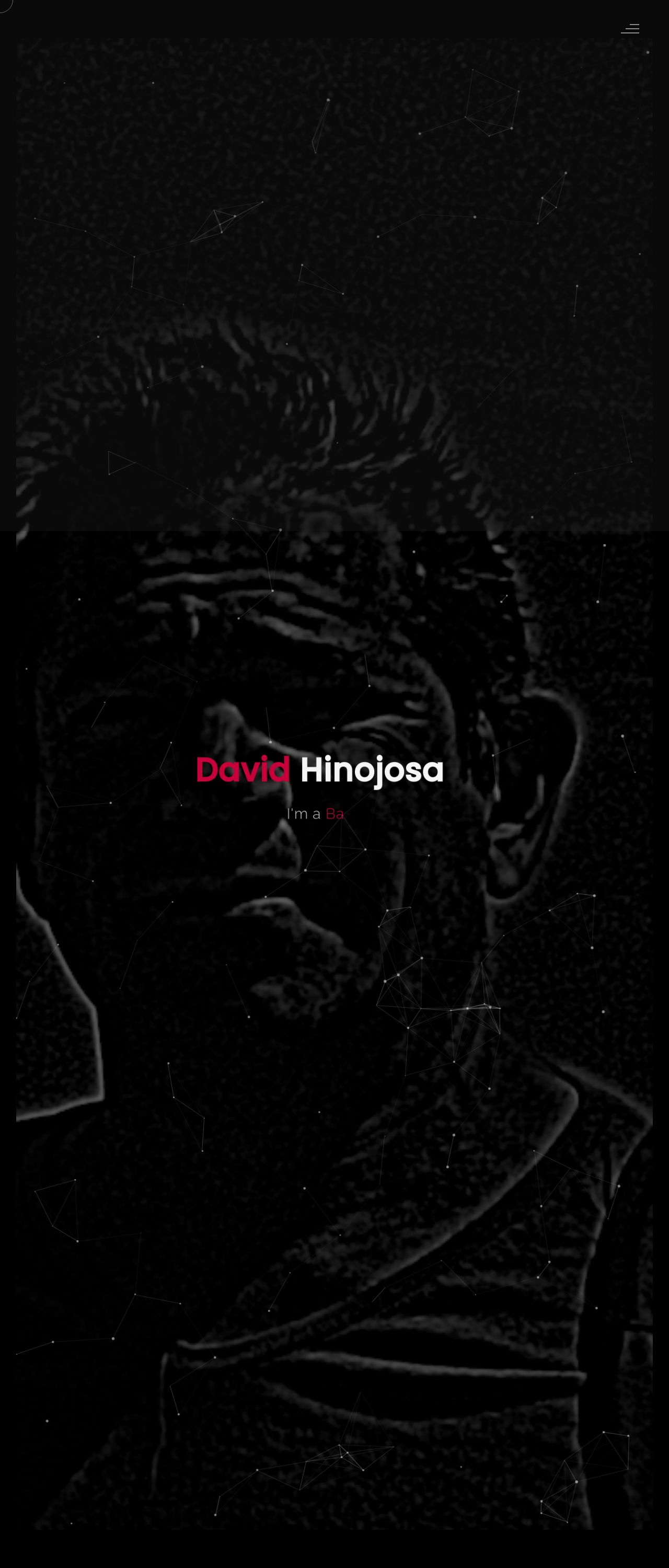
David Hinojosa
Analyzed by AI for fun and insights - not to be taken too seriously!
Visual Design
The visual design of the website is a dark and muted color scheme, with a focus on black, white, and gray tones. The use of these colors creates a clean and professional look, but it may also make the website appear somber and uninviting. The layout is simple and straightforward, with clear headings and concise text. However, the use of a single font throughout the website may make it appear monotonous and lacking in visual interest. The images and graphics used are minimal and do not add much to the overall aesthetic of the website. Overall, the visual design is functional but lacking in creativity and personality.
Recommendation:
Add more visual interest to the website by incorporating a variety of fonts, colors, and graphics. Consider using images and graphics that reflect the personality and tone of the website.
Layout and Clarity
The layout of the website is clear and easy to navigate, with a logical flow of information and clear headings. However, the use of a single column layout may make the website appear cluttered and overwhelming. The text is well-organized and easy to read, but the use of a single font may make it appear monotonous. The website is well-structured, with a clear hierarchy of information and a logical navigation menu. However, the use of a single column layout may make it difficult to scan and read the content. Overall, the layout and clarity are good, but could be improved by incorporating more visual interest and varying the font and font sizes.
Recommendation:
Add more visual interest to the website by incorporating a variety of fonts, colors, and graphics. Consider using images and graphics that reflect the personality and tone of the website.
Content
The content of the website is clear and concise, with well-organized text and headings. However, the use of a single font throughout the website may make it appear monotonous. The text is well-written and free of errors, but could be improved by incorporating more personality and tone. The content is well-structured, with a clear hierarchy of information and a logical flow. However, the use of a single column layout may make it difficult to scan and read the content. Overall, the content is good, but could be improved by incorporating more personality and tone, and varying the font and font sizes.
Recommendation:
Add more personality and tone to the content by incorporating more descriptive language and varied sentence structures. Consider using images and graphics that reflect the personality and tone of the website.
This website was last rated on Feb. 5, 2025, 10:59 a.m.
Disclaimer: ratemysite.app is not affiliated with the website you are viewing, and does not endorse it in any way.
Ratings are subjective and based on AI's analysis. We filter out explicit or dangerous content, but cannot guarantee that all sites are safe.

All rights reserved. © ratemysite.app 2024. Contact: hello @ domain.