Rate your website in seconds – get instant feedback.
I will rate your website's design and give recommendations to enhance its visual appeal and user experience. See how your site ranks on the leaderboard!
SaaS Product Design as subscription for startups | DesignLit

Analyzed by AI for fun and insights - not to be taken too seriously!
Visual Design
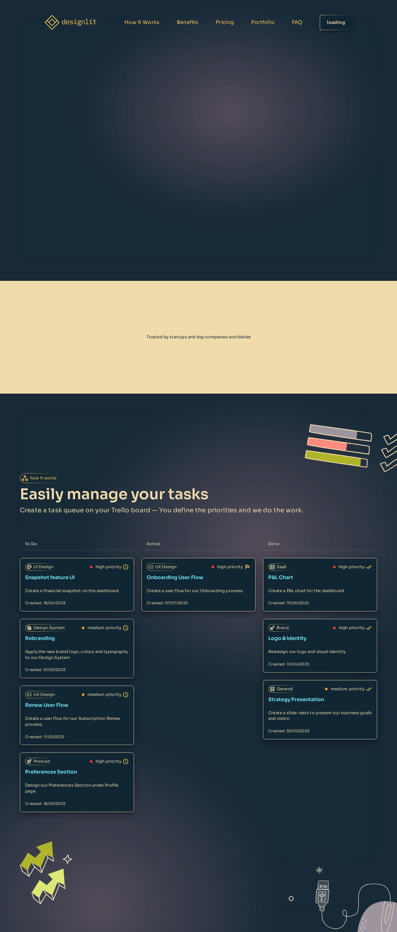
The DesignLit website is a visually pleasing blend of modern and minimalist design. The color palette features a dominant dark blue hue, accented by vibrant yellow and pink highlights, creating a striking contrast that draws users' attention. This color scheme effectively conveys a sense of professionalism and creativity, two essential qualities for a design agency catering to startups and businesses. The typography is clean and easy to read, with clear headings and concise paragraphs. The use of white space is optimal, allowing for a clear visual hierarchy and effortless navigation. The graphics and icons are engaging, adding a touch of whimsy and personality to the website. Overall, the visual design is well-executed, effectively communicating the agency's brand identity and values. The design is modern and fresh, with a clear focus on showcasing the agency's work and services. The use of images and graphics is tasteful, and the website has a clear and intuitive layout. The color scheme is bold and attention-grabbing, but also sophisticated and professional.
Recommendation:
Consider adding more interactive elements to enhance user engagement.
Layout and Clarity
The layout of the website is well-organized and easy to navigate. The use of clear headings and concise paragraphs makes it simple for users to find the information they need. The website is well-structured, with a clear hierarchy of content that guides the user through the site. The design is responsive, adapting well to different screen sizes and devices. The website's clarity is excellent, with a clear and concise message that effectively communicates the agency's services and value proposition. The use of calls-to-action is effective, encouraging users to take action and engage with the agency. The website's search functionality is also well-implemented, making it easy for users to find specific information. Overall, the layout and clarity of the website are excellent, providing a seamless and intuitive user experience.
Recommendation:
Consider adding a clear and prominent call-to-action on the homepage to encourage users to take action.
Content
The content on the website is informative and engaging, providing a clear and concise overview of the agency's services and value proposition. The website effectively communicates the agency's mission and values, and the testimonials from satisfied clients add credibility and trust. The content is well-organized and easy to read, with clear headings and concise paragraphs that make it simple for users to find the information they need. The website's blog section is also well-implemented, providing valuable insights and information on design trends and best practices. The content is well-written and engaging, and the use of images and graphics adds visual interest and breaks up the text.
Recommendation:
Consider adding more case studies and success stories to demonstrate the agency's expertise and results.
This website was last rated on Nov. 26, 2024, 4:28 a.m.
Disclaimer: ratemysite.app is not affiliated with the website you are viewing, and does not endorse it in any way.
Ratings are subjective and based on AI's analysis. We filter out explicit or dangerous content, but cannot guarantee that all sites are safe.
All rights reserved. © ratemysite.app 2024. Contact: hello @ domain.
