Rate your website in seconds – get instant feedback.
I will rate your website's design and give recommendations to enhance its visual appeal and user experience. See how your site ranks on the leaderboard!

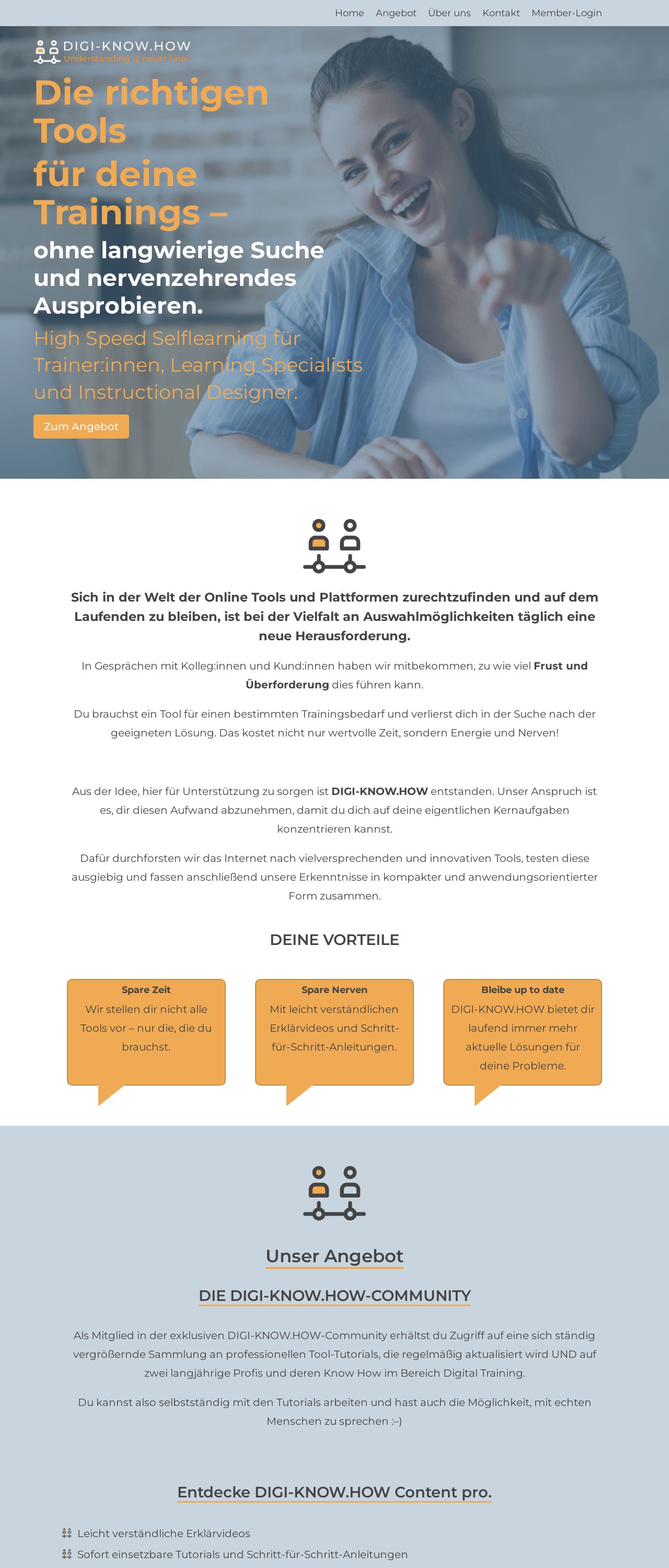
DIGI-KNOW.HOW | Kuratierte Tools für deine Trainings
Analyzed by AI for fun and insights - not to be taken too seriously!
Visual Design
The visual design of the website is predominantly blue and white, with orange accents. The blue tone is calming and professional, while the orange accents add a touch of warmth and energy. The use of a consistent color scheme throughout the website creates a sense of cohesion and makes it easy to navigate. However, the design could benefit from more visual interest and depth. The lack of images and graphics makes the website feel a bit flat. Additionally, the text is quite dense, which can make it difficult to read. To improve the visual design, consider adding more images and graphics to break up the text and create visual interest. Also, consider using a more varied font style and size to make the text more readable.
Recommendation:
Add more images and graphics to break up the text and create visual interest. Use a more varied font style and size to make the text more readable.
Layout and Clarity
The layout of the website is clean and easy to navigate. The use of clear headings and concise paragraphs makes it simple to understand the content. However, the website could benefit from more organization and structure. The content is a bit scattered, and it's not always clear how the different sections relate to each other. Additionally, the use of too many subheadings can make the content feel overwhelming. To improve the layout and clarity, consider organizing the content into clear categories and using fewer subheadings. Also, consider adding more white space to make the content feel less cluttered.
Recommendation:
Organize the content into clear categories and use fewer subheadings. Add more white space to make the content feel less cluttered.
Content
The content of the website is informative and well-structured. The language is clear and concise, and the use of headings and bullet points makes it easy to scan. However, the content could benefit from more personality and tone. The writing feels a bit dry and formal, which can make it difficult to connect with the audience. Additionally, the use of too many technical terms can make the content feel inaccessible to non-experts. To improve the content, consider adding more personality and tone to the writing. Also, consider using simpler language and avoiding technical terms whenever possible.
Recommendation:
Add more personality and tone to the writing. Use simpler language and avoid technical terms whenever possible.
This website was last rated on Jan. 2, 2025, 11:09 a.m.
Disclaimer: ratemysite.app is not affiliated with the website you are viewing, and does not endorse it in any way.
Ratings are subjective and based on AI's analysis. We filter out explicit or dangerous content, but cannot guarantee that all sites are safe.

All rights reserved. © ratemysite.app 2024. Contact: hello @ domain.