Rate your website in seconds – get instant feedback.
I will rate your website's design and give recommendations to enhance its visual appeal and user experience. See how your site ranks on the leaderboard!

Home – Understanding is never final.
Analyzed by AI for fun and insights - not to be taken too seriously!
Visual Design
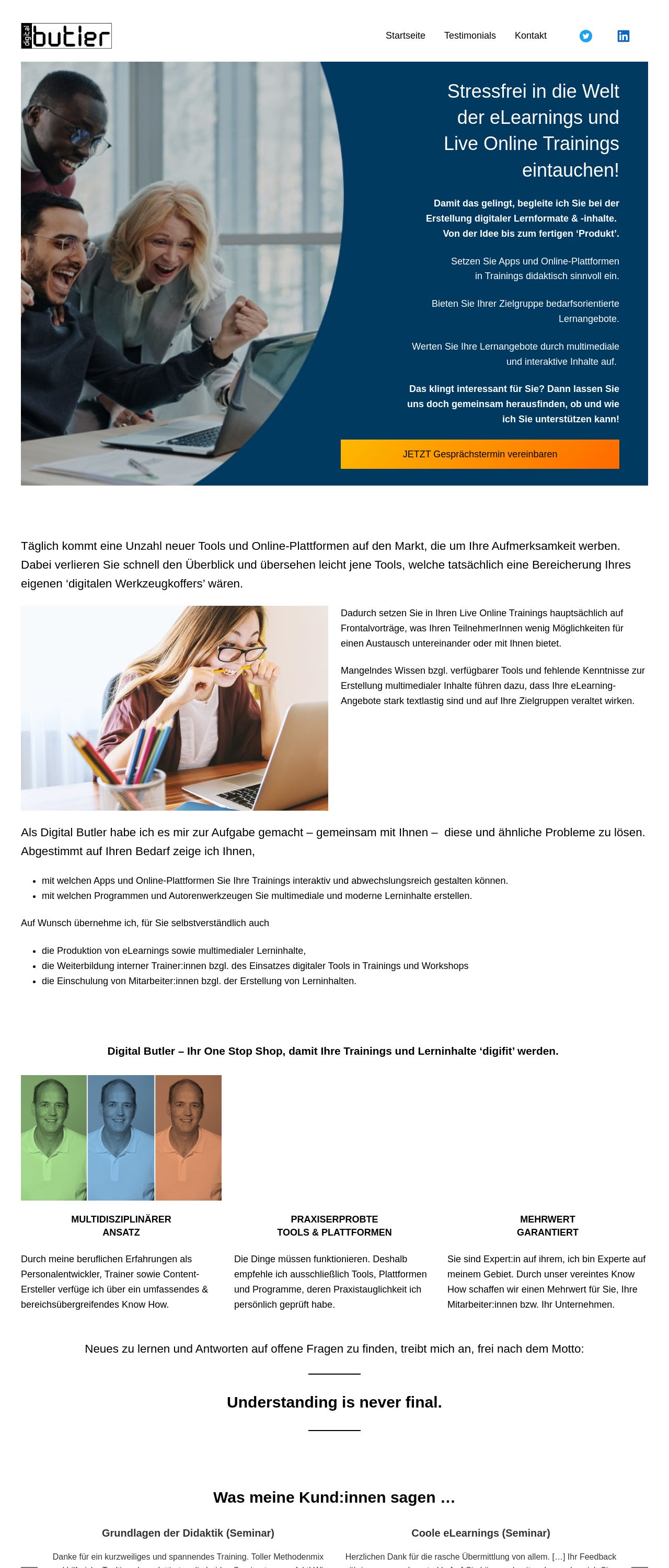
The visual design of the website is a key element that sets the tone and mood for the user's experience. Upon reviewing the screenshot, I notice that the color scheme is predominantly blue, with accents of orange and white. The blue tone is calming and professional, which is suitable for a website focused on understanding and privacy. However, the use of orange as an accent color may not be the most effective choice, as it can evoke feelings of anxiety or excitement. A more muted color like beige or light gray could provide a better contrast and create a more balanced look. The images used on the website are clear and concise, but they could be more visually appealing. The use of headshots of people in different colors creates a sense of diversity and inclusivity, but the images could be more high-quality and well-lit. Additionally, the text overlay on the images could be more subtle and not distract from the main message. Overall, the visual design of the website is clean and professional, but there is room for improvement in terms of color choice and image quality.
Recommendation:
Consider using a more muted color scheme and high-quality images to create a more visually appealing design.
Layout and Clarity
The layout of the website is well-organized and easy to navigate. The use of clear headings, bullet points, and concise paragraphs makes it simple for users to quickly scan and understand the content. However, the text is quite dense, and some of the paragraphs are quite long, which can make it difficult to focus on specific points. The use of white space is effective in separating different sections and creating a sense of flow. However, some of the sections could be further separated to create a clearer distinction between different topics. Overall, the layout of the website is clean and easy to navigate, but there is room for improvement in terms of text density and section separation.
Recommendation:
Consider breaking up long paragraphs into shorter ones and using more white space to create a clearer distinction between different sections.
Content
The content of the website is informative and well-written, but it could be more engaging and compelling. The use of technical terms like "Cookies" and "Consent" may deter some users who are not familiar with these concepts. The explanations provided are clear and concise, but they could be more visually appealing with the use of images, diagrams, or infographics. Additionally, the content could be more interactive, with features like quizzes, games, or interactive simulations to help users better understand the concepts. Overall, the content of the website is informative and well-written, but there is room for improvement in terms of engagement and interactivity.
Recommendation:
Consider using more interactive and engaging content features to help users better understand the concepts.
This website was last rated on Jan. 2, 2025, 11:08 a.m.
Disclaimer: ratemysite.app is not affiliated with the website you are viewing, and does not endorse it in any way.
Ratings are subjective and based on AI's analysis. We filter out explicit or dangerous content, but cannot guarantee that all sites are safe.

All rights reserved. © ratemysite.app 2024. Contact: hello @ domain.