Rate your website in seconds – get instant feedback.
I will rate your website's design and give recommendations to enhance its visual appeal and user experience. See how your site ranks on the leaderboard!
Duarte, Fernandes, Fretta, Koerich & Truppel | Advogados Associados

Analyzed by AI for fun and insights - not to be taken too seriously!
Visual Design
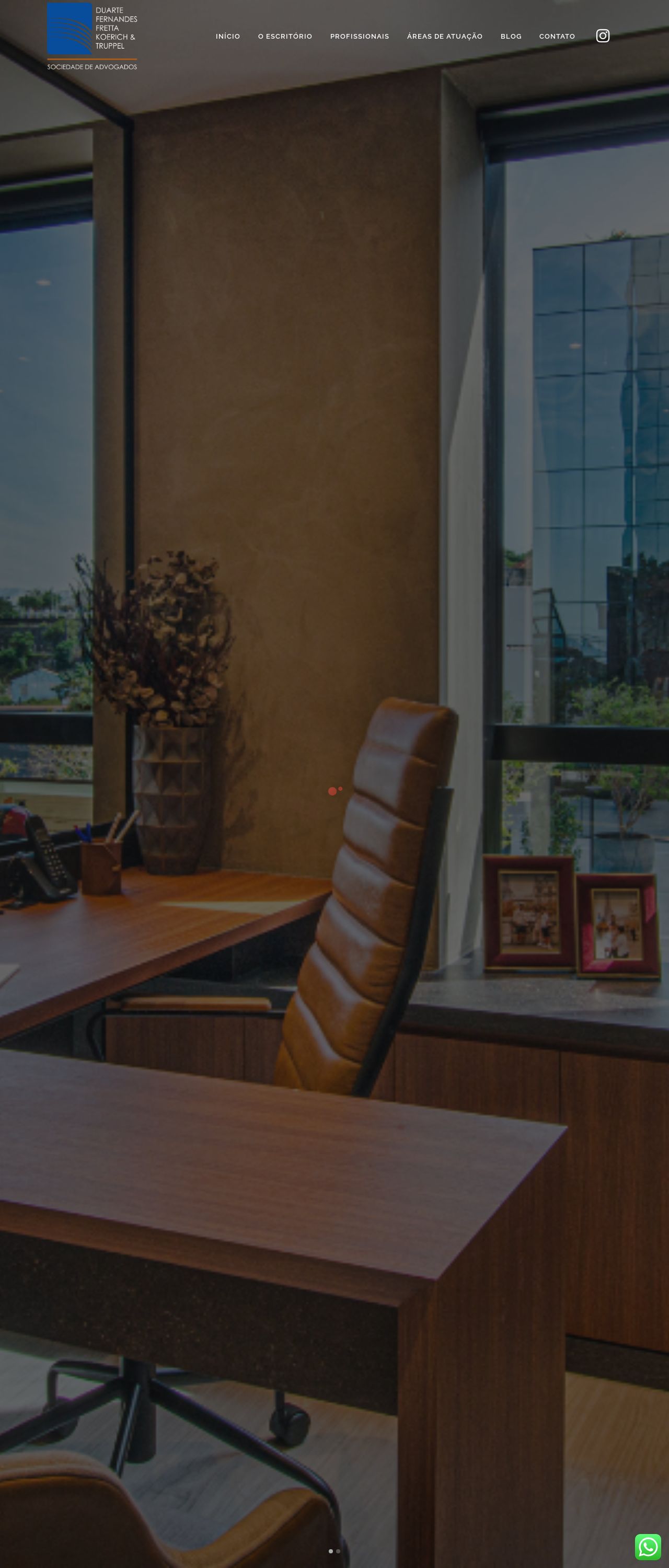
The visual design of the website is professional and well-organized, with a clean and modern aesthetic. The use of a dark gray background with light gray accents creates a sense of sophistication and elegance. The images of the office and the lawyers' portraits add a personal touch, but some of them are blurry, which may detract from the overall impression. The navigation menu is easy to use and understand, with clear labels and a logical structure. However, the font sizes and styles could be more consistent throughout the website, as some sections have larger or smaller text than others. Additionally, the use of images without alt text or proper captions can make it difficult for visually impaired users to understand the content. Overall, the visual design is well-executed, but there are some minor issues that could be improved upon.
Recommendation:
Improve font consistency, add alt text and captions to images, and consider using a more consistent color scheme throughout the website.
Layout and Clarity
The layout of the website is well-organized, with clear headings and concise paragraphs. However, some sections, such as the "ÁREAS DE ATUAÇÃO" page, have too much text and could be broken up into smaller sections or bullet points for easier reading. The use of white space is effective in creating a clean and uncluttered design, but some areas, such as the footer, could be simplified further. The website also has a clear call-to-action (CTA) at the top of the page, which is easy to see and click on. Overall, the layout is well-executed, but there are some areas for improvement.
Recommendation:
Break up long sections of text into smaller sections or bullet points, simplify the footer, and consider adding more white space throughout the website.
Content
The content of the website is informative and well-written, with clear headings and concise paragraphs. However, some sections, such as the "INFORMATIVOS" page, have too much text and could be broken up into smaller sections or bullet points for easier reading. The website also has a clear and easy-to-use navigation menu, which makes it simple to find specific information. Additionally, the website includes a blog section, which is a great way to keep users engaged and up-to-date on the latest news and developments. Overall, the content is well-executed, but there are some areas for improvement.
Recommendation:
Break up long sections of text into smaller sections or bullet points, simplify the footer, and consider adding more white space throughout the website.
This website was last rated on Jan. 11, 2025, 10:45 p.m.
Re-rate available on Jan. 18, 2025, 10:45 p.m.
Disclaimer: ratemysite.app is not affiliated with the website you are viewing, and does not endorse it in any way.
Ratings are subjective and based on AI's analysis. We filter out explicit or dangerous content, but cannot guarantee that all sites are safe.
All rights reserved. © ratemysite.app 2024. Contact: hello @ domain.
