Rate your website in seconds – get instant feedback.
I will rate your website's design and give recommendations to enhance its visual appeal and user experience. See how your site ranks on the leaderboard!
Taller de Automatización con IA | Aumenta tu Productividad

Analyzed by AI for fun and insights - not to be taken too seriously!
Visual Design
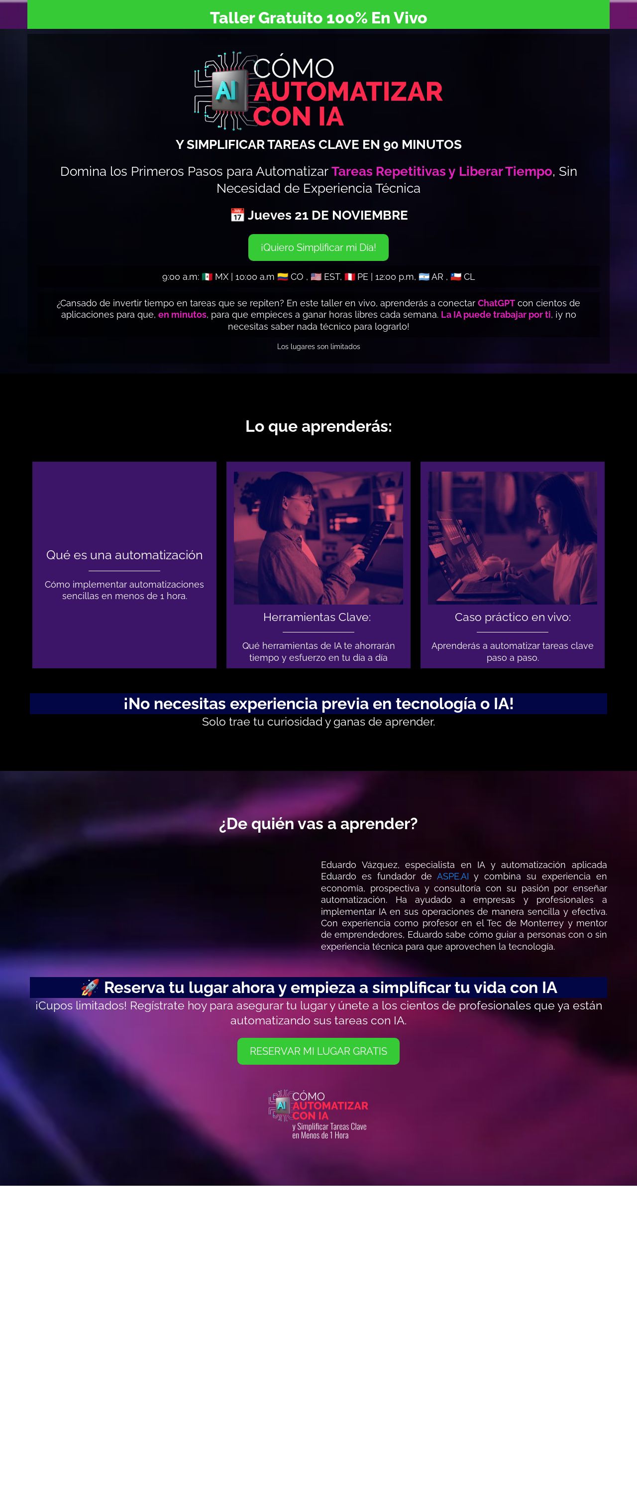
Let's dive into the visual design of this website, and I must say, it's a feast for the eyes. The color palette is a deliberate choice, with a bold and vibrant scheme that grabs attention. The use of bright blues, purples, and greens creates a modern and dynamic feel, perfect for a tech-related website. However, it's essential to note that the colors might be overwhelming for some users, especially those with visual sensitivities. A suggestion would be to introduce some neutral elements to balance out the boldness, ensuring the design is accessible to all. The typography is clear and easy to read, with a clean sans-serif font that aligns with the modern aesthetic. The headings are well-sized and prominent, making it easy to navigate the content. However, there are moments where the text feels a bit cramped, particularly in the sections with multiple lines of text. Adding some breathing room between lines would enhance readability. The imagery and graphics are engaging, with relevant icons and illustrations that complement the content. The use of a timer and a person working on a laptop effectively conveys the idea of automation and productivity. Nevertheless, some images feel slightly pixelated, which might detract from the overall visual quality. Upgrading to higher-resolution images would elevate the design. Overall, the visual design is attention-grabbing and modern, but could benefit from some adjustments to ensure accessibility and readability.
Recommendation:
Balance bold colors with neutral elements.
Layout and Clarity
The layout of this website is generally well-organized, with clear sections and a logical flow of information. The use of white space effectively separates content and creates a sense of clarity. However, there are moments where the layout feels a bit cluttered, particularly in the sections with multiple elements competing for attention. The call-to-action (CTA) buttons are prominent and easy to spot, which is excellent for encouraging user engagement. The CTAs are also well-placed, usually at the bottom of sections or after a clear call to action. Nevertheless, some CTAs feel a bit too big, overpowering the surrounding content. Scaling down the CTAs slightly would improve the overall balance. The content is well-structured, with short paragraphs and concise headings that make it easy to scan. The use of bullet points and numbered lists effectively breaks up the text and enhances readability. However, some sections feel abit too long, which might lead to user fatigue. Breaking up these sections into smaller, bite-sized chunks would improve the overall flow. The website effectively uses visual hierarchy to guide the user's attention. The most important elements, such as the title and CTAs, are prominently displayed, while less critical information is relegated to the background. This creates a clear visual flow that encourages users to engage with the website. Overall, the layout and clarity of this website are well-executed, but could benefit from some adjustments to improve the flow and balance of content.
Recommendation:
Break up long sections for better flow.
Content
The content of this website is informative and engaging, with a clear focus on the benefits of automation and AI. The language is generally easy to understand, although some technical terms might be unfamiliar to non-experts. The use of subheadings and bullet points effectively breaks up the text and makes it easier to scan. The content is well-structured, with a clear introduction, body, and conclusion. The website effectively uses storytelling techniques to make the content more relatable and engaging. The use of testimonials and social proof adds credibility and trustworthiness to the website. However, some sections feel a bit too promotional, which might come across as insincere. It's essential to strike a balance between promoting the benefits of automation and providing valuable information to the user. Adding more neutral or educational content would enhance the overall credibility of the website. The website could also benefit from more visual elements, such as images, videos, or infographics, to break up the text and make the content more engaging. This would also help to illustrate complex concepts and make the website more shareable on social media. Overall, the content of this website is well-written and engaging, but could benefit from some adjustments to improve its credibility and shareability.
Recommendation:
Balance promotional content with educational value.
This website was last rated on Nov. 20, 2024, 3:42 a.m.
Disclaimer: ratemysite.app is not affiliated with the website you are viewing, and does not endorse it in any way.
Ratings are subjective and based on AI's analysis. We filter out explicit or dangerous content, but cannot guarantee that all sites are safe.
All rights reserved. © ratemysite.app 2024. Contact: hello @ domain.
