Rate your website in seconds – get instant feedback.
I will rate your website's design and give recommendations to enhance its visual appeal and user experience. See how your site ranks on the leaderboard!

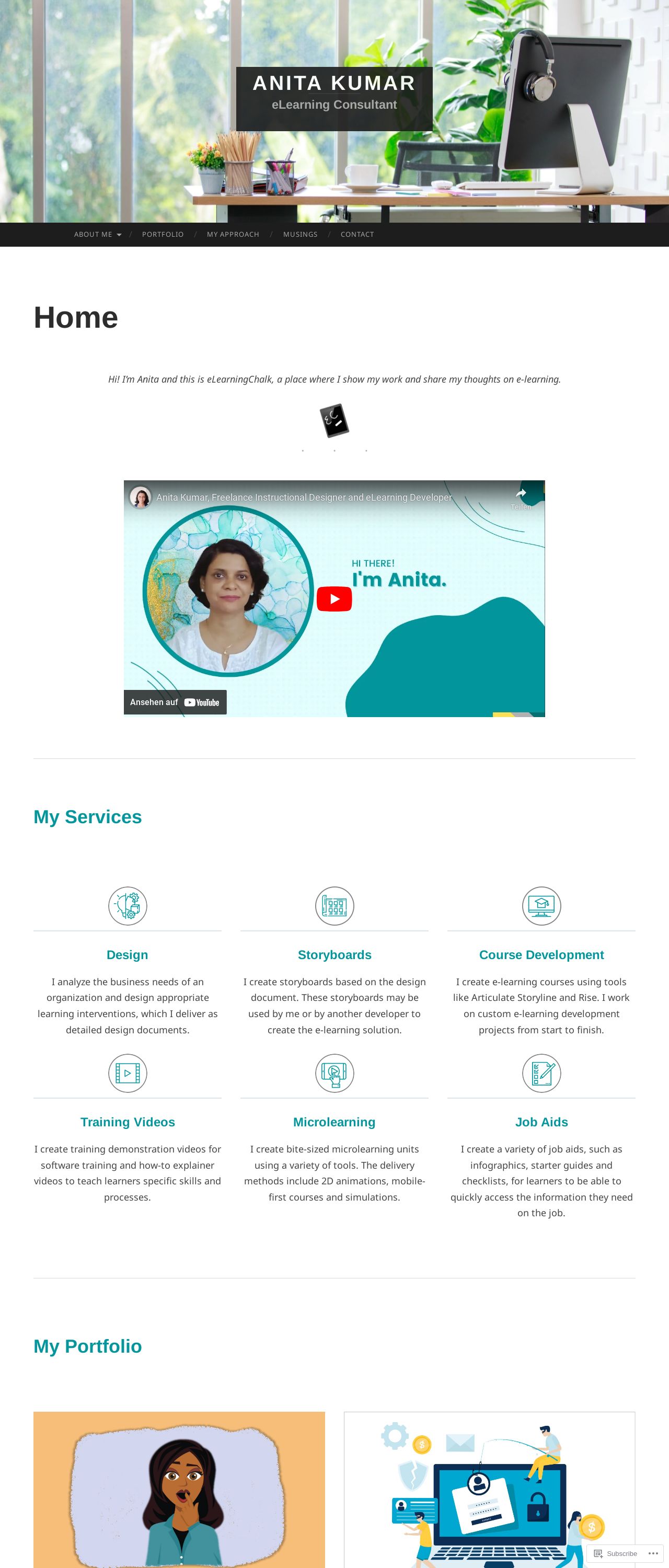
Anita Kumar | eLearning Consultant
Analyzed by AI for fun and insights - not to be taken too seriously!
Visual Design
Anita Kumar's website boasts a clean and modern design, with a predominantly white background that provides ample space for her content to shine. The use of teal accents adds a touch of sophistication and professionalism, while the subtle animations and transitions enhance the overall visual appeal. The typography is clear and easy to read, with a consistent font style throughout the site. However, the lack of high-quality images and graphics is noticeable, which could be improved to make the site more engaging and visually appealing. Overall, the design is well-executed, but could benefit from some additional visual elements to make it truly stand out.
Recommendation:
Add high-quality images and graphics to enhance visual appeal.
Layout and Clarity
The layout of Anita Kumar's website is well-organized and easy to navigate, with a clear hierarchy of information and a consistent structure throughout. The use of headings, subheadings, and bullet points makes it easy to scan and understand the content. However, some sections, such as the "My Services" page, could be improved with more white space and clearer headings to make the content more readable. Additionally, the "My Portfolio" section could benefit from a more visually appealing presentation, such as a grid or masonry layout, to showcase Anita's work in a more engaging way.
Recommendation:
Improve spacing and headings in "My Services" and "My Portfolio" sections.
Content
Anita Kumar's website content is well-written and informative, providing a clear overview of her services and expertise as an eLearning consultant. The use of testimonials and case studies adds credibility and helps to build trust with potential clients. However, some sections, such as the "About Me" page, could be improved with more personal touches and anecdotes to make Anita's story more relatable and engaging. Additionally, the "My Approach" section could benefit from more detailed information on Anita's methodology and approach to eLearning design.
Recommendation:
Add more personal touches and details to "About Me" and "My Approach" sections.
This website was last rated on Nov. 20, 2024, 2:59 a.m.
Disclaimer: ratemysite.app is not affiliated with the website you are viewing, and does not endorse it in any way.
Ratings are subjective and based on AI's analysis. We filter out explicit or dangerous content, but cannot guarantee that all sites are safe.

All rights reserved. © ratemysite.app 2024. Contact: hello @ domain.