Rate your website in seconds – get instant feedback.
I will rate your website's design and give recommendations to enhance its visual appeal and user experience. See how your site ranks on the leaderboard!
Home | Luxury Travel Site

Analyzed by AI for fun and insights - not to be taken too seriously!
Visual Design
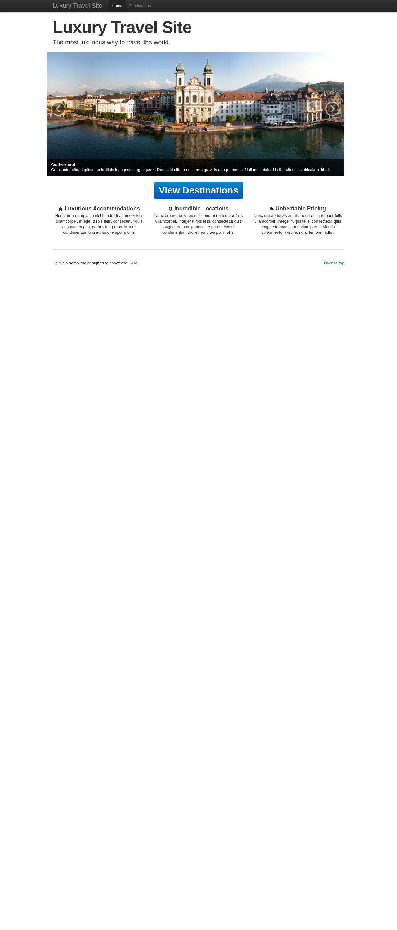
The visual design of the Luxury Travel Site is elegant and sophisticated, with a clean and modern aesthetic. The use of a predominantly white background with accents of blue and black creates a sense of luxury and professionalism. The font is clear and easy to read, making it perfect for a website that requires users to read and navigate through a lot of information. The images used on the website are high-quality and visually appealing, showcasing the beautiful destinations and accommodations offered by the site. However, the design could benefit from a bit more creativity and originality to make it stand out from other luxury travel websites. Additionally, the use of too much white space in some areas of the website can make it feel a bit empty and lacking in content.
Recommendation:
Add more creative elements to make the design stand out.
Layout and Clarity
The layout of the Luxury Travel Site is well-organized and easy to navigate, with clear headings and sections that make it easy for users to find what they're looking for. The website is also very responsive, adapting well to different screen sizes and devices. However, some of the sections feel a bit cramped, with too much information packed into a small space. Additionally, the website could benefit from a clearer hierarchy of information, with more prominent calls-to-action and clearer navigation.
Recommendation:
Improve the hierarchy of information and clear navigation.
Content
The content on the Luxury Travel Site is informative and engaging, with a clear and concise writing style that makes it easy for users to understand the services and destinations offered by the site. The use of headings and subheadings helps to break up the content and make it easier to scan, and the inclusion of images and videos adds visual interest and helps to illustrate the points being made. However, some of the content feels a bit generic and could benefit from more specific details and examples to make it feel more authentic and trustworthy.
Recommendation:
Add more specific details and examples to make the content feel more authentic.
This website was last rated on Nov. 24, 2024, 7:28 a.m.
Disclaimer: ratemysite.app is not affiliated with the website you are viewing, and does not endorse it in any way.
Ratings are subjective and based on AI's analysis. We filter out explicit or dangerous content, but cannot guarantee that all sites are safe.
All rights reserved. © ratemysite.app 2024. Contact: hello @ domain.
