Rate your website in seconds – get instant feedback.
I will rate your website's design and give recommendations to enhance its visual appeal and user experience. See how your site ranks on the leaderboard!
Exode Naturel - Déodorant huile de nigelle – Exode naturel

Analyzed by AI for fun and insights - not to be taken too seriously!
Visual Design
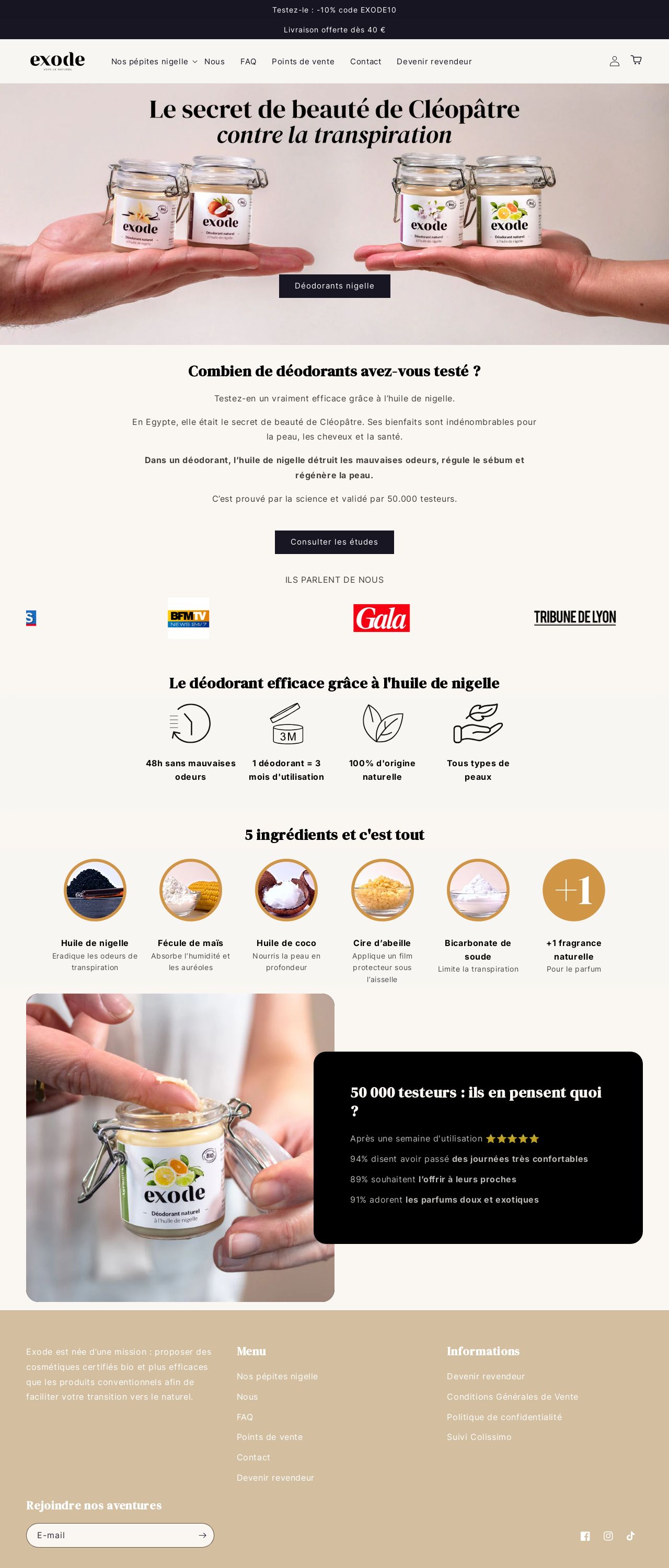
The visual design of the website is clean and simple, with a focus on showcasing the product. The use of a light beige background and white text creates a clean and neutral palette that allows the product to take center stage. The images of the product are well-lit and visually appealing, making it easy for customers to see the product in detail. The overall design is well-organized and easy to navigate, making it simple for customers to find what they're looking for. One area for improvement is the lack of visual hierarchy, making it difficult to distinguish between different sections of the website. Additionally, the use of a single font throughout the website can make it feel a bit flat. To improve this, consider using a clear and concise font hierarchy, as well as incorporating images and graphics to break up the text and add visual interest. Overall, the visual design of the website is effective in showcasing the product and creating a clean and simple user experience.
Recommendation:
Use a clear and concise font hierarchy, and incorporate images and graphics to break up the text and add visual interest.
Layout and Clarity
The layout of the website is well-organized and easy to navigate, with clear headings and concise text. The use of a clear and simple structure makes it easy for customers to find what they're looking for. The website is also responsive, adapting to different screen sizes and devices, which is important for creating a good user experience. One area for improvement is the lack of clear calls-to-action, making it difficult for customers to know what to do next. Additionally, the use of a single column format can make the website feel a bit linear and unengaging. To improve this, consider using a multi-column format and incorporating clear calls-to-action throughout the website. Overall, the layout and clarity of the website are effective in creating a clear and easy-to-use user experience.
Recommendation:
Use a multi-column format and incorporate clear calls-to-action throughout the website.
Content
The content of the website is clear and concise, providing customers with all the information they need to make a purchase. The use of short paragraphs and bullet points makes it easy to scan and understand the content. The website also includes a clear and easy-to-use search function, making it simple for customers to find what they're looking for. One area for improvement is the lack of engaging content, such as customer testimonials or product stories. Additionally, the website could benefit from more detailed product information, such as ingredient lists and usage instructions. To improve this, consider incorporating more engaging content and providing more detailed product information. Overall, the content of the website is effective in providing customers with the information they need to make a purchase.
Recommendation:
Incorporate more engaging content, such as customer testimonials or product stories, and provide more detailed product information.
This website was last rated on Jan. 16, 2025, 2:53 p.m.
Disclaimer: ratemysite.app is not affiliated with the website you are viewing, and does not endorse it in any way.
Ratings are subjective and based on AI's analysis. We filter out explicit or dangerous content, but cannot guarantee that all sites are safe.
All rights reserved. © ratemysite.app 2024. Contact: hello @ domain.
