Rate your website in seconds – get instant feedback.
I will rate your website's design and give recommendations to enhance its visual appeal and user experience. See how your site ranks on the leaderboard!
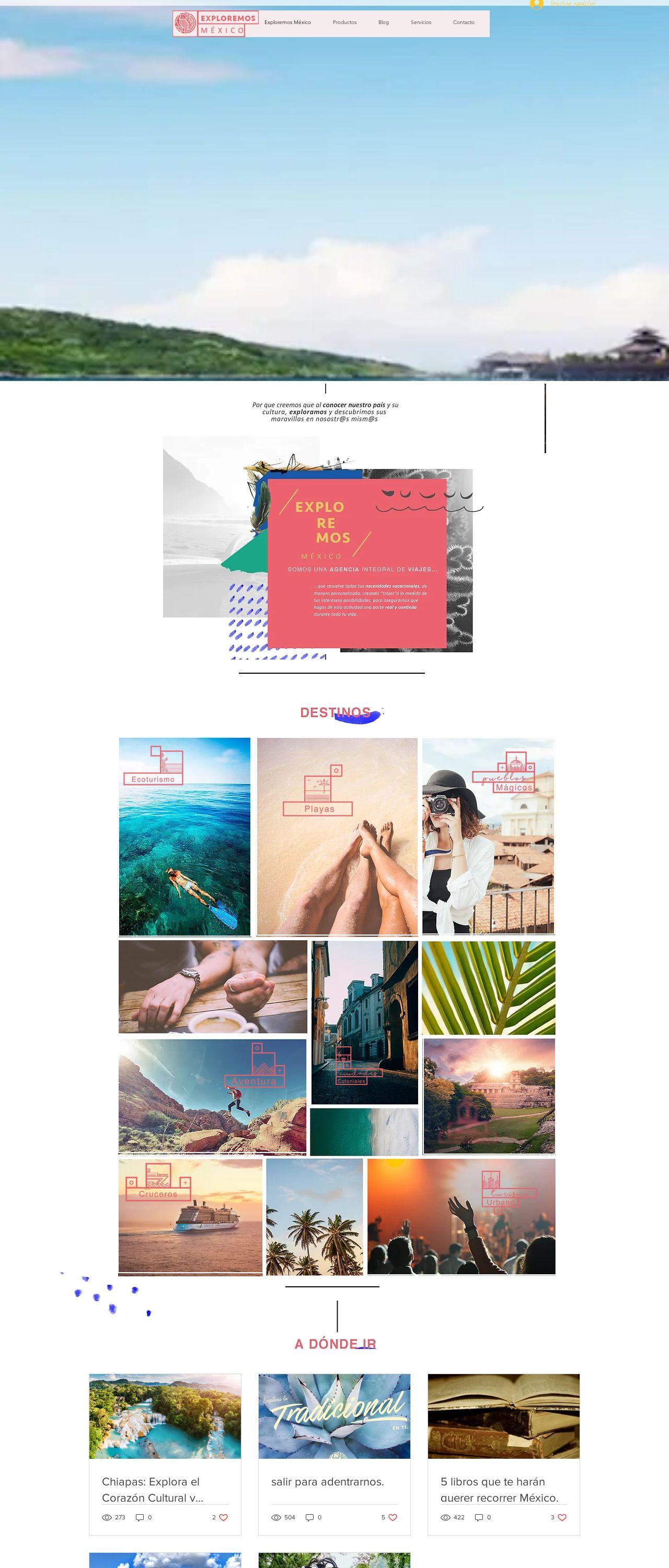
Exploremos México | Agencia de Viajes

Analyzed by AI for fun and insights - not to be taken too seriously!
Visual Design
The visual design of the website is quite striking, with a bold color scheme that immediately grabs the viewer's attention. The use of bright blues and greens creates a sense of energy and vibrancy, which is perfect for a travel agency website. The images used throughout the site are also high-quality and visually appealing, showcasing the beauty of Mexico's landscapes and cultural attractions. However, the design could benefit from a bit more cohesion and consistency in terms of typography and layout. Some of the font sizes and styles feel a bit disjointed, which can make the site feel a bit cluttered at times. Additionally, the use of white space could be improved to create a more balanced and harmonious visual flow.
Recommendation:
Refine typography and layout for better cohesion.
Layout and Clarity
The layout of the website is generally well-organized, with clear sections and easy-to-use navigation. The use of a grid system helps to create a sense of structure and organization, making it easy for users to find what they're looking for. However, there are a few areas where the layout could be improved. For example, the footer feels a bit cluttered, with too many links and too much text. Additionally, some of the images feel a bit oversized, which can make the site feel overwhelming at times. In terms of clarity, the site does a good job of communicating its message and purpose. The language is clear and concise, and the use of headings and subheadings helps to break up the content and make it easier to scan. However, there are a few areas where the language could be more concise and direct. For example, some of the paragraphs feel a bit wordy, which can make it hard for users to quickly scan and understand the content.
Recommendation:
Simplify footer and optimize image sizes.
Content
The content of the website is engaging and informative, providing users with a wealth of information about Mexico's cultural attractions and travel destinations. The language is clear and concise, and the use of headings and subheadings helps to break up the content and make it easier to scan. However, there are a few areas where the content could be improved. For example, some of the paragraphs feel a bit wordy, which can make it hard for users to quickly scan and understand the content. Additionally, the site could benefit from more visual elements, such as images and videos, to help break up the text and make the content more engaging. In terms of quality, the content is generally well-written and free of errors. However, there are a few areas where the language could be more concise and direct. For example, some of the paragraphs feel a bit repetitive, which can make the content feel a bit dull at times.
Recommendation:
Condense paragraphs and add more visuals.
This website was last rated on Nov. 19, 2024, 4:22 p.m.
Disclaimer: ratemysite.app is not affiliated with the website you are viewing, and does not endorse it in any way.
Ratings are subjective and based on AI's analysis. We filter out explicit or dangerous content, but cannot guarantee that all sites are safe.
All rights reserved. © ratemysite.app 2024. Contact: hello @ domain.
