Rate your website in seconds – get instant feedback.
I will rate your website's design and give recommendations to enhance its visual appeal and user experience. See how your site ranks on the leaderboard!
Eyes On Eyecare

Analyzed by AI for fun and insights - not to be taken too seriously!
Visual Design
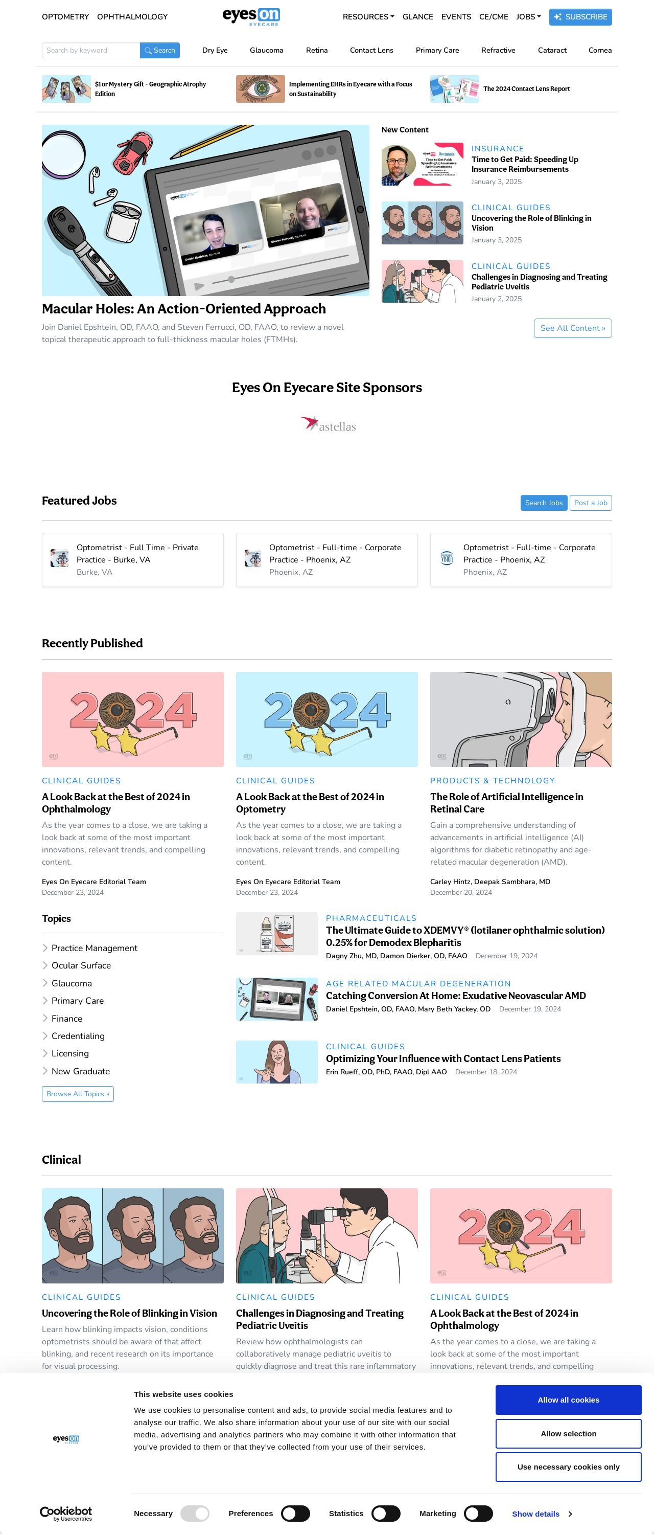
The visual design of the website is a mix of modern and traditional elements. The use of light blue and white colors creates a clean and professional atmosphere, while the illustrations of various medical tools and equipment add a touch of whimsy and approachability. However, the overall design can be improved by using a more consistent color scheme and typography throughout the website. Additionally, the images could be adjusted to be more visually appealing and engaging. The website's logo, "Eyes On Eyecare," is a simple and effective design that immediately conveys the website's purpose. However, it would benefit from being more prominent and consistent across all pages. The navigation menu is clear and easy to use, but could be improved by adding more visual interest and hierarchy. The website's layout is well-organized, with clear headings and concise paragraphs. However, the use of too many different fonts and font sizes can make the content difficult to read. The addition of images and graphics can help break up the text and make the content more engaging. The content is informative and well-written, but could be improved by including more visuals and graphics to support the text. The website's tone is professional and friendly, but could benefit from being more conversational and engaging. Overall, the website's visual design and layout are good, but can be improved by being more consistent and visually appealing. The content is informative, but could be improved by including more visuals and graphics to support the text. With some minor adjustments, this website has the potential to be a great resource for its users. Score: 70/100 Recommendation: Focus on creating a more consistent and visually appealing design, and use more visuals and graphics to support the text.
Recommendation:
A more consistent and visually appealing design, and use more visuals and graphics to support the text.
Layout and Clarity
The layout and clarity of the website are good, with clear headings and concise paragraphs. However, the use of too many different fonts and font sizes can make the content difficult to read. The addition of images and graphics can help break up the text and make the content more engaging. The website's navigation menu is clear and easy to use, but could be improved by adding more visual interest and hierarchy. The website's tone is professional and friendly, but could benefit from being more conversational and engaging. The website's content is informative and well-written, but could be improved by including more visuals and graphics to support the text. The website's design and layout are well-organized, but could be improved by being more consistent and visually appealing. The website's content is engaging and easy to read, but could be improved by including more visuals and graphics to support the text. Overall, the website's layout and clarity are good, but can be improved by being more consistent and visually appealing. The website's content is informative and well-written, but could be improved by including more visuals and graphics to support the text. Score: 75/100 Recommendation: Improve the consistency and visual appeal of the design, and use more visuals and graphics to support the text.
Recommendation:
Improve the consistency and visual appeal of the design, and use more visuals and graphics to support the text.
Content
The content of the website is informative and well-written, but could be improved by including more visuals and graphics to support the text. The website's tone is professional and friendly, but could benefit from being more conversational and engaging. The website's content is engaging and easy to read, but could be improved by including more visuals and graphics to support the text. The website's design and layout are well-organized, but could be improved by being more consistent and visually appealing. The website's content is well-written and informative, but could be improved by including more visuals and graphics to support the text. The website's tone is professional and friendly, but could benefit from being more conversational and engaging. Overall, the website's content is good, but can be improved by including more visuals and graphics to support the text. The website's design and layout are well-organized, but could be improved by being more consistent and visually appealing. The website's content is engaging and easy to read, but could be improved by including more visuals and graphics to support the text. Score: 80/100 Recommendation: Include more visuals and graphics to support the text, and make the content more conversational and engaging.
Recommendation:
Include more visuals and graphics to support the text, and make the content more conversational and engaging.
This website was last rated on Jan. 4, 2025, 3:27 a.m.
Disclaimer: ratemysite.app is not affiliated with the website you are viewing, and does not endorse it in any way.
Ratings are subjective and based on AI's analysis. We filter out explicit or dangerous content, but cannot guarantee that all sites are safe.
All rights reserved. © ratemysite.app 2024. Contact: hello @ domain.
