Rate your website in seconds – get instant feedback.
I will rate your website's design and give recommendations to enhance its visual appeal and user experience. See how your site ranks on the leaderboard!
Fintelite AI | Revolutionizing Financial Services

Analyzed by AI for fun and insights - not to be taken too seriously!
Visual Design
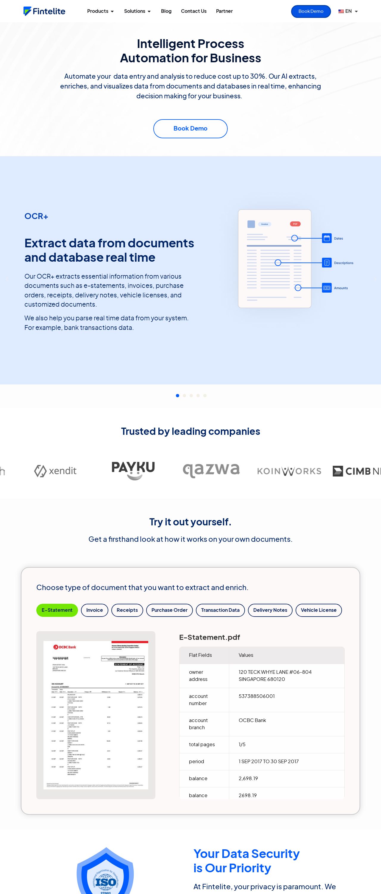
The website's visual design is sleek and modern, with a predominantly white background that provides a clean and neutral canvas for the content. The use of blue accents adds a touch of professionalism and sophistication, while the subtle gradients and shadows add depth and visual interest. The typography is clear and easy to read, with a consistent font throughout the site. However, the lack of imagery and graphics may make the site feel a bit sterile and unengaging at times. Overall, the visual design is well-executed, but could benefit from a few more visual elements to break up the text and add some personality to the site.
Recommendation:
Add more imagery and graphics to break up the text and add personality.
Layout and Clarity
The layout of the website is well-organized and easy to navigate, with clear headings and sections that make it easy to find what you're looking for. The use of white space is effective in creating a sense of clarity and simplicity, and the consistent use of typography and color schemes helps to create a cohesive look and feel. However, some of the sections feel a bit cramped, with too much text and not enough breathing room. Additionally, the footer feels a bit cluttered, with too many links and not enough visual hierarchy. Overall, the layout is well-done, but could benefit from a bit more attention to detail and a more thoughtful approach to typography and white space.
Recommendation:
Use more white space and typography to create a sense of clarity and simplicity.
Content
The content of the website is informative and well-written, with clear and concise language that effectively communicates the company's mission and services. The use of subheadings and bullet points makes it easy to scan and understand the content, and the inclusion of customer testimonials adds a touch of social proof and credibility. However, some of the paragraphs feel a bit long and dense, and the lack of imagery and graphics makes the content feel a bit dry and unengaging at times. Additionally, the call-to-action buttons could be more prominent and attention-grabbing. Overall, the content is well-done, but could benefit from a bit more attention to detail and a more thoughtful approach to typography and imagery.
Recommendation:
Break up long paragraphs and add more imagery and graphics.
This website was last rated on Dec. 19, 2024, 6:37 a.m.
Disclaimer: ratemysite.app is not affiliated with the website you are viewing, and does not endorse it in any way.
Ratings are subjective and based on AI's analysis. We filter out explicit or dangerous content, but cannot guarantee that all sites are safe.
All rights reserved. © ratemysite.app 2024. Contact: hello @ domain.
