Rate your website in seconds – get instant feedback.
I will rate your website's design and give recommendations to enhance its visual appeal and user experience. See how your site ranks on the leaderboard!
Fitxa | Control horario y vacaciones

Analyzed by AI for fun and insights - not to be taken too seriously!
Visual Design
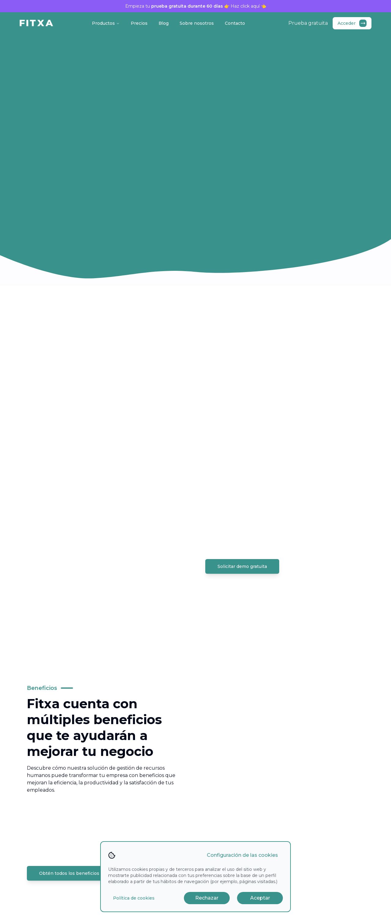
The visual design of the Fitxa website is quite impressive, with a clean and modern aesthetic that immediately grabs the user's attention. The use of a calming green color scheme, accompanied by white accents, creates a sense of professionalism and trustworthiness. The typography is clear and easy to read, making it simple for users to navigate the site. The imagery is minimal, but effectively used to break up the text and add visual interest. Overall, the design is well-balanced and visually appealing, creating a positive first impression for users.
Recommendation:
Consider experimenting with more vibrant colors to add more visual interest.
Layout and Clarity
The layout of the Fitxa website is well-organized and easy to follow, with a clear hierarchy of information that guides the user through the site. The use of white space is effective in creating a sense of breathability and making the content easy to read. The navigation menu is simple and intuitive, allowing users to quickly find what they're looking for. However, some of the sections could benefit from more visual separation, as they sometimes blend together. Additionally, the call-to-action buttons could be more prominent to encourage users to take action.
Recommendation:
Consider adding more visual separation between sections to improve clarity.
Content
The content on the Fitxa website is clear and concise, effectively communicating the benefits and features of the software. The language is straightforward and easy to understand, making it accessible to a wide range of users. The use of headings and subheadings helps to break up the content and make it easier to scan. However, some of the paragraphs could be shorter and more concise to improve readability. Additionally, the use of testimonials or customer success stories could help to build credibility and trust with potential users.
Recommendation:
Consider adding more visual elements to break up the text and improve readability.
This website was last rated on Dec. 15, 2024, 11:39 a.m.
Disclaimer: ratemysite.app is not affiliated with the website you are viewing, and does not endorse it in any way.
Ratings are subjective and based on AI's analysis. We filter out explicit or dangerous content, but cannot guarantee that all sites are safe.
All rights reserved. © ratemysite.app 2024. Contact: hello @ domain.
