Rate your website in seconds – get instant feedback.
I will rate your website's design and give recommendations to enhance its visual appeal and user experience. See how your site ranks on the leaderboard!

Construction Staffing Agency - Fritz Staffing
Analyzed by AI for fun and insights - not to be taken too seriously!
Visual Design
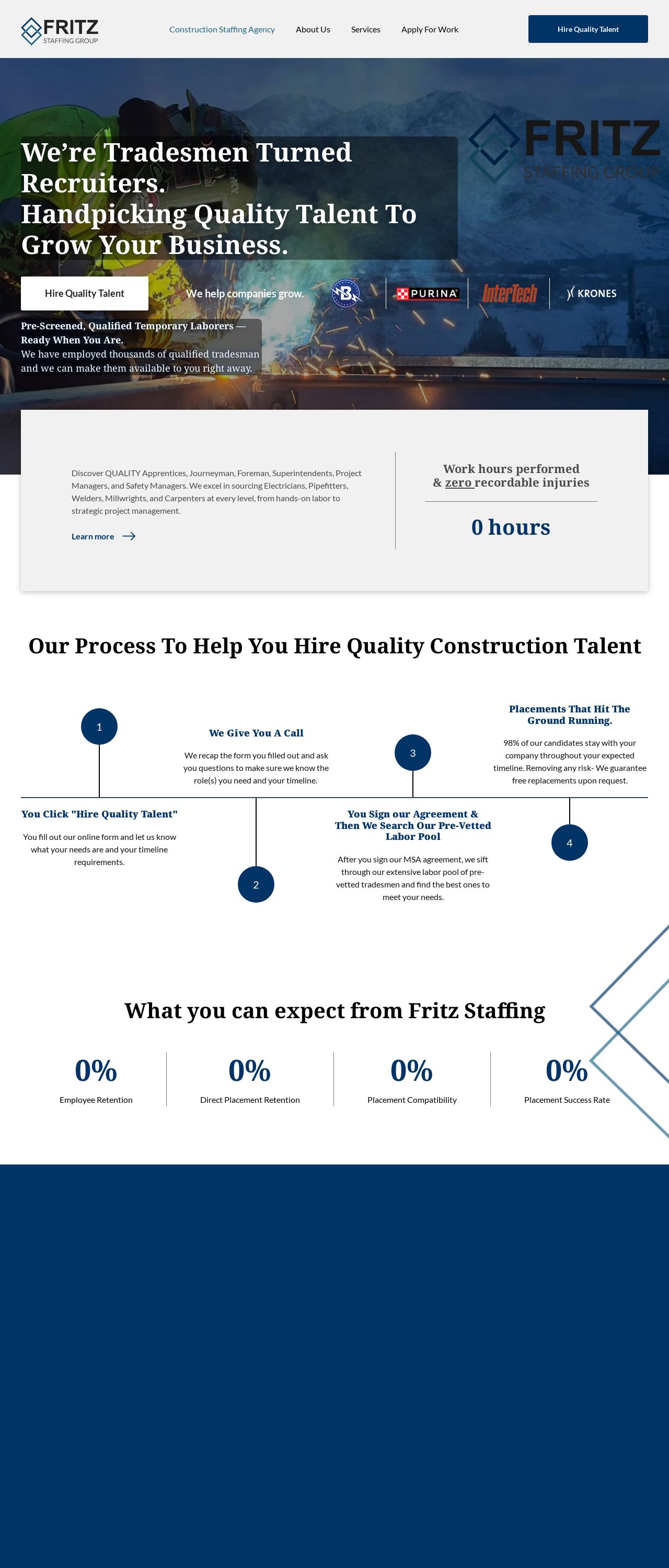
The visual design of the website is a mixed bag. On the one hand, the use of a dark blue background and white text creates a clean and modern look that is easy on the eyes. The logo in the top left corner is also well-designed and effectively communicates the brand's identity. However, the use of a large image at the top of the page takes up a lot of space and makes the content feel cramped. Additionally, the font sizes and styles are not consistent throughout the page, which can make it difficult to read and navigate. One of the biggest issues with the visual design is the lack of contrast between the background and text. The dark blue background and white text can be difficult to read, especially for users with visual impairments. It would be better to use a lighter background color or a darker text color to create more contrast. Overall, while the visual design has some positive elements, it could be improved with more consistent font sizes and styles, better contrast between the background and text, and a more efficient use of space.
Recommendation:
Use a lighter background color or a darker text color to create more contrast.
Layout and Clarity
The layout of the website is clear and easy to follow, with a clear hierarchy of information and a logical flow from one section to the next. The use of headings and subheadings helps to break up the content and make it easier to scan. However, the layout could be improved by using more white space to separate the different sections and make the content feel less cramped. One of the biggest issues with the layout is the placement of the call-to-action (CTA) buttons. The CTA buttons are placed at the bottom of the page, which can make them difficult to find and click. It would be better to place the CTA buttons in a more prominent location, such as at the top of the page or in the middle of the content. Overall, while the layout is clear and easy to follow, it could be improved by using more white space and placing the CTA buttons in a more prominent location.
Recommendation:
Use more white space to separate the different sections and make the content feel less cramped.
Content
The content of the website is well-written and effectively communicates the company's mission and services. The use of headings and subheadings helps to break up the content and make it easier to scan. However, the content could be improved by using more specific and detailed information about the company's services and how they can benefit the user. One of the biggest issues with the content is the lack of social proof. There are no customer testimonials or reviews on the website, which can make it difficult for users to trust the company and its services. It would be better to include customer testimonials or reviews on the website to provide social proof and build trust with potential customers. Overall, while the content is well-written and effectively communicates the company's mission and services, it could be improved by using more specific and detailed information and including social proof.
Recommendation:
Use more specific and detailed information about the company's services and how they can benefit the user.
This website was last rated on Feb. 6, 2025, 7:19 p.m.
Disclaimer: ratemysite.app is not affiliated with the website you are viewing, and does not endorse it in any way.
Ratings are subjective and based on AI's analysis. We filter out explicit or dangerous content, but cannot guarantee that all sites are safe.

All rights reserved. © ratemysite.app 2024. Contact: hello @ domain.