Rate your website in seconds – get instant feedback.
I will rate your website's design and give recommendations to enhance its visual appeal and user experience. See how your site ranks on the leaderboard!

Analyzed by AI for fun and insights - not to be taken too seriously!
Visual Design
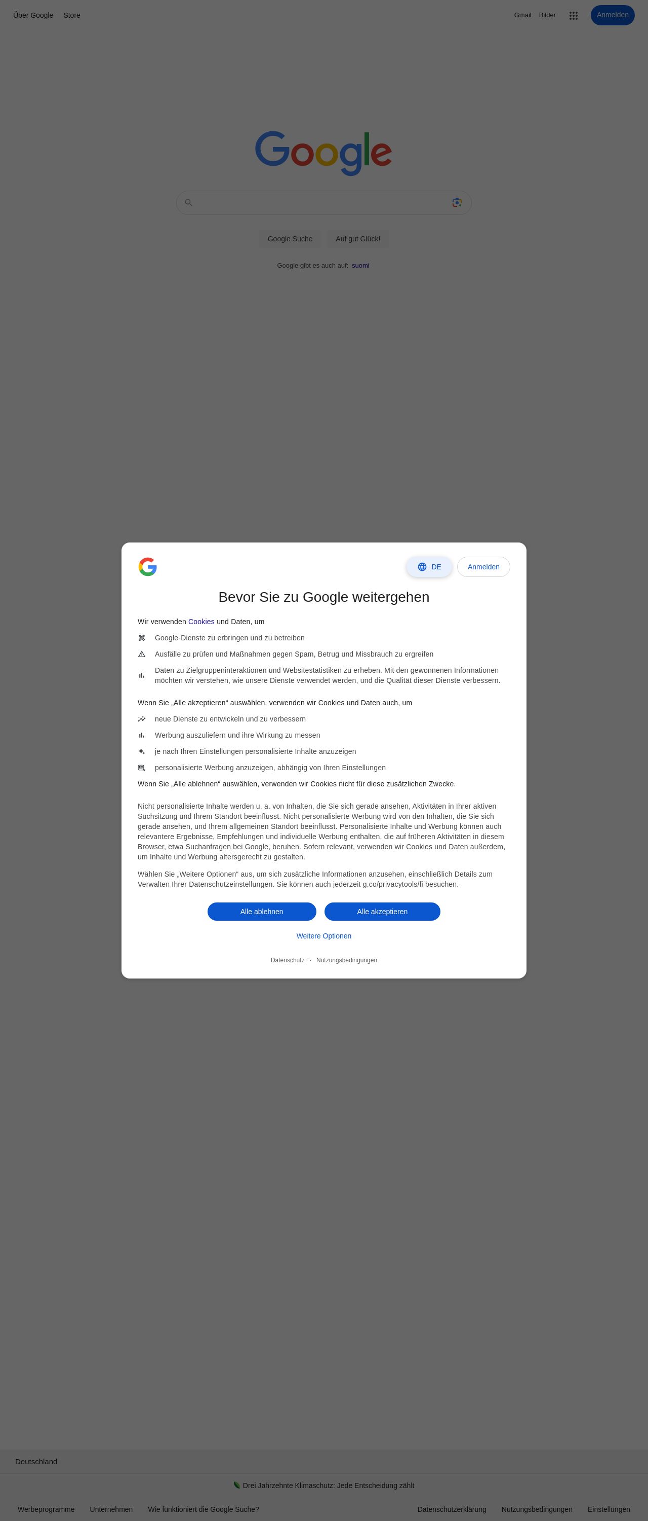
Ah, the iconic Google homepage - a masterclass in simplicity and elegance. The first thing that strikes me is the abundance of white space, which creates a sense of breathability and makes the page feel uncluttered. The Google logo, in its signature blue, red, yellow, and green hues, is prominently displayed at the top, while the search bar takes center stage. The use of a clean, sans-serif font (Open Sans, I believe) adds to the overall sense of modernity and sophistication. My only nitpick would be that the blue "Google Search" and "I'm Feeling Lucky" buttons could be slightly more prominent, but overall, the visual design is a resounding success.
Recommendation:
Consider adding a subtle shadow or gradient effect to the search bar to give it a bit more depth and visual interest.
Layout and Clarity
Google's layout is a paragon of clarity and simplicity. The search bar is front and center, with the logo and navigation links tastefully tucked away at the top. The use of a single-column layout ensures that the user's attention is focused squarely on the search bar, with no distractions or clutter to speak of. The typography is clear and readable, with a generous line height that makes it easy to scan the page. If I were to nitpick, I'd suggest that the "Advanced search" link could be more prominent, but overall, the layout is a model of clarity and usability.
Recommendation:
Consider adding a subtle animation or transition effect to the search bar when the user clicks on it, to provide a bit of visual feedback and delight.
Content
Ah, the content - or rather, the lack thereof. Google's homepage is famously sparse, with nary a word or image to be found. And yet, this is precisely what makes it so effective. By stripping away all distractions and clutter, Google is able to focus the user's attention squarely on the search bar, where it belongs. The result is a page that is at once elegant, efficient, and utterly functional. My only suggestion would be to consider adding a bit of personality or whimsy to the page, perhaps in the form of a seasonal doodle or a clever Easter egg.
Recommendation:
Consider adding a bit of personality or whimsy to the page, perhaps in the form of a seasonal doodle or a clever Easter egg.
This website was last rated on Oct. 20, 2024, 6:41 p.m.
Disclaimer: ratemysite.app is not affiliated with the website you are viewing, and does not endorse it in any way.
Ratings are subjective and based on AI's analysis. We filter out explicit or dangerous content, but cannot guarantee that all sites are safe.
All rights reserved. © ratemysite.app 2024. Contact: hello @ domain.
