Rate your website in seconds – get instant feedback.
I will rate your website's design and give recommendations to enhance its visual appeal and user experience. See how your site ranks on the leaderboard!
HelloSilk - Taies d’Oreiller en Soie et Accessoires Beauté Naturels – Hellosilk

Analyzed by AI for fun and insights - not to be taken too seriously!
Visual Design
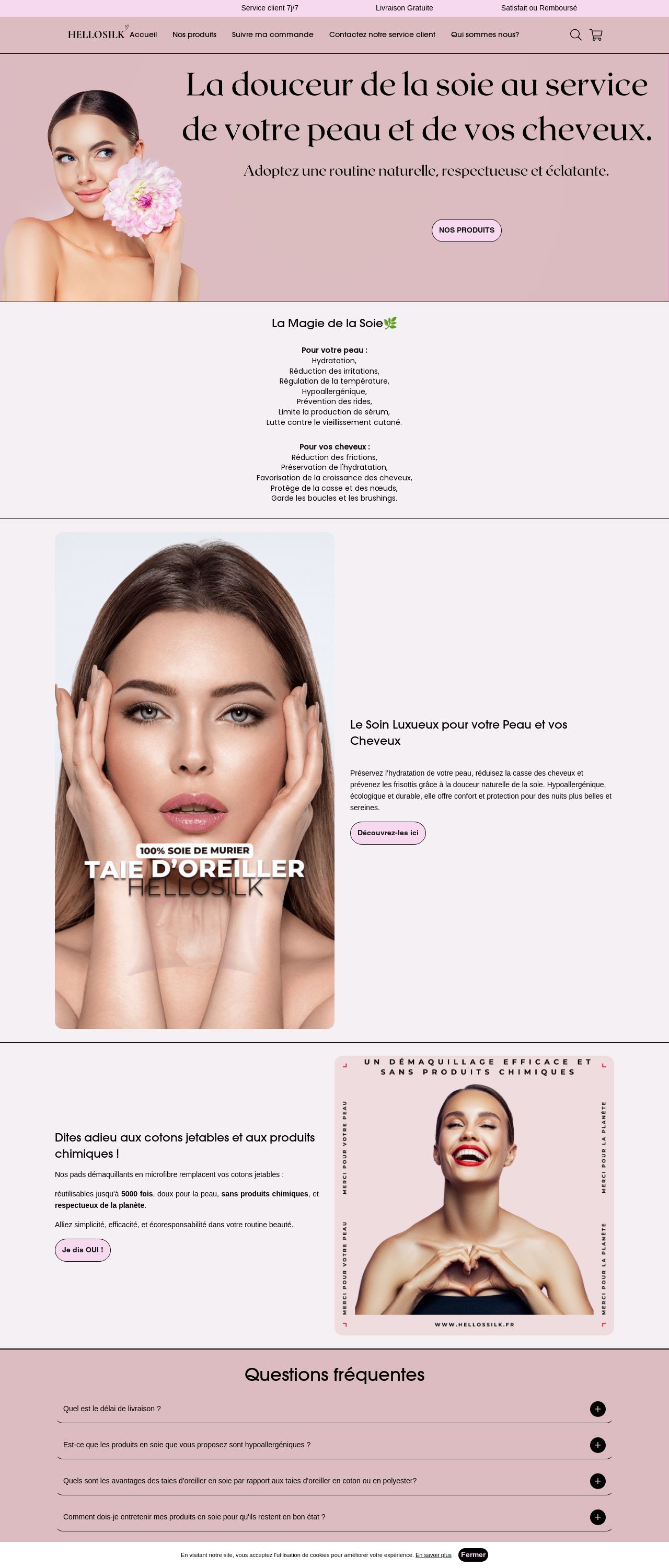
The visual design of the website is predominantly pink and white, with a clean and minimalist aesthetic. The use of pink as the primary color creates a soft and feminine atmosphere, which is fitting for a beauty and skincare website. However, the design is not overly feminine, and the overall look is modern and sophisticated. The website's layout is well-organized, with clear headings and concise text. The images of women are used throughout the site, but they are not overly sexualized, and the focus is on showcasing the products and services rather than objectifying the models. The design is easy on the eyes, and the use of negative space creates a sense of calmness. However, the design could benefit from a bit more creativity and experimentation, as it feels a bit safe and predictable. Overall, the visual design is effective in communicating the brand's message and creating a positive user experience.
Recommendation:
Consider incorporating more creative and experimental design elements to make the website stand out.
Layout and Clarity
The layout of the website is clean and easy to navigate, with clear headings and concise text. The use of white space is effective in creating a sense of calmness and making the content easy to read. The website's structure is logical, with each section flowing smoothly into the next. The navigation menu is well-organized, and the search function is easily accessible. However, the website could benefit from a bit more clarity and organization, particularly in the footer section, where the links are not clearly labeled. Overall, the layout is effective in communicating the brand's message and creating a positive user experience.
Recommendation:
Consider adding more clear labels and organization to the footer section to improve user experience.
Content
The content on the website is well-written and informative, with a focus on showcasing the products and services. The use of bullet points and short paragraphs makes the content easy to read and understand. The website provides a clear call-to-action, encouraging users to explore the products and services. However, the content could benefit from a bit more depth and detail, particularly in the product descriptions. Additionally, the website could benefit from more customer testimonials and reviews to build trust and credibility. Overall, the content is effective in communicating the brand's message and creating a positive user experience.
Recommendation:
Consider adding more depth and detail to the product descriptions, as well as incorporating customer testimonials and reviews to build trust and credibility.
This website was last rated on Jan. 16, 2025, 2:52 p.m.
Disclaimer: ratemysite.app is not affiliated with the website you are viewing, and does not endorse it in any way.
Ratings are subjective and based on AI's analysis. We filter out explicit or dangerous content, but cannot guarantee that all sites are safe.
All rights reserved. © ratemysite.app 2024. Contact: hello @ domain.
