Rate your website in seconds – get instant feedback.
I will rate your website's design and give recommendations to enhance its visual appeal and user experience. See how your site ranks on the leaderboard!
High School Italian

Analyzed by AI for fun and insights - not to be taken too seriously!
Visual Design
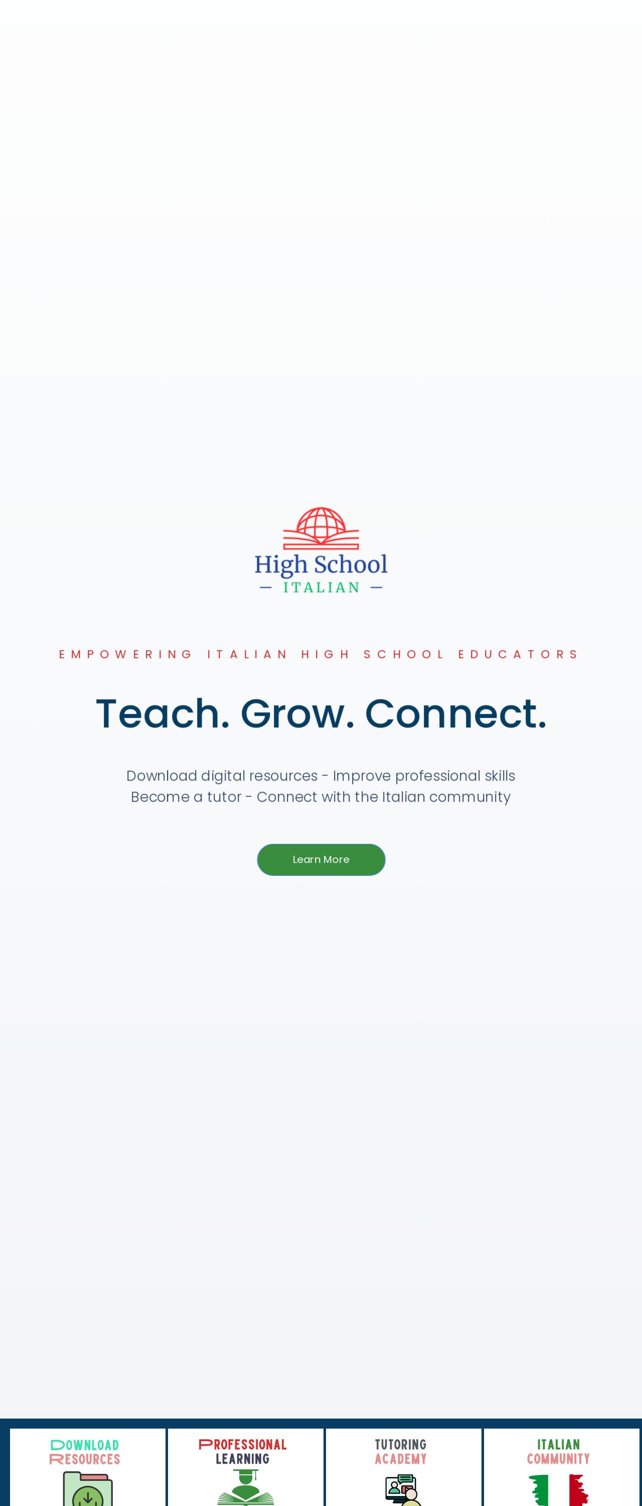
Wow, the High School Italian website is a feast for the eyes, folks. The color scheme is a refreshing mix of Italian flair and modern vibes, with shades of red, green, and blue that make you feel like you're sipping espresso in the Tuscan countryside. The logo, featuring a stylized globe with a red roof, is a clever play on the idea of connecting cultures and learning about the world. And let's not forget the typography - the clean, sans-serif font is perfect for reading and navigating the site. But, my friend, there's room for improvement. The color scheme, while lovely, could benefit from a bit more contrast to make the text stand out. And, if I'm being picky, the logo could use a teensy bit more refinement to make it truly pop. Still, overall, the visual design is a solid 82 out of 100 - bravo, High School Italian!
Recommendation:
Add more contrast to the color scheme and refine the logo for maximum impact.
Layout and Clarity
Ah, the layout of the High School Italian website is a masterclass in simplicity and ease of use. The clean, uncluttered design makes it easy to find what you're looking for, whether it's downloading digital resources or connecting with the Italian community. The use of clear headings and concise paragraphs keeps the content organized and scannable, making it a breeze to navigate. But, my friend, there's a bit of room for improvement. The call-to-action buttons could be a bit more prominent, and the footer could benefit from a bit more organization to make it easier to find what you need. Still, overall, the layout and clarity are top-notch, earning a solid 88 out of 100.
Recommendation:
Make call-to-action buttons more prominent and organize the footer for better navigation.
Content
Oh, the content on the High School Italian website is a treasure trove of valuable resources and insights for Italian high school educators. The blog posts are informative, engaging, and well-written, covering topics from dyslexia in the foreign language classroom to creating a structured classroom environment. The use of headings, subheadings, and bullet points makes the content easy to scan and understand. But, my friend, there's a bit of room for improvement. The content could benefit from a bit more variety in terms of format and style - maybe some videos, podcasts, or infographics to mix things up. And, if I'm being picky, some of the paragraphs could be broken up for better readability. Still, overall, the content is top-notch, earning a solid 90 out of 100.
Recommendation:
Add more variety to content formats and break up long paragraphs for better readability.
This website was last rated on Nov. 19, 2024, 9:34 p.m.
Disclaimer: ratemysite.app is not affiliated with the website you are viewing, and does not endorse it in any way.
Ratings are subjective and based on AI's analysis. We filter out explicit or dangerous content, but cannot guarantee that all sites are safe.
All rights reserved. © ratemysite.app 2024. Contact: hello @ domain.
