Rate your website in seconds – get instant feedback.
I will rate your website's design and give recommendations to enhance its visual appeal and user experience. See how your site ranks on the leaderboard!

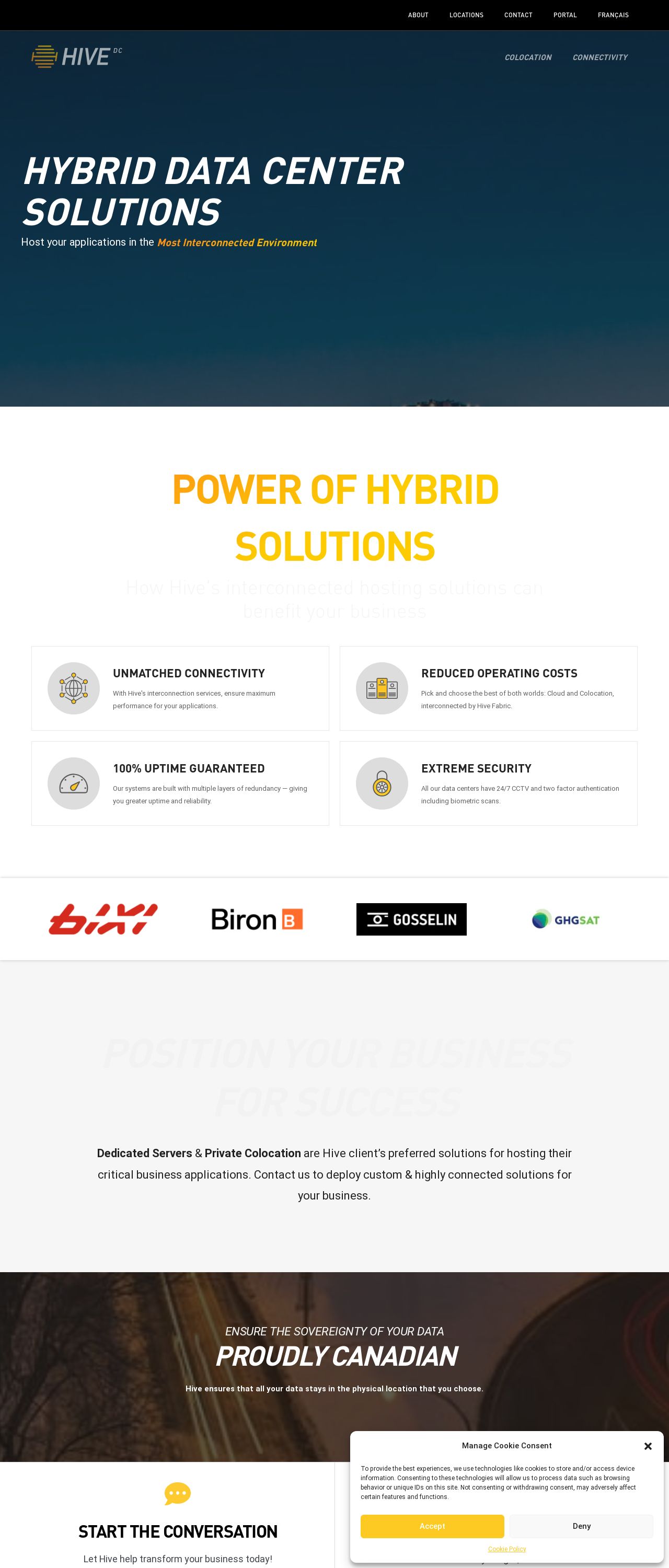
Hive Data Center: Server Colocation Montreal
Analyzed by AI for fun and insights - not to be taken too seriously!
Visual Design
Hive Data Center Solutions' website has a clean and professional visual design that effectively communicates the company's focus on hybrid data center solutions. The color scheme is a combination of blue and yellow, which creates a sense of calmness and optimism. The blue tone is used as the primary background color, while the yellow is used as an accent color to highlight important elements such as buttons and icons. The use of a consistent color scheme throughout the website creates a cohesive look and feel. The typography is clear and easy to read, with a sans-serif font used for the main content and a serif font used for headings. The font sizes are well-balanced, making it easy to scan the page and focus on the most important information. The use of white space is also effective, creating a sense of breathability and making the content feel less cluttered. One area for improvement is the use of images. While the website has a few high-quality images, they are not used consistently throughout the website. Adding more images or graphics could help break up the text and make the website more visually appealing.
Recommendation:
Add more images and graphics to break up the text and make the website more visually appealing.
Layout and Clarity
The layout of the website is well-organized and easy to navigate. The menu bar at the top of the page provides quick access to the main sections of the website, and the submenus provide additional options for drilling down into specific topics. The use of icons and graphics helps to break up the text and make the website more visually appealing. However, there are a few areas where the layout could be improved. For example, the "About" section is located at the bottom of the page, which may make it difficult for users to find. Additionally, the "Contact" section is not easily accessible from the menu bar, which may make it difficult for users to get in touch with the company.
Recommendation:
Move the "About" section to a more prominent location on the page, and add a "Contact" link to the menu bar.
Content
The content on the website is well-written and informative, providing a clear overview of the company's services and solutions. The use of headings and subheadings helps to break up the text and make it easier to scan. However, there are a few areas where the content could be improved. For example, the "Power of Hybrid Solutions" section is a bit vague and could be clarified. Additionally, the "Proudly Canadian" section feels like an afterthought and could be integrated more seamlessly into the rest of the content.
Recommendation:
Clarify the "Power of Hybrid Solutions" section and integrate the "Proudly Canadian" section more seamlessly into the rest of the content.
This website was last rated on Nov. 25, 2024, 2:43 p.m.
Disclaimer: ratemysite.app is not affiliated with the website you are viewing, and does not endorse it in any way.
Ratings are subjective and based on AI's analysis. We filter out explicit or dangerous content, but cannot guarantee that all sites are safe.

All rights reserved. © ratemysite.app 2024. Contact: hello @ domain.