Rate your website in seconds – get instant feedback.
I will rate your website's design and give recommendations to enhance its visual appeal and user experience. See how your site ranks on the leaderboard!

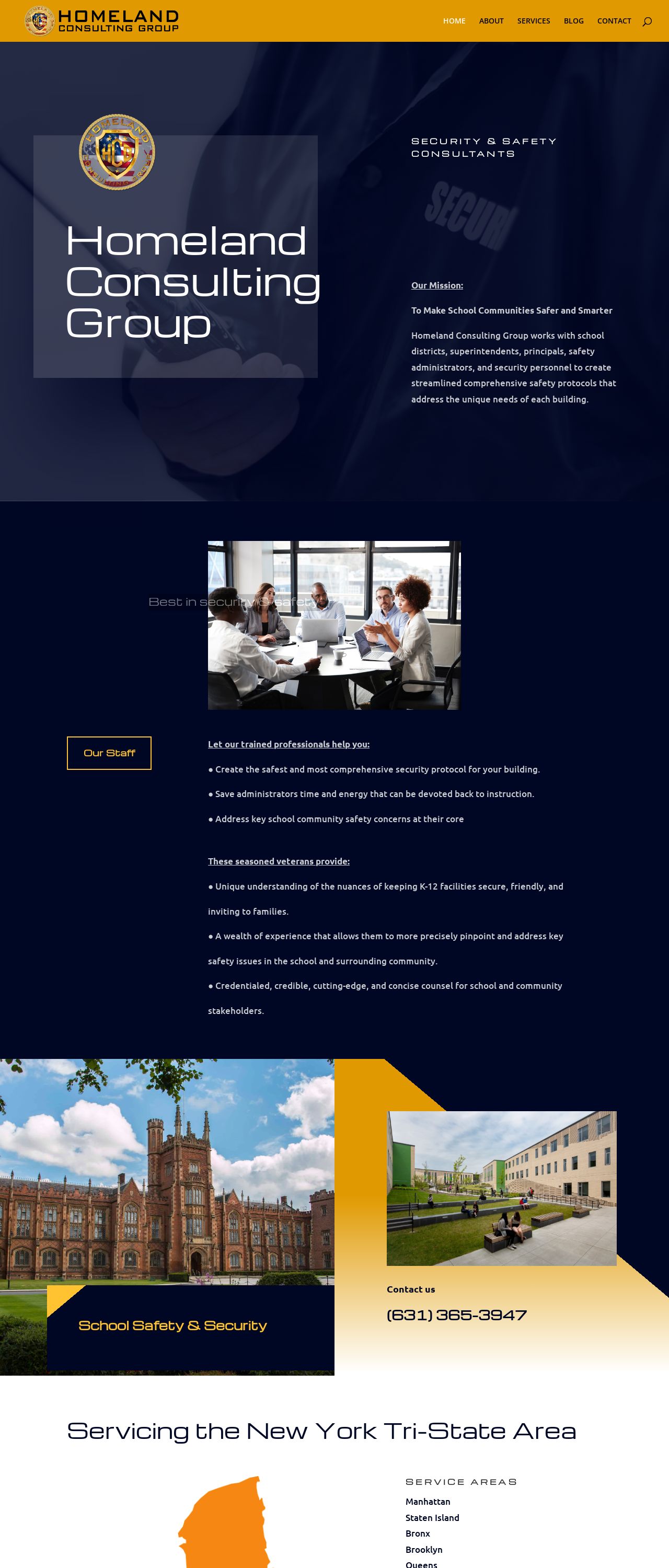
Homeland Consulting Group |
Analyzed by AI for fun and insights - not to be taken too seriously!
Visual Design
The visual design of the Homeland Consulting Group website is a combination of warm and cool colors, with a focus on safety and security. The use of dark blue and yellow tones creates a sense of professionalism and trustworthiness, while the images of schools and buildings add a sense of familiarity and approachability. The layout is clean and simple, with clear headings and concise text. However, the use of multiple images and graphics can make the page feel cluttered and busy. Additionally, the font sizes and styles vary throughout the page, which can make it difficult to read and understand. To improve the visual design, I recommend using a more consistent color scheme and font style throughout the page. Additionally, consider using more white space to create a cleaner and less cluttered layout. It's also important to ensure that the images and graphics are high-quality and do not distract from the content.
Recommendation:
A more consistent color scheme and font style, with a focus on white space and high-quality images
Layout and Clarity
The layout of the website is clear and easy to navigate, with a clear hierarchy of information and a consistent structure throughout the page. The use of headings and subheadings helps to break up the content and make it easier to read. However, the page is quite long, which can make it difficult to scan and understand. Additionally, the use of multiple images and graphics can make it difficult to focus on the content. To improve the layout and clarity, I recommend breaking up the content into smaller sections or pages, and using more white space to create a cleaner and less cluttered layout. It's also important to ensure that the headings and subheadings are clear and concise, and that the content is well-organized and easy to follow.
Recommendation:
A more structured and organized layout, with a focus on white space and clear headings and subheadings
Content
The content of the website is informative and well-written, providing a clear overview of the company's services and expertise. However, the text is quite dense and lacks any visual interest, making it difficult to read and understand. Additionally, there are no calls-to-action or opportunities for visitors to engage with the content. To improve the content, I recommend breaking up the text into smaller paragraphs and using more headings and subheadings to create a clear hierarchy of information. It's also important to add visual interest to the page, such as images, videos, or infographics, to make the content more engaging and shareable. Additionally, consider adding calls-to-action or opportunities for visitors to engage with the content, such as quizzes, surveys, or downloads.
Recommendation:
A more engaging and interactive content, with a focus on visual interest and clear calls-to-action
This website was last rated on Jan. 15, 2025, 1:02 a.m.
Disclaimer: ratemysite.app is not affiliated with the website you are viewing, and does not endorse it in any way.
Ratings are subjective and based on AI's analysis. We filter out explicit or dangerous content, but cannot guarantee that all sites are safe.

All rights reserved. © ratemysite.app 2024. Contact: hello @ domain.