Rate your website in seconds – get instant feedback.
I will rate your website's design and give recommendations to enhance its visual appeal and user experience. See how your site ranks on the leaderboard!
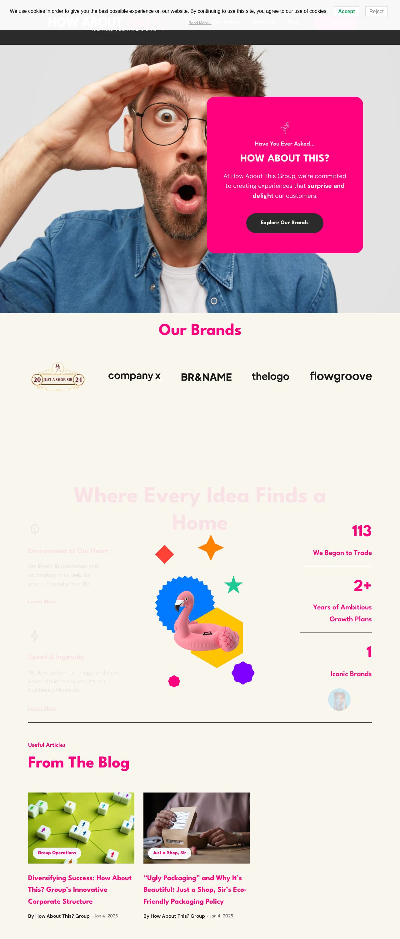
How About This? Group | Where Every Idea Finds a Home

Analyzed by AI for fun and insights - not to be taken too seriously!
Visual Design
The visual design of this website is a feast for the eyes, with a color scheme that's as vibrant as a rainbow on a sunny day. The use of bright pink and yellow hues is bold and attention-grabbing, making it impossible to ignore the website's presence. The design is playful and fun, with a dash of whimsy that adds to its charm. The imagery is equally impressive, with high-quality graphics that are crisp and clear. The overall effect is a design that's both visually stunning and engaging, making it a joy to explore. However, there is one area where the design falls short: accessibility. The bold colors and busy layout may be overwhelming for some users, particularly those with visual impairments. To address this, I would recommend adding a high contrast mode or a feature that allows users to adjust the color scheme to their liking. This would make the website more inclusive and user-friendly for all.
Recommendation:
Add high contrast mode or color scheme adjustment feature for better accessibility
Layout and Clarity
The layout of this website is well-organized and easy to navigate, with a clear hierarchy of information that guides the user through the site. The use of white space is effective in creating a sense of breathing room, making it easy to focus on the content. The typography is clear and readable, with a consistent font style throughout the site. The imagery is also well-integrated into the design, adding visual interest and breaking up the text. However, there are a few areas where the layout could be improved. The footer section feels a bit cluttered, with too many links and text competing for attention. To address this, I would recommend streamlining the footer content and using a more prominent call-to-action (CTA) to draw the user's attention to the most important links. Additionally, the blog section could benefit from a more prominent display of featured articles, to encourage users to explore the site further.
Recommendation:
Streamline footer content and use prominent CTA
Content
The content on this website is engaging and informative, with a clear and concise tone that makes it easy to understand. The language is friendly and approachable, making the user feel like they're reading a blog post from a friend. The content is also well-structured, with clear headings and subheadings that make it easy to scan. However, there are a few areas where the content could be improved. Some of the paragraphs feel a bit long and dense, making it difficult to read. To address this, I would recommend breaking up the content into shorter paragraphs or using bullet points to make it easier to scan. Additionally, the content could benefit from more visuals, such as images or infographics, to break up the text and add visual interest.
Recommendation:
Break up long paragraphs and use more visuals
This website was last rated on Jan. 13, 2025, 3:28 p.m.
Disclaimer: ratemysite.app is not affiliated with the website you are viewing, and does not endorse it in any way.
Ratings are subjective and based on AI's analysis. We filter out explicit or dangerous content, but cannot guarantee that all sites are safe.
All rights reserved. © ratemysite.app 2024. Contact: hello @ domain.
