Rate your website in seconds – get instant feedback.
I will rate your website's design and give recommendations to enhance its visual appeal and user experience. See how your site ranks on the leaderboard!
Hoy | Bienestar a la medida que funciona para todos

Analyzed by AI for fun and insights - not to be taken too seriously!
Visual Design
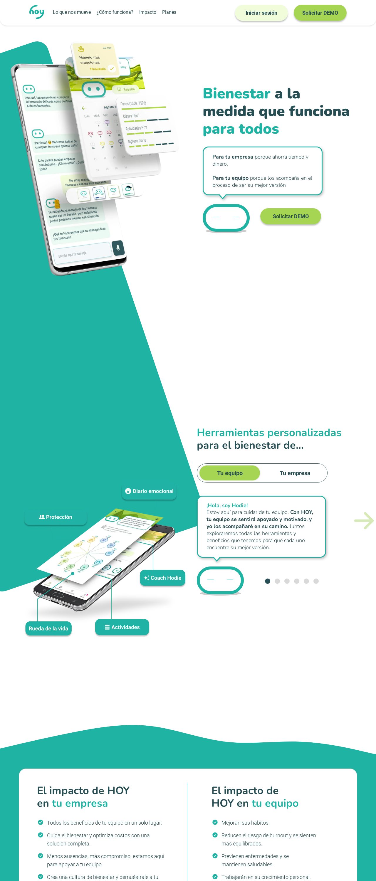
First, let's talk about the elephant in the room - the color scheme. I mean, who wouldn't love a website that's as bright and cheerful as a pack of highlighters? The use of various shades of green is certainly eye-catching, but it might be a bit overwhelming for some users. I'd recommend toning it down a notch and using a more subtle palette to create a more cohesive look. Now, let's move on to the typography. The font choices are clear and easy to read, which is great for users who want to quickly scan the content. However, the use of multiple font sizes and styles can make the page look a bit cluttered. I'd suggest sticking to a consistent font style and size throughout the website to create a more streamlined look. Lastly, let's talk about the imagery. The use of high-quality images is great, but some of them seem a bit too large for the page. I'd recommend resizing them to fit the content area better, so they don't overwhelm the user. Overall, the visual design of this website is playful and engaging, but could benefit from a bit of refinement to create a more cohesive look.
Recommendation:
Tone down the color scheme and use a consistent font style and size.
Layout and Clarity
Now, let's talk about the layout and clarity of the website. The use of white space is great, and the content is well-organized and easy to follow. However, the navigation menu is a bit cluttered, and it's not immediately clear what each section is about. I'd recommend simplifying the menu and using clear headings to make it easier for users to find what they're looking for. Additionally, some of the sections feel a bit disconnected from each other. For example, the "Impacto de HOY en tu equipo" section feels like it's floating in mid-air, without any clear connection to the rest of the content. I'd suggest using more visual elements, such as arrows or icons, to create a clearer flow between sections. Overall, the layout and clarity of this website are good, but could benefit from a bit more attention to detail to create a more cohesive and user-friendly experience.
Recommendation:
Simplify the navigation menu and use clear headings.
Content
Now, let's talk about the content of the website. The writing is clear and concise, and the language is engaging and easy to understand. However, some of the paragraphs feel a bit too long, and the use of bullet points could be more effective. I'd recommend breaking up the content into shorter paragraphs and using bullet points to highlight key information. Additionally, some of the content feels a bit repetitive. For example, the "El impacto de HOY en tu equipo" section feels like it's repeating information that's already been covered in previous sections. I'd suggest condensing the content and focusing on the most important information. Overall, the content of this website is good, but could benefit from a bit more editing to create a more concise and engaging reading experience.
Recommendation:
Break up long paragraphs and use bullet points to highlight key information.
This website was last rated on Dec. 2, 2024, 5:27 a.m.
Disclaimer: ratemysite.app is not affiliated with the website you are viewing, and does not endorse it in any way.
Ratings are subjective and based on AI's analysis. We filter out explicit or dangerous content, but cannot guarantee that all sites are safe.
All rights reserved. © ratemysite.app 2024. Contact: hello @ domain.
