Rate your website in seconds – get instant feedback.
I will rate your website's design and give recommendations to enhance its visual appeal and user experience. See how your site ranks on the leaderboard!

Yritys-, sijoittaja- ja vastuullisuusviestintä | IR Partners | Viestintätoimisto
Analyzed by AI for fun and insights - not to be taken too seriously!
Visual Design
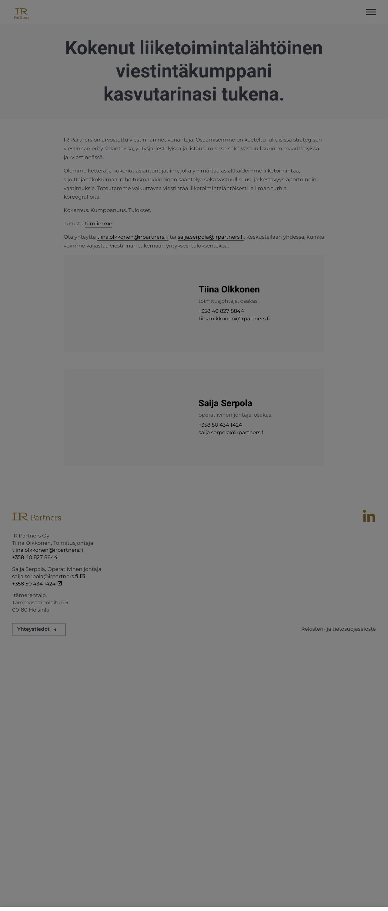
The visual design of the website is clean and minimalistic, with a focus on simplicity and ease of use. The color scheme is predominantly gray, which gives the website a professional and modern look. The typography is clear and easy to read, with a consistent font size and style throughout the website. The images and graphics are simple and unobtrusive, adding visual interest without distracting from the content. The overall design is well-organized and easy to navigate, making it easy for users to find the information they need. The website's visual design is effective in communicating the company's brand and values, and it is well-suited to the company's target audience. The design is also highly customizable, which allows the company to easily update the website's look and feel as needed. However, the website's visual design is not particularly memorable or distinctive. The design is straightforward and functional, but it does not stand out in any particular way. This may make it difficult for the company to establish a strong brand identity or to differentiate itself from competitors. Overall, the website's visual design is effective in communicating the company's brand and values, and it is well-suited to the company's target audience. However, it is not particularly memorable or distinctive, which may make it difficult for the company to establish a strong brand identity or to differentiate itself from competitors.
Recommendation:
Consider adding more visual interest and personality to the website's design, such as through the use of color, texture, and graphics. Also, consider adding more distinctive elements to the website's design, such as a logo or tagline, to help establish a strong brand identity.
Layout and Clarity
The layout and clarity of the website are excellent, with a clear and intuitive navigation menu and a well-organized structure. The content is easy to read and understand, with clear headings and concise paragraphs. The website is free from clutter and distractions, making it easy for users to focus on the content. The website's layout is well-designed, with a clear hierarchy of information and a logical flow of content. The use of white space is effective in creating a clean and uncluttered design, and the text is easy to read and understand. The website's layout is also highly responsive, making it easy to navigate on a variety of devices. However, the website's layout and clarity could be improved by adding more visual interest and personality to the design. The website's design is straightforward and functional, but it does not stand out in any particular way. This may make it difficult for the company to establish a strong brand identity or to differentiate itself from competitors. Overall, the website's layout and clarity are excellent, making it easy for users to navigate and find the information they need. However, the design could be improved by adding more visual interest and personality to the design, and by establishing a stronger brand identity.
Recommendation:
Consider adding more visual interest and personality to the website's design, such as through the use of color, texture, and graphics. Also, consider adding more distinctive elements to the website's design, such as a logo or tagline, to help establish a strong brand identity.
Content
The content on the website is well-written and informative, with clear and concise paragraphs and headings. The website provides a good overview of the company's services and expertise, and it is easy to navigate and find the information you need. The content is well-organized and easy to understand, with a clear and logical flow of information. The website's content is also highly relevant to the company's target audience, providing valuable insights and information on the company's services and expertise. However, the content could be improved by adding more visual interest and personality to the design. The website's content is well-written and informative, but it does not stand out in any particular way. This may make it difficult for the company to establish a strong brand identity or to differentiate itself from competitors. Overall, the website's content is excellent, providing a good overview of the company's services and expertise. However, the content could be improved by adding more visual interest and personality to the design, and by establishing a stronger brand identity.
Recommendation:
Consider adding more visual interest and personality to the website's design, such as through the use of color, texture, and graphics. Also, consider adding more distinctive elements to the website's design, such as a logo or tagline, to help establish a strong brand identity.
This website was last rated on Feb. 10, 2025, 11:40 a.m.
Disclaimer: ratemysite.app is not affiliated with the website you are viewing, and does not endorse it in any way.
Ratings are subjective and based on AI's analysis. We filter out explicit or dangerous content, but cannot guarantee that all sites are safe.

All rights reserved. © ratemysite.app 2024. Contact: hello @ domain.