Rate your website in seconds – get instant feedback.
I will rate your website's design and give recommendations to enhance its visual appeal and user experience. See how your site ranks on the leaderboard!

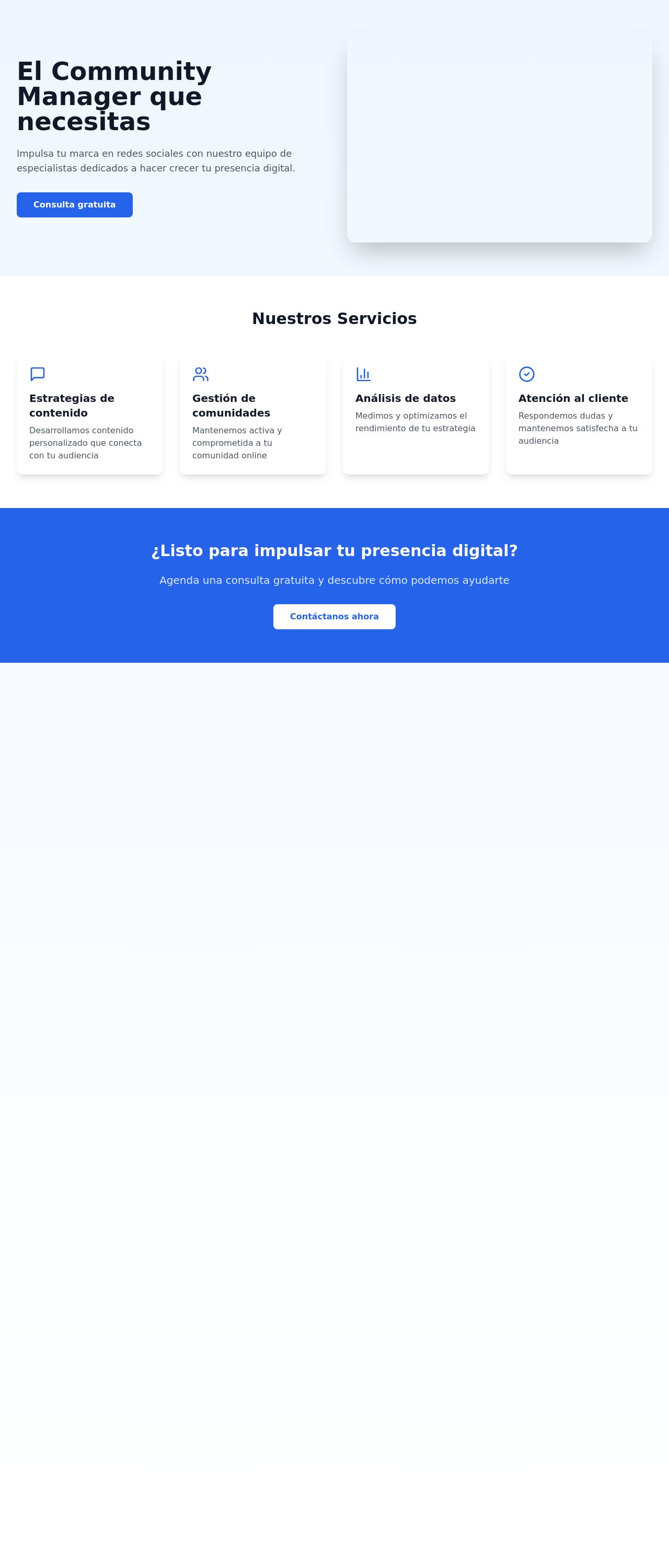
Vite + React + TS
Analyzed by AI for fun and insights - not to be taken too seriously!
Visual Design
The visual design of the website is clean and modern, with a focus on simplicity and ease of use. The color scheme is predominantly blue and white, which creates a sense of trust and professionalism. The typography is clear and easy to read, with a consistent font throughout the site. The use of icons and graphics is minimal, but effective in breaking up the text and adding visual interest. The overall design feels cohesive and well-organized, making it easy to navigate and find the information you need. One area for improvement is the use of images. While the website does include some images, they are not very prominent or high-quality. Adding more images, especially of the services offered, could help to break up the text and make the site more visually appealing. Another area for improvement is the use of white space. While the website does have some white space, it could be used more effectively to create a sense of breathing room and make the site feel less cluttered. This would also help to draw attention to the most important elements of the site. Overall, the visual design of the website is strong, but could be improved with the addition of more images and better use of white space.
Recommendation:
Add more high-quality images to break up the text and make the site more visually appealing. Use white space more effectively to create a sense of breathing room and draw attention to the most important elements of the site.
Layout and Clarity
The layout and clarity of the website are excellent. The site is easy to navigate, with clear and concise headings and a logical flow of information. The use of subheadings and bullet points helps to break up the text and make it easier to read. The site is well-organized, with a clear hierarchy of information and a clear call-to-action (CTA) at the top of the page. One area for improvement is the use of color. While the blue and white color scheme is clean and modern, it can be difficult to read on certain backgrounds. Adding more contrast to the site would help to make it more readable and visually appealing. Another area for improvement is the use of CTAs. While the site does have a clear CTA at the top of the page, it could be more prominent and attention-grabbing. This would help to encourage visitors to take action and engage with the site. Overall, the layout and clarity of the website are strong, but could be improved with the addition of more contrast and a more prominent CTA.
Recommendation:
Add more contrast to the site to make it more readable and visually appealing. Make the CTA more prominent and attention-grabbing to encourage visitors to take action and engage with the site.
Content
The content of the website is well-written and easy to read. The language is clear and concise, and the tone is professional and friendly. The content is well-organized, with a clear hierarchy of information and a logical flow. One area for improvement is the use of bullet points. While the site does use bullet points effectively, there are a few instances where they are not used consistently. This can make the text feel cluttered and difficult to read. Another area for improvement is the use of images. While the site does include some images, they are not very prominent or high-quality. Adding more images, especially of the services offered, could help to break up the text and make the site more visually appealing. Overall, the content of the website is strong, but could be improved with the addition of more bullet points and high-quality images.
Recommendation:
Add more bullet points to the site to break up the text and make it easier to read. Use more images, especially of the services offered, to make the site more visually appealing.
This website was last rated on Feb. 5, 2025, 8:15 p.m.
Disclaimer: ratemysite.app is not affiliated with the website you are viewing, and does not endorse it in any way.
Ratings are subjective and based on AI's analysis. We filter out explicit or dangerous content, but cannot guarantee that all sites are safe.

All rights reserved. © ratemysite.app 2024. Contact: hello @ domain.