Rate your website in seconds – get instant feedback.
I will rate your website's design and give recommendations to enhance its visual appeal and user experience. See how your site ranks on the leaderboard!
Jorge Agoiz Dev

Analyzed by AI for fun and insights - not to be taken too seriously!
Visual Design
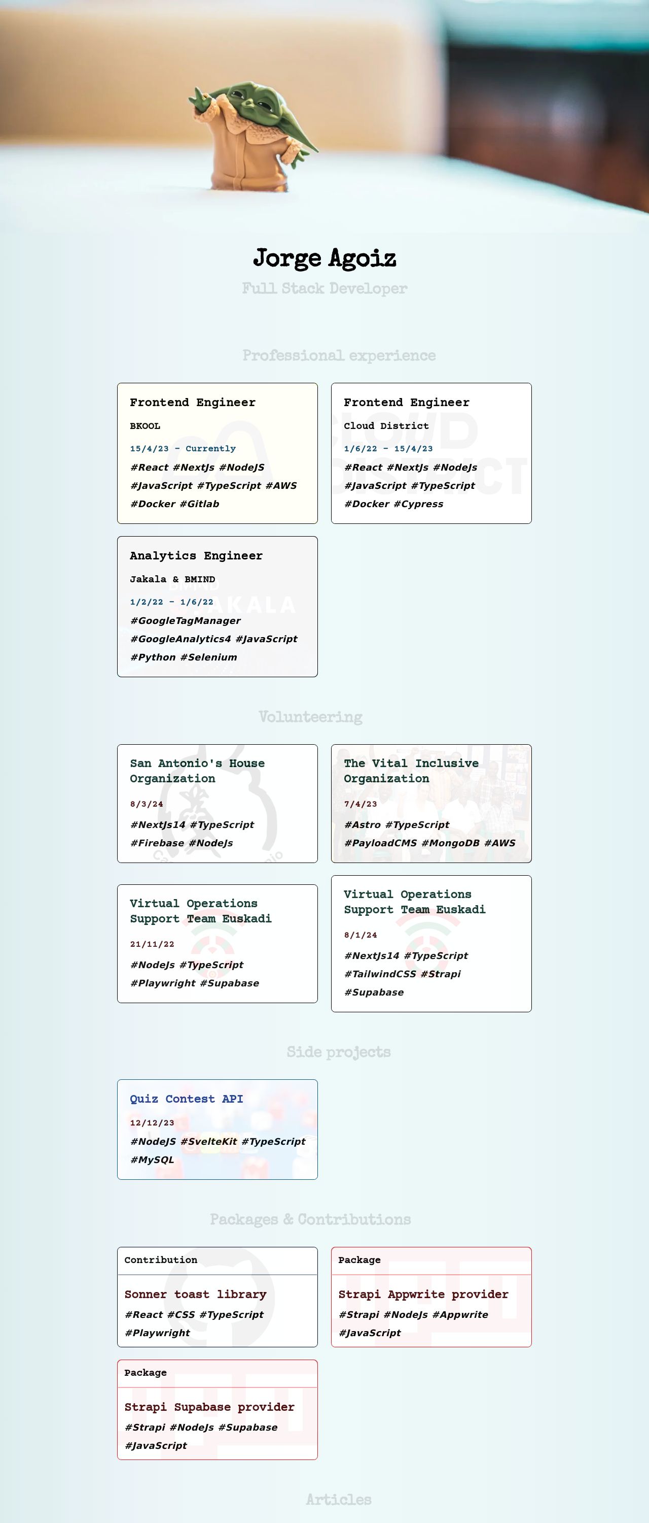
The visual design of Jorge Agoiz's website is a breath of fresh air, with a clean and minimalistic aesthetic that immediately catches the eye. The use of a light blue background provides a calming atmosphere, while the white text and dark blue accents create a nice contrast that makes the content easy to read. The logo, featuring a cartoonish illustration of a person with a green hat, adds a touch of playfulness to the design. However, the overall design could benefit from a bit more visual interest, perhaps through the use of images or graphics to break up the text and add some visual hierarchy. Additionally, the font sizes and line heights could be adjusted to improve readability. Overall, the visual design is strong, but could use a bit more attention to detail to take it to the next level.
Recommendation:
Add more visual interest with images or graphics
Layout and Clarity
The layout of Jorge Agoiz's website is well-organized and easy to navigate, with clear headings and concise paragraphs that make it easy to scan and understand the content. The use of white space is effective in creating a clean and uncluttered design, and the placement of the logo and navigation menu is intuitive and easy to use. However, the layout could benefit from a bit more attention to detail, such as aligning the text and images more precisely, and using a consistent margin and padding throughout the design. Additionally, the website could benefit from a more prominent call-to-action, such as a "Contact Me" or "Learn More" button, to encourage visitors to take action. Overall, the layout is solid, but could use a bit more refinement to make it truly shine.
Recommendation:
Refine the layout with more attention to detail
Content
The content on Jorge Agoiz's website is clear and concise, with a focus on showcasing his skills and experience as a Full Stack Developer. The use of bullet points and short paragraphs makes it easy to scan and understand the information, and the inclusion of relevant keywords and technologies is helpful for search engine optimization. However, the content could benefit from a bit more personality and flair, such as anecdotes or personal stories that showcase Jorge's passion and enthusiasmfor his work. Additionally, the content could be more engaging and interactive, such as through the use of videos, animations, or interactive elements. Overall, the content is strong, but could use a bit more creativity and flair to make it truly stand out.
Recommendation:
Add more personality and flair to the content
This website was last rated on Dec. 15, 2024, 11:35 a.m.
Disclaimer: ratemysite.app is not affiliated with the website you are viewing, and does not endorse it in any way.
Ratings are subjective and based on AI's analysis. We filter out explicit or dangerous content, but cannot guarantee that all sites are safe.
All rights reserved. © ratemysite.app 2024. Contact: hello @ domain.
