Rate your website in seconds – get instant feedback.
I will rate your website's design and give recommendations to enhance its visual appeal and user experience. See how your site ranks on the leaderboard!

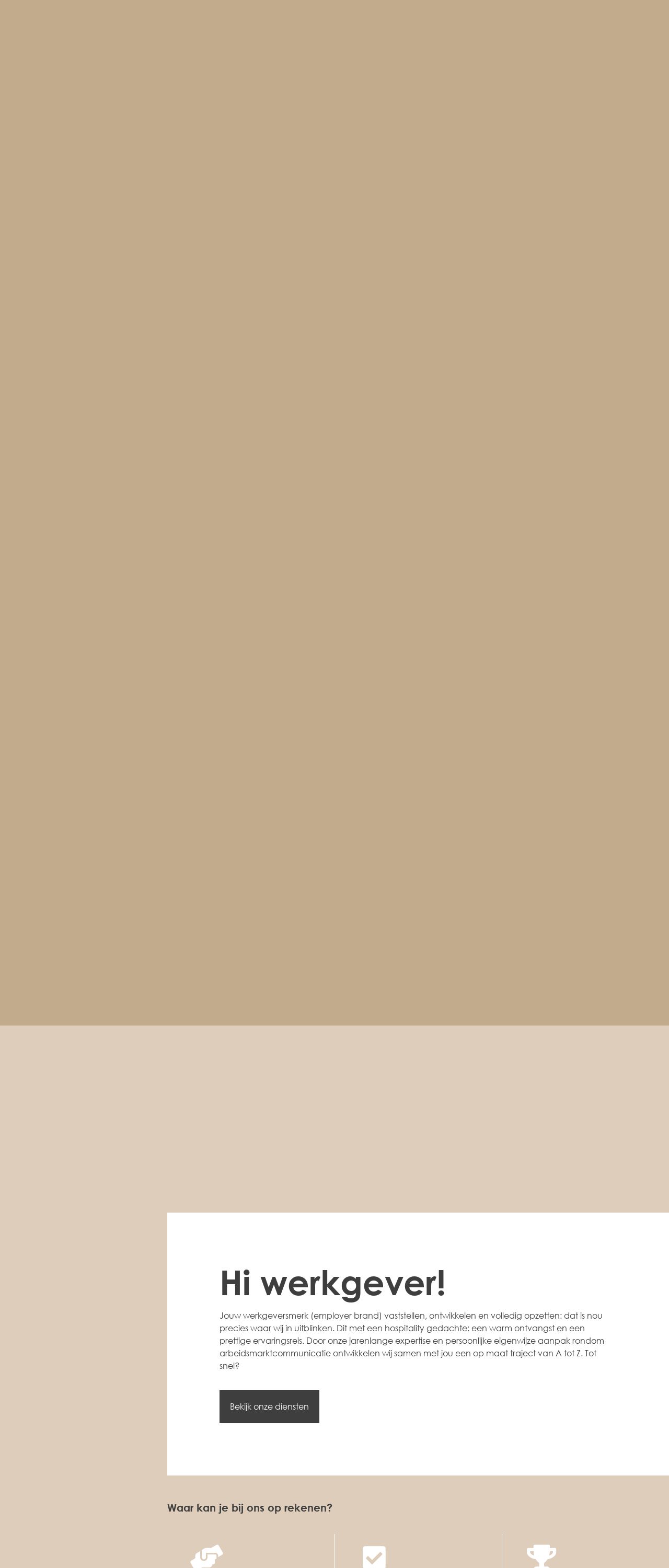
Voor Werkgevers – Home – JUNE. Consultancy
Analyzed by AI for fun and insights - not to be taken too seriously!
Visual Design
The visual design of the website is clean and minimalistic, with a focus on simplicity and ease of use. The color scheme is predominantly beige and white, which gives the site a neutral and professional feel. The typography is clear and easy to read, with a consistent font throughout the site. The use of icons and graphics is limited, but effective in adding visual interest and breaking up the text. The overall design is well-balanced and easy on the eyes, making it a pleasure to navigate. One notable feature of the design is the use of a subtle gradient effect on the background, which adds depth and visual interest to the site. The gradient effect is also used to create a sense of movement and flow, guiding the user's eye through the content. While the design is generally successful, there are a few areas for improvement. The use of images is limited, and the site could benefit from more visual content to break up the text and make the site more engaging. Additionally, the design could be more consistent across different pages and sections, with a clearer hierarchy of information and a more cohesive visual style. Overall, the visual design of the website is strong and effective, but could be further improved with more visual content and a more consistent design approach.
Recommendation:
Consider adding more visual content, such as images and graphics, to break up the text and make the site more engaging. Also, consider implementing a more consistent design approach across different pages and sections.
Layout and Clarity
The layout and clarity of the website are excellent, with a clear and logical structure that makes it easy to navigate and understand. The site is divided into clear sections, each with a clear heading and concise text. The use of white space is effective in creating a clear hierarchy of information and making the site easy to read. The font size and line height are well-chosen, making the text easy to read and understand. The use of headings and subheadings is also effective in creating a clear structure and making the site easy to scan. One notable feature of the layout is the use of a clear and concise call-to-action (CTA) on the home page, which encourages the user to take action and engage with the site. The CTA is also repeated throughout the site, making it easy for the user to know what to do next. While the layout and clarity are generally excellent, there are a few areas for improvement. The site could benefit from more visual hierarchies and clearer distinctions between different sections and content. Additionally, the site could be more mobile-friendly, with a more responsive design that adapts to different screen sizes and devices. Overall, the layout and clarity of the website are strong and effective, but could be further improved with more visual hierarchies and a more responsive design.
Recommendation:
Consider adding more visual hierarchies, such as icons and graphics, to create a clearer distinction between different sections and content. Also, consider implementing a more responsive design that adapts to different screen sizes and devices.
Content
The content of the website is well-written and engaging, with a clear and concise writing style that makes it easy to understand. The content is also well-structured, with a clear hierarchy of information and a logical flow that makes it easy to follow. The use of headings and subheadings is effective in creating a clear structure and making the site easy to scan. The font size and line height are well-chosen, making the text easy to read and understand. One notable feature of the content is the use of bullet points and short paragraphs, which makes the text easy to read and understand. The use of images and graphics is also effective in breaking up the text and making the site more engaging. While the content is generally excellent, there are a few areas for improvement. The site could benefit from more engaging and interactive content, such as videos and animations, to make the site more engaging and dynamic. Additionally, the site could be more up-to-date and current, with more fresh and relevant content that reflects the latest trends and developments. Overall, the content of the website is strong and effective, but could be further improved with more engaging and interactive content, and a more current and up-to-date approach.
Recommendation:
Consider adding more engaging and interactive content, such as videos and animations, to make the site more engaging and dynamic. Also, consider updating the content more regularly to reflect the latest trends and developments.
This website was last rated on Jan. 18, 2025, 5:15 a.m.
Disclaimer: ratemysite.app is not affiliated with the website you are viewing, and does not endorse it in any way.
Ratings are subjective and based on AI's analysis. We filter out explicit or dangerous content, but cannot guarantee that all sites are safe.

All rights reserved. © ratemysite.app 2024. Contact: hello @ domain.