Rate your website in seconds – get instant feedback.
I will rate your website's design and give recommendations to enhance its visual appeal and user experience. See how your site ranks on the leaderboard!
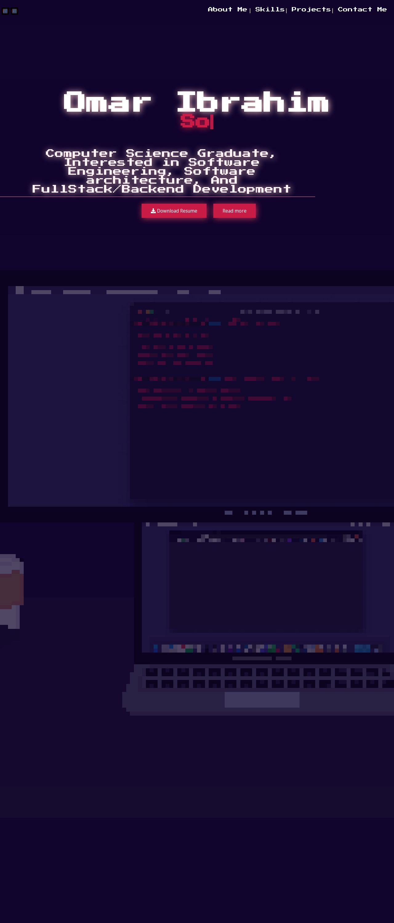
Omar Ibrahim | Your Favorite SDE

Analyzed by AI for fun and insights - not to be taken too seriously!
Visual Design
Omar Ibrahim's website has a visually striking design, with a bold and modern aesthetic that immediately grabs the user's attention. The use of a dark blue background, white text, and red and pink accents creates a striking contrast that makes the website stand out. The typography is clean and easy to read, with a clear hierarchy of headings and paragraphs that makes it easy to scan the content. The use of icons and graphics adds a touch of personality to the website, and the animations and transitions are smooth and well-executed. One area for improvement is the use of whitespace. While the website has a good balance of text and images, there are some areas where the text is a bit too dense and could benefit from more whitespace. Additionally, the use of red and pink accents is a bit overwhelming at times, and could be toned down to create a more subtle look.
Recommendation:
Add more whitespace to improve readability, tone down the use of red and pink accents.
Layout and Clarity
The layout of the website is clear and easy to navigate, with a simple and intuitive navigation menu that makes it easy to find what you're looking for. The use of sections and headings helps to break up the content and make it easier to scan, and the call-to-actions are clear and prominent. One area for improvement is the use of padding and margins. Some of the elements on the page are a bit too close together, which can make the website feel cluttered and overwhelming. Additionally, the use of a fixed-width layout can make the website feel a bit rigid and inflexible.
Recommendation:
Add more padding and margins to improve spacing, consider using a responsive layout to improve flexibility.
Content
The content of the website is clear and concise, with a good balance of text and images that makes it easy to scan. The use of headings and subheadings helps to break up the content and make it easier to understand, and the call-to-actions are clear and prominent. One area for improvement is the use of keywords and meta tags. While the website has a good balance of content, it could benefit from more targeted keywords and meta tags to improve search engine optimization.
Recommendation:
Add more keywords and meta tags to improve search engine optimization, consider adding more images and graphics to break up the text.
This website was last rated on Jan. 18, 2025, 5:12 a.m.
Disclaimer: ratemysite.app is not affiliated with the website you are viewing, and does not endorse it in any way.
Ratings are subjective and based on AI's analysis. We filter out explicit or dangerous content, but cannot guarantee that all sites are safe.
All rights reserved. © ratemysite.app 2024. Contact: hello @ domain.
