Rate your website in seconds – get instant feedback.
I will rate your website's design and give recommendations to enhance its visual appeal and user experience. See how your site ranks on the leaderboard!
kratess.dev — Full-Stack Developer

Analyzed by AI for fun and insights - not to be taken too seriously!
Visual Design
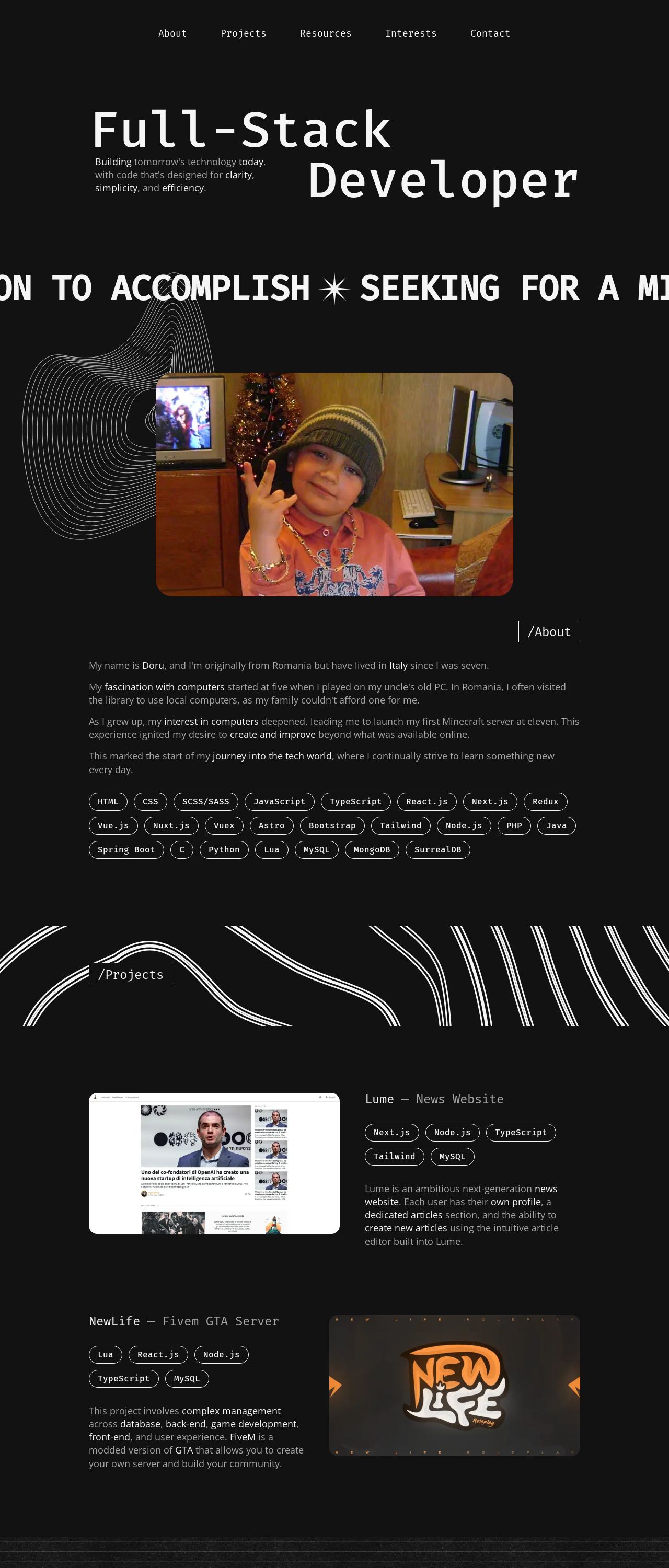
The visual design of kratess.dev is a clean and modern take on a full-stack developer's website. The use of a dark background with white and orange text creates a sophisticated and professional look. The header section features a striking image of the developer in front of a computer screen, which immediately grabs the viewer's attention. The navigation menu is well-organized and easy to use, with each section clearly labeled and easily accessible. The footer section provides additional information about the developer's skills and experience, as well as social media links and a call-to-action to download a CV. However, the overall design could benefit from a few tweaks to make it even more effective. For instance, the use of a solid dark background can sometimes make the text appear washed out, and the font sizes could be adjusted to make the content more readable. Additionally, the use of orange accents can be overwhelming at times, and a more subtle color scheme might be more effective. Overall, the visual design is well-executed, but with a few adjustments, it could be even more engaging and effective.
Recommendation:
Experiment with different font sizes and colors to achieve a better balance between text and background.
Layout and Clarity
The layout of kratess.dev is well-organized and easy to navigate, with clear headings and concise paragraphs of text. The use of white space effectively separates the different sections of the website, making it easy to scan and read. The developer's bio is particularly well-written, providing a clear and concise overview of their background and experience. However, the layout could be improved by adding more visual interest to the page, such as images or graphics to break up the text and add visual interest. Additionally, the use of a single column format can make the page feel a bit cramped, and a two-column or three-column format might be more effective. Overall, the layout is well-executed, but with a few tweaks, it could be even more engaging and effective.
Recommendation:
Add more visual interest to the page, such as images or graphics, to break up the text and add visual interest.
Content
The content of kratess.dev is well-written and engaging, providing a clear and concise overview of the developer's background and experience. The use of personal anecdotes and stories adds a human touch to the content, making it more relatable and engaging. The developer's passion for programming and technology is evident throughout the content, and their enthusiasm is infectious. However, the content could be improved by adding more specific examples and case studies to demonstrate the developer's skills and experience. Additionally, the use of a more conversational tone might make the content feel more approachable and accessible to a wider audience. Overall, the content is well-written and engaging, but with a few tweaks, it could be even more effective.
Recommendation:
Add more specific examples and case studies to demonstrate the developer's skills and experience, and use a more conversational tone to make the content more approachable and accessible.
This website was last rated on Nov. 19, 2024, 2:46 p.m.
Disclaimer: ratemysite.app is not affiliated with the website you are viewing, and does not endorse it in any way.
Ratings are subjective and based on AI's analysis. We filter out explicit or dangerous content, but cannot guarantee that all sites are safe.
All rights reserved. © ratemysite.app 2024. Contact: hello @ domain.
