Rate your website in seconds – get instant feedback.
I will rate your website's design and give recommendations to enhance its visual appeal and user experience. See how your site ranks on the leaderboard!

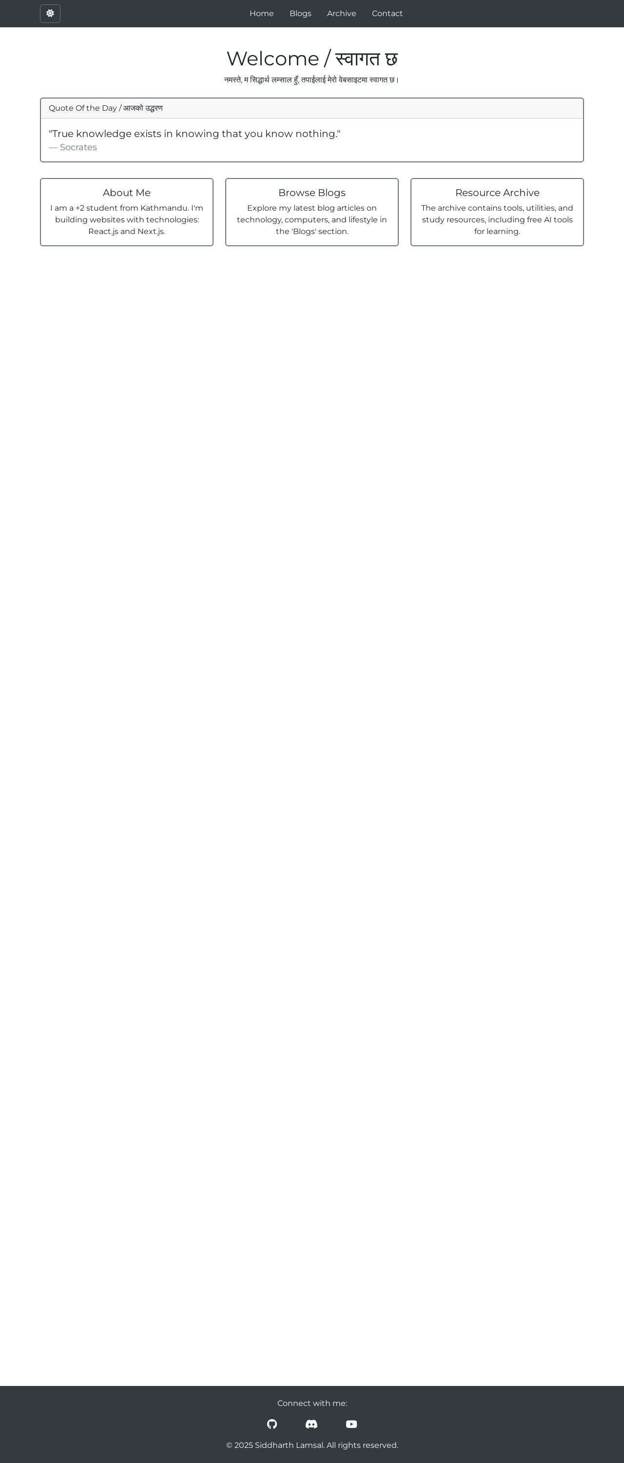
Siddharth's Website
Analyzed by AI for fun and insights - not to be taken too seriously!
Visual Design
The visual design of Siddharth's website is simple and clean, with a predominantly white background that makes the text and images stand out. The use of a single color scheme, primarily shades of gray and white, creates a cohesive look. The layout is well-organized, with clear headings and concise paragraphs. However, the design could benefit from more visual interest and depth, such as incorporating images or graphics to break up the text and add visual appeal. Additionally, the font sizes and line spacing could be adjusted for better readability. Overall, the design is functional and easy to navigate, but could use some visual flair to make it more engaging.
Recommendation:
Consider adding more visual elements, such as images or graphics, to break up the text and add visual interest. Adjust font sizes and line spacing for better readability.
Layout and Clarity
The layout of Siddharth's website is well-structured, with a clear hierarchy of information. The use of headings and subheadings makes it easy to scan and understand the content. The text is concise and easy to read, with clear bullet points and lists. However, the layout could benefit from more white space to make the content feel less dense and overwhelming. Additionally, the use of a single font throughout the website makes it feel a bit monotonous. Overall, the layout is functional and easy to navigate, but could use some tweaks to make it feel more visually appealing and engaging.
Recommendation:
Consider adding more white space to make the content feel less dense and overwhelming. Experiment with different fonts to add visual interest and variety.
Content
The content of Siddharth's website is informative and engaging, with a clear and concise writing style. The use of headings and subheadings makes it easy to scan and understand the content. However, the content could benefit from more depth and substance, such as including more examples or anecdotes to illustrate the points being made. Additionally, the use of technical terms and jargon could be explained in simpler terms to make the content more accessible to a wider audience. Overall, the content is well-written and easy to understand, but could use some additional context and explanation to make it feel more comprehensive and engaging.
Recommendation:
Consider adding more depth and substance to the content, such as including more examples or anecdotes to illustrate the points being made. Explain technical terms and jargon in simpler terms to make the content more accessible to a wider audience.
This website was last rated on Jan. 14, 2025, 5:38 a.m.
Disclaimer: ratemysite.app is not affiliated with the website you are viewing, and does not endorse it in any way.
Ratings are subjective and based on AI's analysis. We filter out explicit or dangerous content, but cannot guarantee that all sites are safe.

All rights reserved. © ratemysite.app 2024. Contact: hello @ domain.